
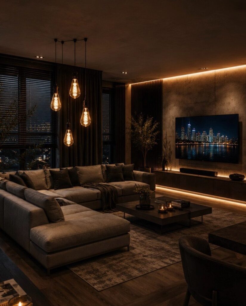
Dark living rooms range from a single charcoal accent wall behind the sofa to slatted wood panels, deep plum seating corners, and moody blue paint around a fireplace.
The choice comes down to how much light your space gets and whether you want warmth or drama.
1. Gothic Gallery Wall
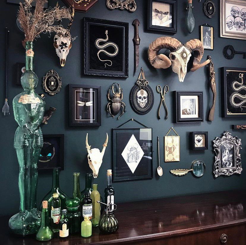
A gallery wall can hold more than family photos. This one leans into natural history: animal skulls, preserved insects under glass, and dark-framed prints that feel museum-quality without looking academic.
The dark green background makes lighter objects pop without needing bright lighting. I’d mount everything flush to the wall rather than layering on shelves, which keeps the look intentional instead of cluttered.
Start with a few anchor pieces, then fill in with smaller frames. Odd numbers read better than even, and leaving a little breathing room between frames makes each piece feel deliberate.
2. Warm-Toned Bulbs
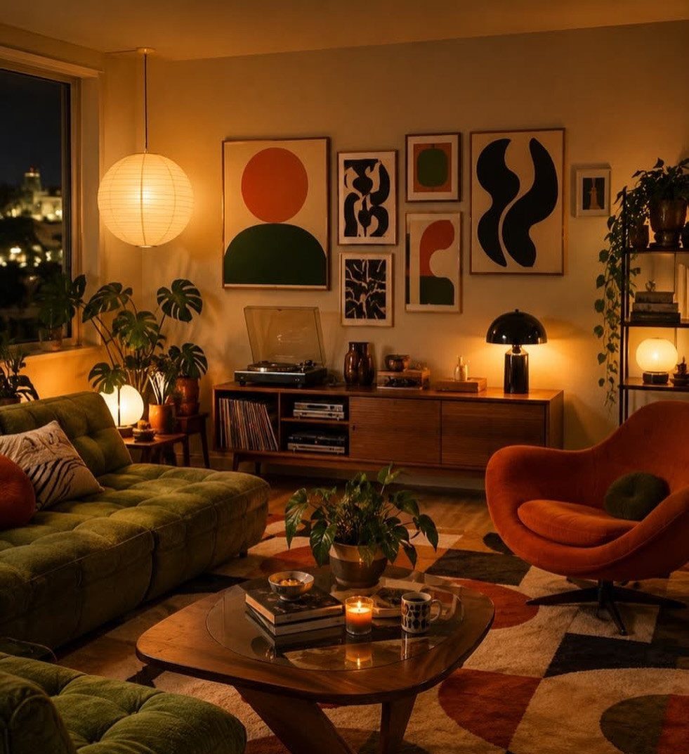
Lighting changes everything in a dark room. Warm bulbs (2700K to 3000K) give off a soft amber glow that makes deep wall colors feel inviting instead of cave-like.
I’d use multiple lamps at different heights instead of one overhead fixture. Table lamps, floor lamps, and wall sconces spread light around the room and let you control which corners feel cozy versus which stay shadowy.
Swap out any cool white bulbs first. The difference is immediate, and you’ll notice it most in the evening when you actually want to relax.
3. Maximalist Styling
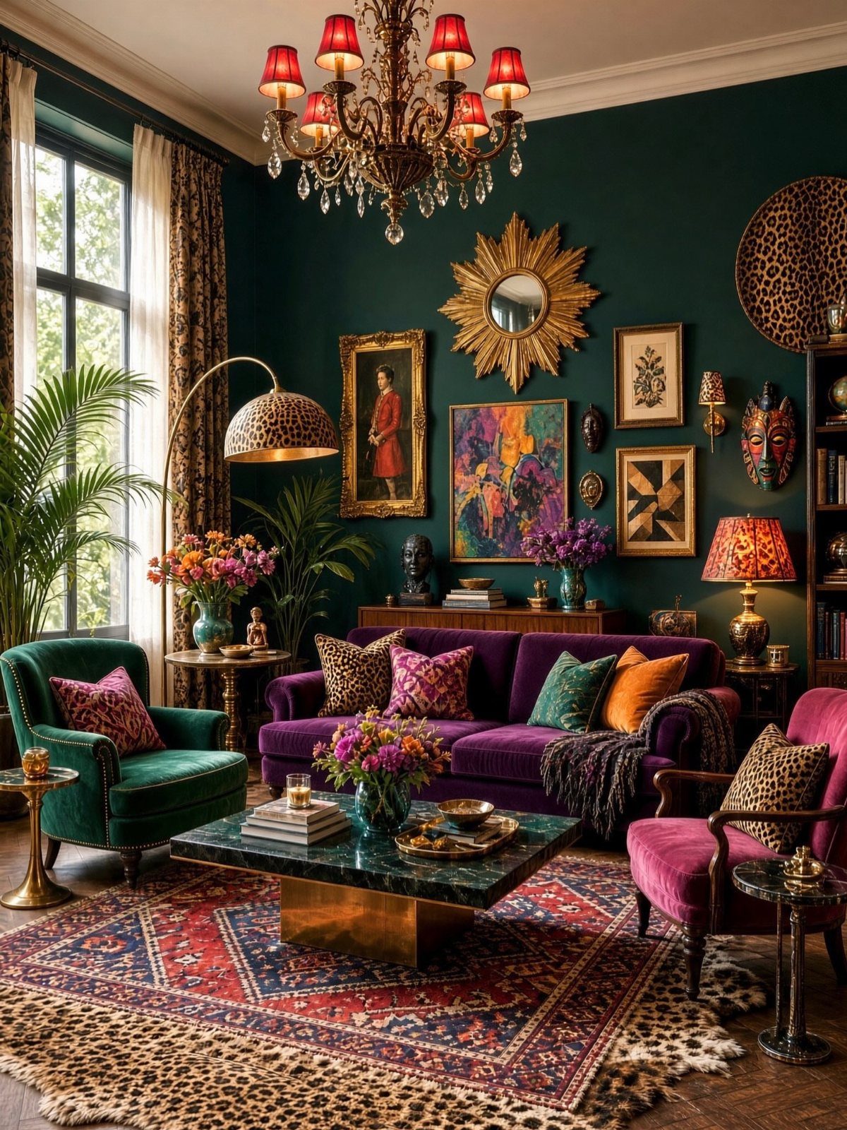
Maximalism works in dark rooms because the walls can handle visual weight. Jewel tones, metallic finishes, bold patterns, and layered textures all sit comfortably together when the backdrop stays consistent.
I’d start with one saturated anchor piece, like a velvet sofa or a large patterned rug, then build from there.
Mix in brass or gold accents, animal prints, and artwork that doesn’t match but shares a color or two with the rest of the room.
Committing fully makes it work. One bold piece reads as a mistake; many bold pieces read as a point of view.
4. Modern Moody
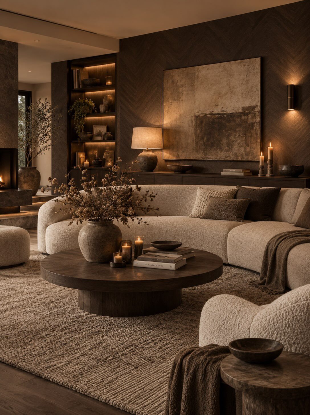
Dark chevron walls add geometry without needing wallpaper. The pattern creates movement across the surface, which keeps solid charcoal from feeling flat or one-dimensional.
Pairing it with a neutral sofa and natural wood furniture balances the intensity. I like this approach because the walls do the work, and the rest of the room can stay simple.
If you’re painting chevron yourself, use painter’s tape and measure the angles carefully. A wobbly chevron is worse than a plain wall.
5. Moody Blue Fireplace Corner
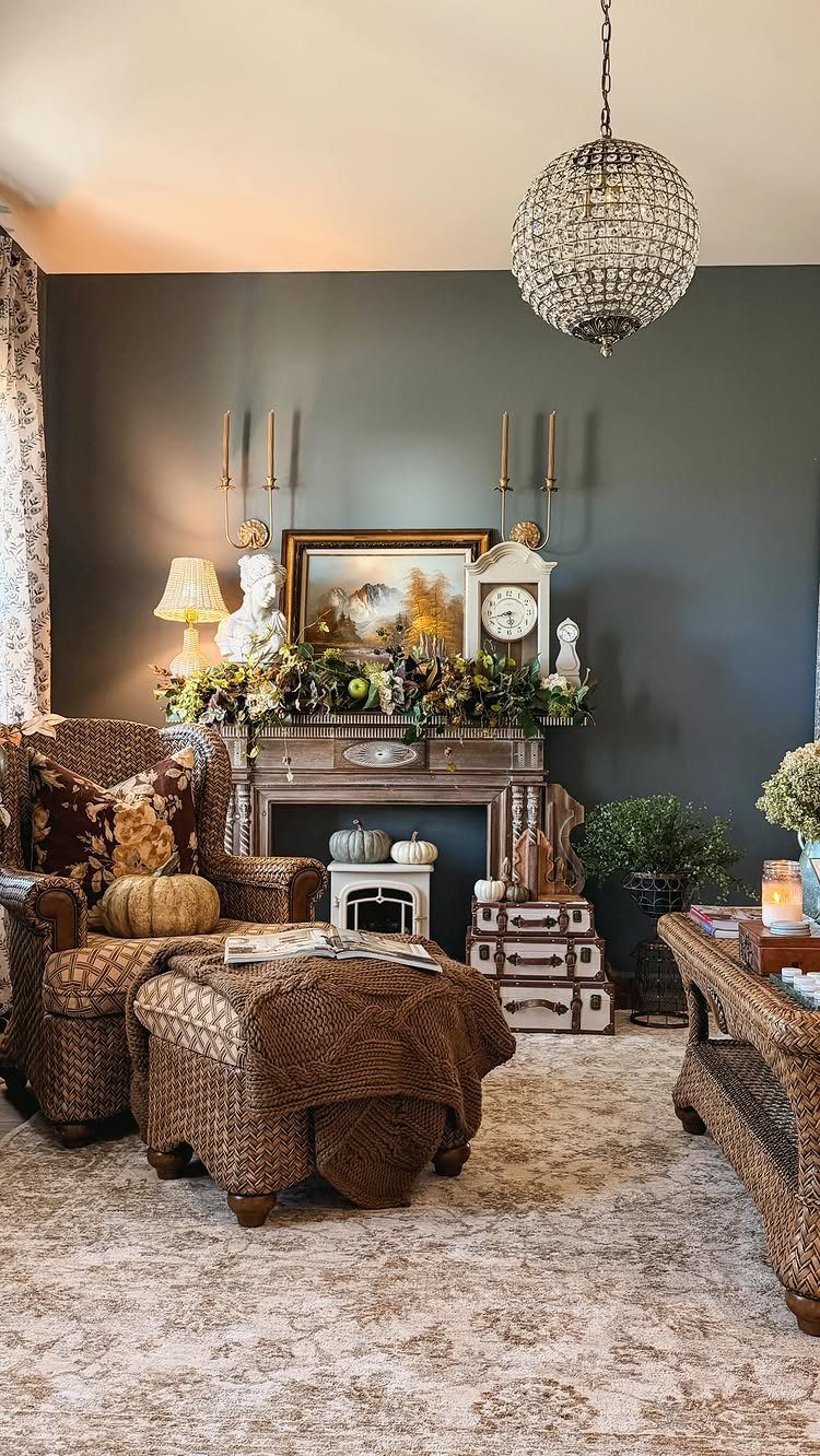
Deep navy anchors a room without the starkness of black. It holds warmth better, especially around a fireplace where the glow from the hearth picks up subtle undertones in the paint.
I’d pair it with brown leather or woven seating and keep metals in the warm range: brass, bronze, or copper. A crystal chandelier adds a formal touch that stops the space from feeling too rustic.
Navy also works well if you’re renting and want something dramatic but easier to paint over later. It reads as a deliberate choice, not a risk.
6. Black Walls with Soft Candlelight
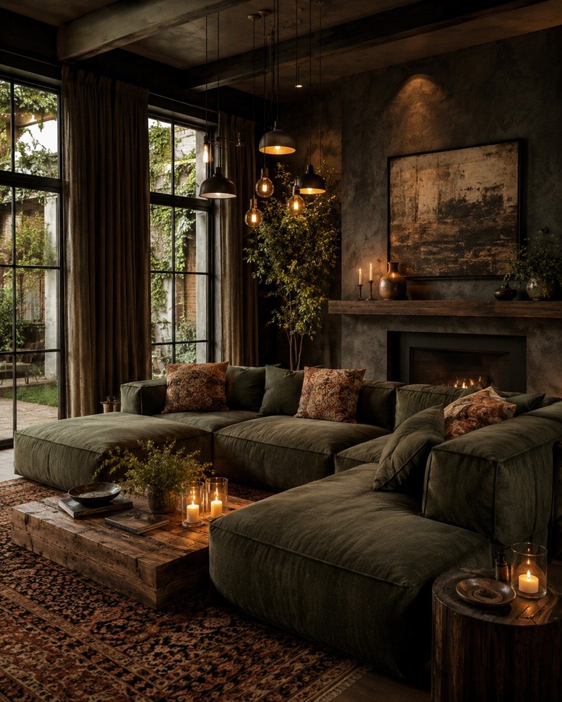
Candlelight softens black walls in a way electric bulbs can’t. The flicker adds movement, and the warm orange glow counters the coolness of dark paint.
I’d use pillar candles on the coffee table and a few votives on shelves or the mantel. Real candles beat LED versions for ambiance, but if you’re leaving them unattended, battery-operated ones with a timer are safer.
Black walls absorb light, so you need more sources than you think. Candles alone won’t light the room, but they make it feel lived-in once the lamps are on.
7. Dark Painted Ceiling
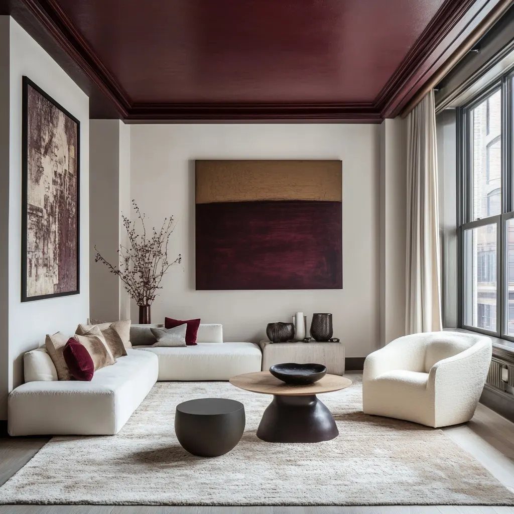
Painting the ceiling changes the proportions of a room. A dark ceiling makes the space feel more enclosed, which works when you want intimacy instead of openness.
Burgundy holds warmth better than black or charcoal. It reads as intentional rather than stark, and it pairs well with both neutral furniture and saturated accents.
I’d carry the ceiling color down onto the crown molding if there is any. Stopping at a white trim line breaks the effect and makes the ceiling look like an afterthought.
8. Plum Walls with Velvet Seating
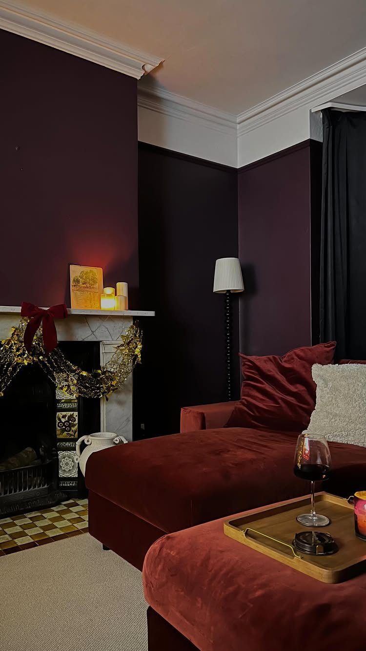
Plum and red velvet sit in the same tonal family, so they layer without clashing. The wall color supports the sofa instead of competing with it, and both feel richer together than either would alone.
Velvet catches light differently depending on the angle, which adds texture to a room that might otherwise read flat. I’d keep other fabrics smooth: linen, cotton, or leather rather than more pile.
A white mantel keeps the room from feeling too heavy. Metallic accents in gold or brass pull the whole palette together without adding another color.
9. Dark Grey Accent Wall
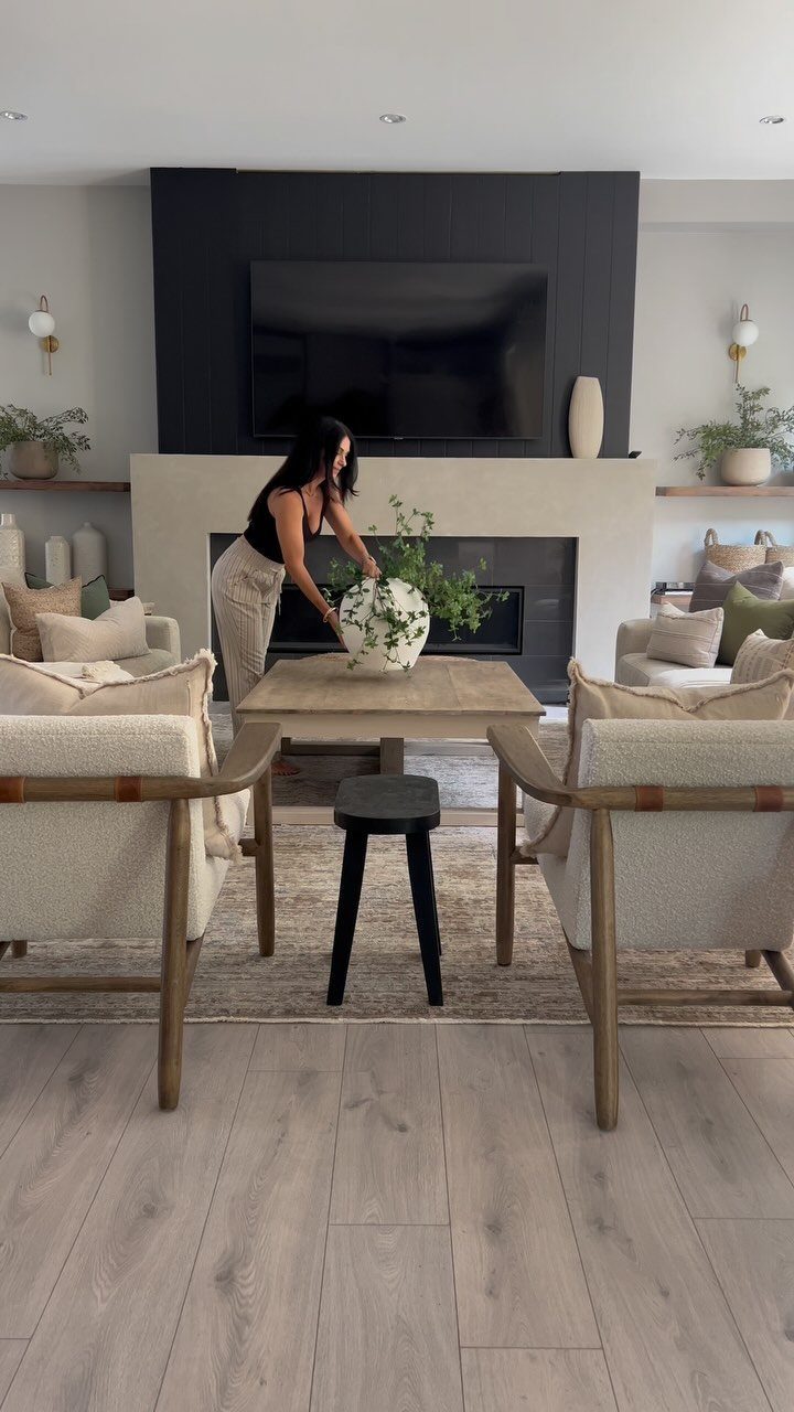
A single dark wall lets you test the idea without committing the whole room. Charcoal grey is easier to live with than black but still dramatic enough to change the mood.
Pairing it with beige upholstery and light wood keeps the contrast soft. The grey grounds the space without making it feel closed in, and the neutral furniture balances the weight.
I’d paint the wall behind the sofa or the one opposite the main seating. Putting dark paint where you look most often makes it feel like part of the design instead of an accident.
10. Dark Olive Green Walls
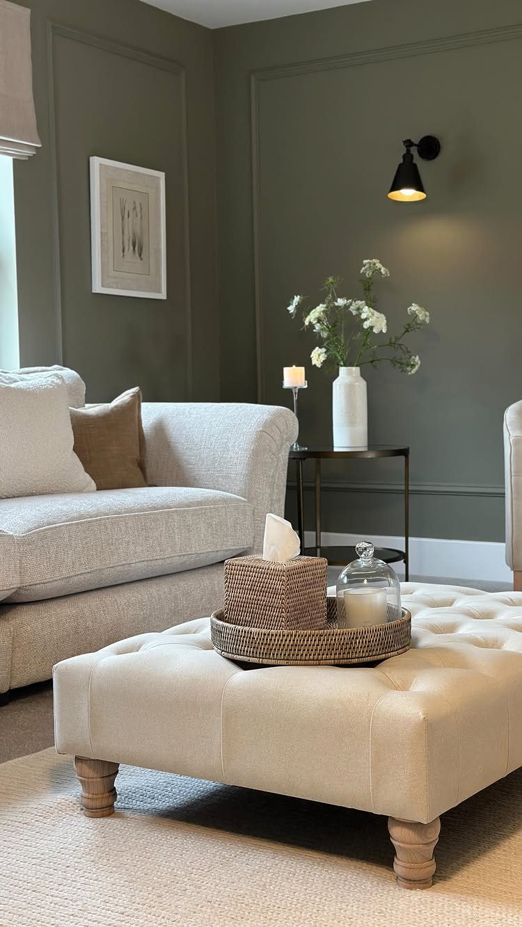
Olive green reads as earthy rather than moody, which makes it easier to live with than deeper jewel tones. It works especially well in rooms with natural light, where the color shifts slightly through the day.
Wall molding breaks up the surface and adds dimension.
Without it, a single dark color can feel flat. I’d keep the molding the same shade as the walls rather than picking it out in white, which keeps the look cohesive.
Beige seating and warm wood tones keep the room grounded. Olive pairs naturally with both, and the whole palette stays in the warm neutral range.
11. Dark Wood Slatted Walls
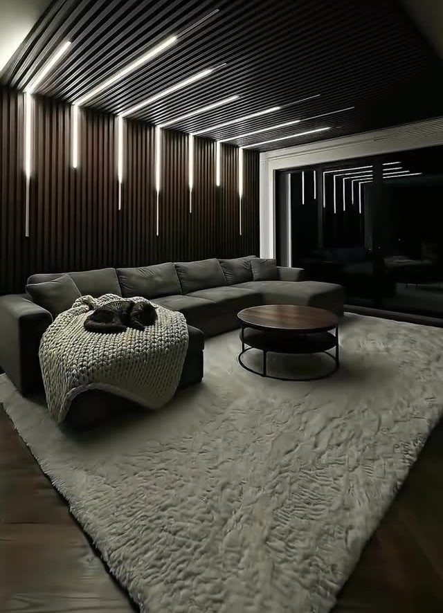
Slatted wood adds texture and depth that flat drywall can’t. The vertical lines draw the eye up, and the narrow gaps between slats create subtle shadows that change with the light.
Carrying the slats onto the ceiling makes the treatment feel architectural instead of decorative. It’s a bigger commitment than an accent wall, but the result is more cohesive.
I’d use this in a room with enough natural light to keep it from feeling like a cave. The grey sectional and shaggy rug soften the harder lines of the wood and keep the space comfortable.
12. Dark Teal Walls with Landscape Mural
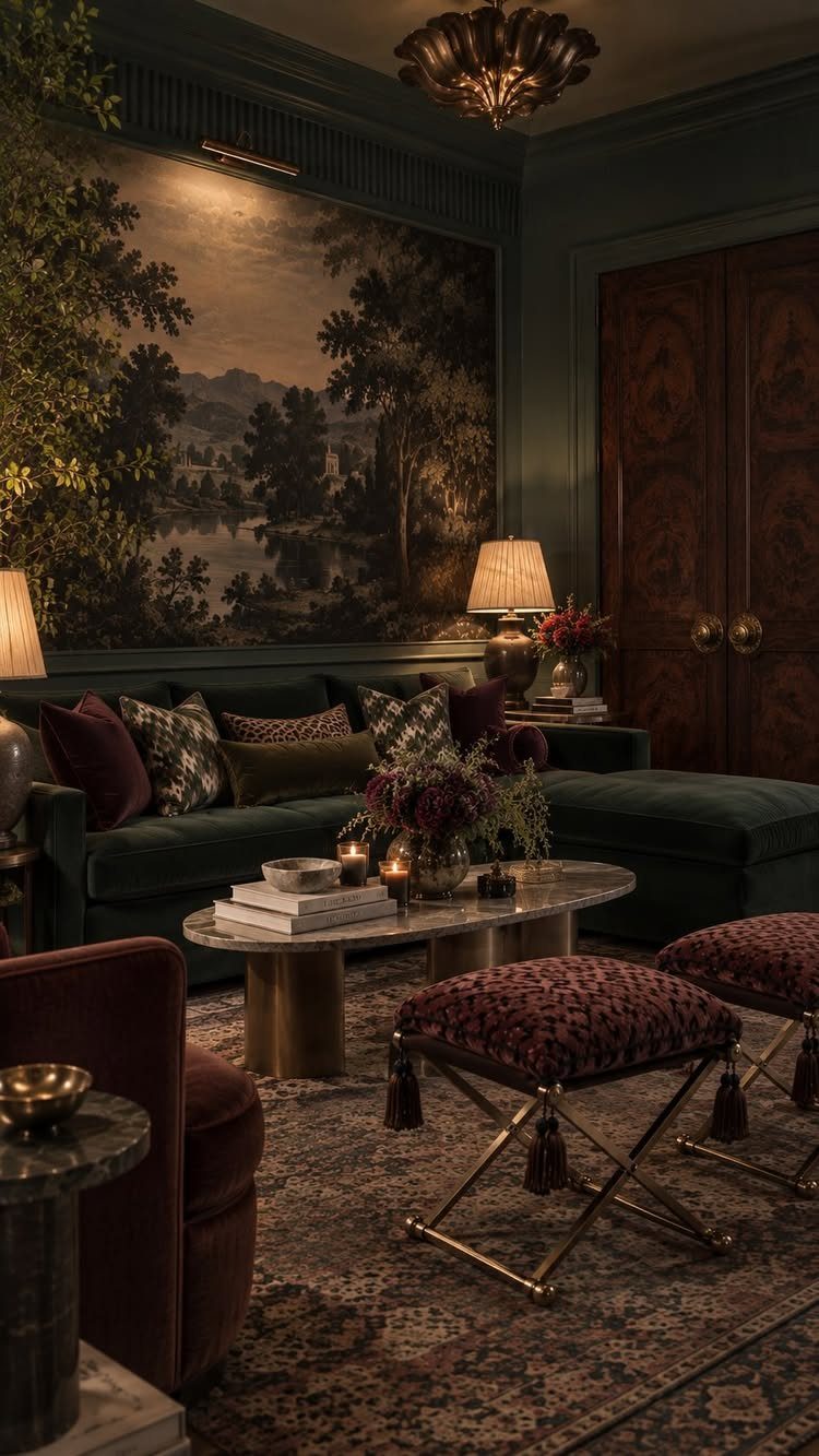
A landscape mural gives a dark room a focal point that isn’t furniture. The teal walls set the stage, and the mural adds depth without needing bright colors or heavy contrast.
Green velvet seating ties into the mural without matching it exactly. I’d keep the rest of the palette in jewel tones: burgundy, gold, or rust rather than pastels or neutrals.
The marble coffee table and patterned ottomans add texture at a smaller scale, which keeps the room from feeling dominated by one large image. Layering different materials makes maximalist spaces feel intentional.
Choosing Paint Colors
Select paint with a low Light Reflectance Value if you want a room that absorbs light rather than bouncing it around. The lower the LRV, the deeper and more enclosed the space will feel.
Paint a sample square on at least 2 walls and watch how it shifts from morning to evening.
A room facing north gets cooler, flatter light that can dull a color, while southern exposure adds warmth and makes the same shade feel richer.
If your room gets limited natural light, stick with warm-toned darks instead of cool ones. Charcoal gray, navy blue, forest green, deep plum, and dark brown all work, but the undertone matters more in a dim space.
Creating Depth with Texture
A dark room without texture reads flat. Mixing materials keeps the space from feeling one-dimensional: velvet next to leather, a wool rug under a wooden coffee table, a knit throw over linen upholstery.
Contrast in finish matters as much as contrast in material.
Dark wood, metal, exposed brick, and stone all add visual weight and work well in a monochromatic palette. The more variation in surface, the less the room feels like it’s closing in.
Staying inside one color family and changing texture instead keeps a small room from looking busy. A smooth leather sofa next to a thick wool rug gives you the contrast you need without patterns fighting each other.
Frequently Asked Questions
What colors look good in a dark living room?
Colors with more pigment hold their own: charcoal, navy, forest green, deep plum and chocolate brown all stay grounded instead of looking washed out. Warm-toned darks feel cozier than cool ones, especially in rooms without much natural light.
Pay attention to the paint’s LRV (Light Reflectance Value). Lower LRV numbers mean the paint absorbs more light, which makes the walls feel closer.
What is the 3 color rule in interior design?
I split color across 3 levels: the dominant color covers about 60% of the room (usually walls), a secondary color takes up 30% (furniture, curtains, one accent wall), and a final accent hits the last 10% (pillows, art, small accessories).
It keeps a palette balanced without guessing. In a dark room, the 60 is typically the deep wall color, the 30 might be neutral upholstery, and the 10 comes from metallic accents or bold accessories.
How do I make my room dark and moody?
Start with deep wall colors, then layer textures like velvet, leather, wool, and wood to keep the space from reading flat.
Use warm bulbs (2700K to 3000K) in multiple lamps instead of one overhead fixture, which spreads light and lets you control how shadowy the room feels.
Mixing materials and finishes adds the depth that makes a dark room feel intentional instead of cave-like.