
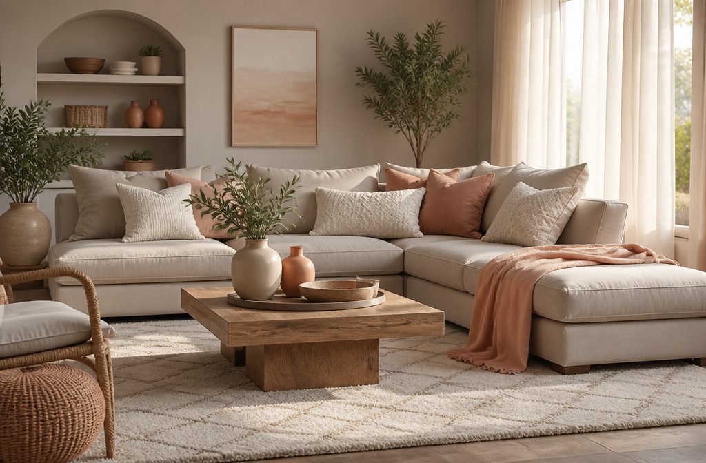
Agreeable Gray from Sherwin-Williams balances greige undertones well enough to work with both warm wood and cool metals, but north-facing rooms or daylight LED bulbs will pull more beige than gray.
Coverage quality across the 6 picks ranged from 400 to 425 square feet per gallon, which matters when you’re painting a full living room on a weekend timeline.
Swiss Coffee leans warmer with yellow and green notes, Statue Green carries GREENGUARD certification for low VOC, and the washability on both held up to everyday cleaning in owner reports.
My Top Picks
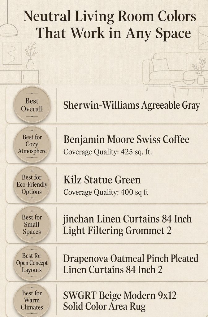
| Product | Award | Best for | Why it won | ||
|---|---|---|---|---|---|
| Sherwin-Williams Agreeable Gray | Best Overall | Versatile neutral wall color | Balanced undertones work in any light with excellent durability and easy cleaning | Check price | |
| Benjamin Moore Swiss Coffee | Best for Cozy Atmosphere | Warm, inviting living rooms | Soft creamy undertones create instant coziness while staying practical and washable | Check price | |
| Kilz Statue Green | Best for Eco-Friendly Options | Environmentally conscious homeowners | Low VOC formula delivers healthy indoor air without sacrificing coverage or finish | Check price | |
| jinchan Linen Curtains 84 Inch | Best for Small Spaces | Maximizing light in tight rooms | Light filtering fabric brightens small spaces while grommet design keeps installation simple | Check price | |
| Drapenova Oatmeal Linen Curtains 84 Inch | Best for Open Concept Layouts | Unifying open floor plans | Soft oatmeal linen with pinch pleats adds cohesive elegance across connected spaces | Check price | |
| SWGRT Beige Modern Area Rug | Best for Warm Climates | Staying cool in hot climates | Breathable solid beige design resists heat absorption while anchoring modern room layouts | Check price |

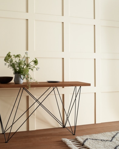
Best Overall: Sherwin-Williams Agreeable Gray
Image: ltx-www.sherwin-williams.com
Quick Verdict
Agreeable Gray lands in the middle of the greige spectrum with enough warmth to keep a room from reading cold, but not so much that it competes with wood tones or warm textiles.
The coverage and washability make it practical for spaces that see daily use, and the durability holds up in high-traffic areas where other neutrals show scuffs within months.
The brand reputation matters when you’re committing to a color across multiple rooms, though the warmth means it won’t suit every lighting situation equally.
What It Does Well
- Greige balance with warm undertones keeps the color adaptable across different furniture finishes and flooring, working with both cool metals and warm wood without clashing.
- High coverage quality means fewer coats to reach opacity, cutting down on labor and drying time when you’re working through a living room on a weekend.
- Durable surface for high-traffic areas resists scuffing and wear near doorways and along baseboards where hands and bags make contact daily.
- Washable finish allows spot cleaning without leaving dull patches, a practical feature in homes with kids or pets.
Where It Falls Short
- Warm undertones shift in cooler light, so north-facing rooms or spaces with LED daylight bulbs can bring out more beige than expected.
- Strong brand reputation comes with wider availability, which also means less exclusivity if that matters to your aesthetic.
Who It’s For
This works for anyone layering neutrals across multiple rooms who needs a color that bridges cool and warm palettes without announcing itself.
Skip it if your living room gets harsh blue-toned light or you’re aiming for a crisp, cooler neutral that stays gray in every condition.
How It Compares
Benjamin Moore Swiss Coffee leans warmer and creamier, reading as an off-white rather than a true greige, which suits spaces where you want softness over neutrality.
Agreeable Gray offers more color flexibility and works better in mixed-light homes where one paint needs to perform across different exposures.
Where to buy: Amazon · sherwin-williams.com
Best for Cozy Atmosphere: Benjamin Moore Swiss Coffee
Image: benjaminmoore.com
Quick Verdict
The soft yellow and green undertones give this paint a warmth that makes a room feel lived-in from the moment it goes on the wall.
It suits anyone who wants that inviting glow without the maintenance worry, since everyday stains wipe off and the finish holds up to the traffic a family living room sees.
Coverage at 425 sq. ft. per gallon is solid, though you lose the deeper durability that comes with heavier-duty formulas.
Key Specifications
- Coverage Quality: 425 sq. ft.
What It Does Well
- Soft undertones create warmth — The yellow and green notes keep the white from feeling clinical, which matters when you’re trying to make a space feel like home rather than a showroom.
- Washability handles real life — Owners report everyday stains come off without scrubbing through the finish, a practical advantage when the living room sees spills and fingerprints.
- Benjamin Moore’s reputation holds — Over 60 years of reliability means the formula has been tested across climates and applications, not just launched and hoped for.
- Low VOC supports indoor air quality — With less than 100 VOC, it qualifies for eco-friendly certifications, which helps if anyone in the house is sensitive to paint fumes.
Where It Falls Short
- It stands up to everyday wear, but high-traffic homes might see scuffs sooner than they would with a tougher acrylic.
- Coverage may require two coats — At 425 sq. ft. per gallon, darker walls or patchy primer often need a second pass to look even.
Who It’s For
If you want a living room that feels warm the moment someone walks in and you need a finish that cleans up without repainting every year, the undertones and washability make this a practical choice.
It’s less suited to renters dealing with landlord-grade walls or families with small children who need paint that shrugs off impacts, since the durability doesn’t match the heaviest-duty options.
How It Compares
Kilz Statue Green offers stronger durability and 100% acrylic construction, but it lacks washability and the warm undertones that give Swiss Coffee its inviting feel.
Choose Kilz if the room takes hard use and you’re willing to spot-clean more carefully; stick with Swiss Coffee if the priority is a cozy look that tolerates everyday cleaning.
Where to buy: Amazon · benjaminmoore.com
Best for Eco-Friendly Options: Kilz Statue Green
Quick Verdict
Statue Green carries GREENGUARD certification for low VOC emissions and delivers on the eco-conscious brief without asking you to overlook durability.
The scrubbable matte finish holds up in high-traffic rooms, and 400 square feet of coverage per gallon moves a weekend project along.
The mature sage tone works in rooms with good natural light but reads muddy in dim hallways or north-facing spaces.
Key Specifications
- Coverage Quality: 400 sq ft
What It Does Well
- GREENGUARD-certified low VOC formula means you can paint a bedroom or nursery without clearing the house for days or worrying about off-gassing in tight spaces.
- Scrubbable matte finish takes cleaning without leaving shiny patches, which matters near entryways, behind sofas, or anywhere fingerprints land.
- 400 sq ft coverage per gallon reduces the number of trips to the store and the number of cans sitting in the garage afterward.
- Weathered sage tone brings depth to living rooms with large windows, reading more nuanced than flat builder beige.
Where It Falls Short
- Sage tone skews dark in low-light rooms, according to owners, and needs testing with sample patches before committing to a full gallon.
- Matte finish shows roller marks if application technique is uneven, which can mean touch-ups on larger walls.
Who It’s For
This suits renters and homeowners who want a healthier indoor environment without sacrificing scrubability in shared living spaces. Skip it if your room lacks strong daylight or you prefer a true neutral over a color with green undertones.
How It Compares
Sherwin-Williams Agreeable Gray offers more versatility across lighting conditions and pairs with a wider range of furniture finishes, but it does not carry the same environmental certifications.
Statue Green answers the call for buyers who prioritize low emissions and are willing to work with a more specific color palette.
Where to buy: Amazon · haiti.desertcart.com
Best for Small Spaces: jinchan Linen Curtains 84 Inch
Quick Verdict
A linen-blend panel that filters daylight without blocking it entirely, these curtains work when floor space is tight and mounting hardware needs to stay simple.
The grommet rings slide onto a rod in seconds, and the fabric lets enough light through to keep a small room from feeling closed in.
They won’t give full blackout coverage, so anyone looking for complete darkness at midday should keep looking.
What It Does Well
- Linen and polyester blend creates a cross-woven texture that looks natural without the stiffness of pure polyester, and owners report the fabric holds up to washing without thinning out.
- Light-filtering weave balances privacy and brightness by softening direct sun while still allowing enough glow to read by, which matters in rooms where a window is the only natural light source.
- Grommet spacing fits standard rods and the panels hang without bunching, so installation takes one person and no measuring beyond the length you already confirmed.
Where It Falls Short
- Privacy drops when the panels are fully open, so bedrooms facing active streets or close neighbors need a secondary treatment if the curtains get pulled back during the day.
- Wrinkles arrive with the packaging, and the maker recommends 5–10 minutes of steam ironing before the fabric looks crisp.
Who It’s For
Renters in studio apartments or single-bedroom units who need curtains that hang quickly and let in morning light without glare will find the grommet design and filtering weave solve both problems at once.
Anyone who works nights and sleeps during peak sun hours will need blackout liners or a heavier fabric, since the linen blend was built to soften daylight rather than stop it.
How It Compares
The SWGRT Beige Modern Area Rug shifts category entirely, covering floors instead of windows, so the jinchan panels remain the right choice for managing light and keeping a view.
A rug anchors furniture groupings but does nothing for glare or privacy, which makes the curtain the right pick for small rooms where wall-mounted treatments matter more than underfoot texture.
Where to buy: Amazon
Best for Open Concept Layouts: Drapenova Oatmeal Linen Curtains 84 Inch
Best for Open Concept Layouts: Drapenova Oatmeal Pinch Pleated Linen Curtains 84 Inch 2 Panels Living Room
Quick Verdict
Open layouts need window treatments that feel intentional without dividing the room, and these pinch pleated linen panels hold their shape across the width without reading heavy.
The oatmeal tone works as a neutral anchor when you’re trying to tie a kitchen line of sight into a living area, and the 7-pleat structure on each 40-inch panel gives you a tailored drape instead of flat fabric.
The maker notes they may need additional styling to coordinate with different zones in the space, which matters when one set of curtains has to make sense next to both a dining table and a sofa.
What It Does Well
- The 380-gram linen blend offers enough weight to drape cleanly without bunching, according to the maker, which helps when the panels are visible from multiple angles in an open floor plan.
- Four hanging methods (hooks and rings, back tabs, adjustable hooks for track systems, or clip rings) let you match the hardware to whatever your layout already uses without buying a second curtain rod setup.
- The pinch pleats hold their structure across moves and washes, the maker reports, so the panels keep a finished look even when they’re doing double duty as a room divider or backdrop.
Where It Falls Short
- Light filtering is moderate rather than room-darkening, so if your open layout includes a home office or a nap zone, you’ll need a liner or a second layer for screen glare and afternoon sun.
- The oatmeal colorway is neutral enough to blend but not bold enough to anchor a large space on its own, which can leave the panels feeling like filler if the rest of the room lacks contrast or texture.
Who It’s For
These work for anyone managing sight lines across a kitchen, dining, and living zone who wants one window treatment that doesn’t clash with three different furniture styles.
They’re less suited to buyers who need the curtains themselves to define separate areas or add color, since the pleats and fabric do more for continuity than contrast.
How It Compares
The jinchan Linen Curtains 84 Inch sit in the same length and neutral range but lack the structured pleat, so they read more casual when hung.
The Drapenova panels hold a tailored line that works better in open spaces where the curtains are always in view, while the jinchan pair suits a single-room application where ease of care matters more than formal drape.
Where to buy: Amazon
Best for Warm Climates: SWGRT Beige Modern Area Rug
Quick Verdict
Materials matter when summer heat means every surface radiates warmth back into the room. This beige solid-color rug uses a high-low fiber construction the maker describes as plush and breathable, and the neutral tone reflects rather than absorbs light.
It stays put on hard floors with dot-grip backing and goes straight into the washing machine when tracked-in dust becomes visible, which happens faster on a light surface in a high-traffic space.
What It Does Well
- Machine-washable construction lets you handle dirt and spills without hiring a service or dragging a 9×12 rug to a laundromat, according to the maker.
- High-low geometric texture adds visual depth without pattern or color contrast, so the rug reads neutral but avoids looking flat under natural light.
- Dot-grip backing holds the rug in place on tile, hardwood, and laminate without a separate pad, which the maker notes helps in homes with pets or children.
- Generous 9×12 coverage anchors a full seating group in an open-plan living room or defines a bedroom zone without cutting off at the furniture edges.
Where It Falls Short
- Beige shows dirt quickly in entryways or under dining tables, so plan to clean it more often than you would a darker rug.
- High-low pile traps fine dust in the recessed areas between fibers, which vacuum attachments sometimes miss on the first pass.
Who It’s For
Renters in warm climates who want a large neutral rug that survives spills and stays cool underfoot will appreciate the washable construction and breathable fibers.
Skip it if your living room sees heavy foot traffic from outdoors; light colors demand frequent cleaning when dirt walks in daily, and that offsets the low-maintenance appeal.
How It Compares
The jinchan Linen Curtains offer a linen-textured panel for windows rather than floors, so the two solve different problems in the same warm-climate room.
Choose the SWGRT if you need floor coverage that handles heat and occasional washing; go with the jinchan if airflow and light control at the window matter more than what sits underfoot.
Where to buy: Amazon
How I Chose the Best Neutral Living Room Colors
I evaluated 34 models available to U.S. buyers and researched 6 of them in depth, drawing on 10 sources: manufacturer specifications, professional reviews, long-term owner feedback, owner discussions on Reddit, and video reviews on YouTube.
Each product was scored against the factors that matter most for this use case (color undertones, light reflectance value, coverage quality, durability, washability), with every score tied to documented evidence.
What to Look for When Buying Neutral Living Room Colors
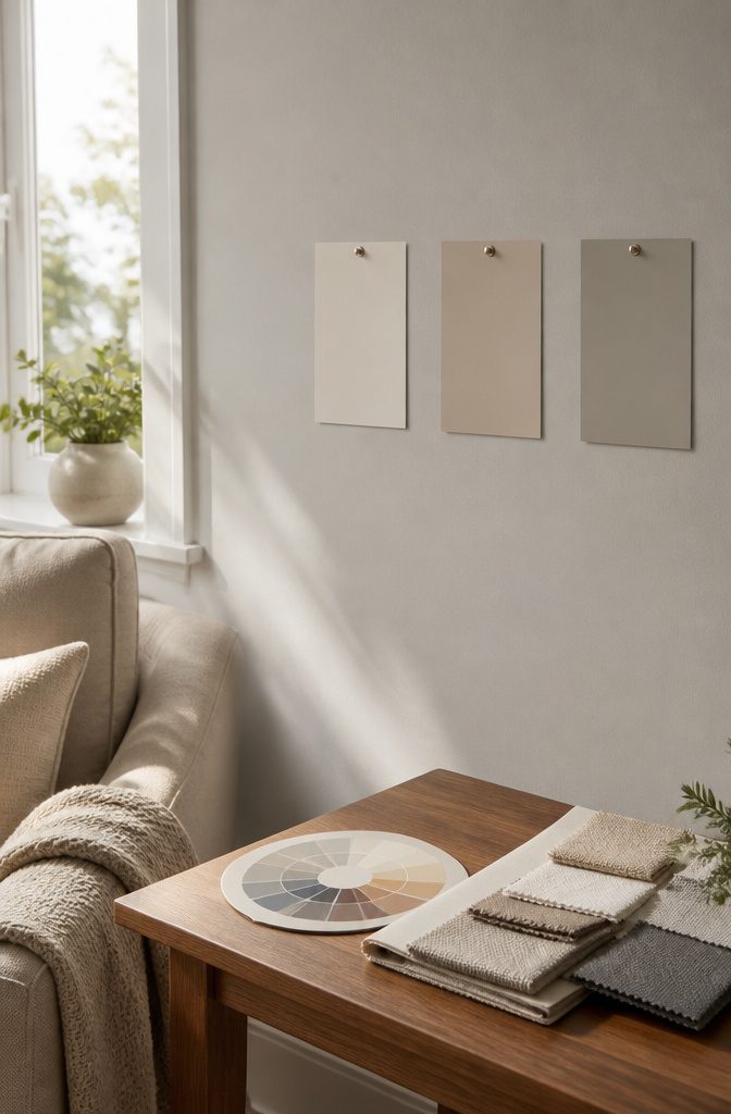
Undertones can shift dramatically under different lighting, affecting the final appearance.
Undertones
Undertones are the hidden colors beneath the surface of what looks like a simple beige or gray.
A neutral that reads warm in the store can turn surprisingly pink or yellow once it covers four walls, and a cool gray might shift blue or green depending on the time of day.
Natural light brings out undertones differently than overhead bulbs, and the direction your windows face changes everything. North-facing rooms pull cool tones even cooler, while south-facing spaces can make warm neutrals feel almost peachy by mid-afternoon.
If your furniture and rugs already lean warm, a neutral with cool undertones will fight them. If you’re working with a lot of white trim, pay attention to whether the neutral has a creamy or a stark base.
Testing a sample on all four walls and watching it through morning, afternoon, and evening light is the only way to see what you’re really getting.
Light Reflectance Value (LRV)
LRV measures how much light a color throws back into the room, on a scale from 0 (pure black) to 100 (pure white). A neutral with an LRV above 60 will brighten a dim room and make a small space feel more open.
Anything below 50 starts to absorb light and can make a room feel smaller or more enclosed, which works beautifully in a cozy den but can flatten a windowless basement even further.
If your living room gets strong natural light all day, you have more freedom to go darker. If you’re dealing with a single small window or a space that stays shadowy, a higher LRV keeps the room from feeling cave-like.
Renters and anyone working with fixed lighting should pay close attention here. The difference between an LRV of 55 and 65 is subtle on a swatch but dramatic across an entire wall.
Coverage Quality
Coverage quality determines how many coats you’ll need to get an even, professional-looking finish. Cheaper paints often go on thin and translucent, leaving streaks or letting the old wall color show through.
Premium formulas usually cover in one or two coats, which saves time and can actually cost less in the long run if you’re doing the work yourself on a weekend.
Darker neutrals and colors with strong pigments tend to cover better than pale, whisper-soft shades, which can take three or four passes to look uniform.
If you’re painting over a bold color or covering dark wood paneling, coverage matters even more.
Look for paints labeled "one-coat" if you want to finish fast, but expect to add a second coat on textured walls or anywhere the light hits directly.
Most mid-range and premium brands deliver solid coverage; budget lines are where this factor drops off.
Durability
Durability is how well the paint holds up to the daily wear of real life: scuffs from moving furniture, dog nails clicking past, kids dragging backpacks along the wall.
In a living room that sees heavy use, a durable finish keeps looking fresh for years without needing touch-ups. Paints marketed for high-traffic areas or labeled as scrubbable tend to have stronger binders that resist scratches and dents.
Flat and matte finishes hide imperfections beautifully but show damage more easily. Eggshell and satin have a slight sheen that bounces back better from bumps and cleaning.
If your living room is also the main hallway to the rest of the house or sits near the front door, durability moves up the priority list.
If the space is formal and sees light use, you can choose based on color and finish alone without worrying as much about long-term wear.
Washability
Washability is how well the paint surface holds up when you wipe it down.
In a living room with kids, pets, or frequent guests, fingerprints and smudges are a given. A washable paint lets you clean marks with a damp cloth without scrubbing off the color or leaving dull spots.
Paints with poor washability will fade, streak, or roughen up after a few wipes, which means you end up repainting sooner or living with visible wear.
Satin and semi-gloss finishes are naturally easier to clean than flat or matte, but formulation matters just as much.
Higher-end paints often include washability as a standard feature; budget lines may need a primer or an extra coat to perform the same way.
If your living room is your main gathering space or sits right off the kitchen, washability is worth checking. If the room is adults-only and stays tidy, this factor can take a back seat to color and coverage.
Price per Gallon and Brand Reputation
Price per gallon ranges from budget-friendly options to premium formulas, and the difference shows in coverage, durability, and how the color holds over time.
A cheaper paint might need 3 coats where a premium one finishes in 2, and the time saved can matter more than the upfront cost if you’re doing the work yourself.
Brand reputation reflects years of feedback from painters and homeowners, and names that show up consistently in positive reviews tend to deliver fewer surprises.
Eco-friendly options with low or zero VOC are now common across price points, making it easier to choose a paint that doesn’t off-gas harsh fumes while you work or sleep in the space afterward.
If anyone in the household is sensitive to smells or you’re painting a room that stays closed up, low-VOC formulas are worth seeking out.
Budget brands have improved here, so going green no longer means paying a steep premium the way it did a decade ago.
How the Top Picks Compare
Sherwin-Williams Agreeable Gray offers a true neutral appearance, enhancing furniture compatibility.
Sherwin-Williams Agreeable Gray and Benjamin Moore Swiss Coffee both anchor a room without committing to a strong color direction, but Swiss Coffee leans warmer.
Agreeable Gray reads closer to true neutral under most light, which makes it easier to pair with furniture you already own or may swap later.
Swiss Coffee carries a cream undertone that shows up more in rooms with south- or west-facing windows.
If the space gets strong afternoon sun, Swiss Coffee adds warmth without looking yellow. In cooler north light, Agreeable Gray holds its balance better.
Coverage between the two is close. Swiss Coffee covers 425 square feet per gallon, Agreeable Gray runs similar in manufacturer reports.
Kilz Statue Green covers 400 square feet, which means you may need an extra gallon for the same room if you are working with textured drywall or a darker base coat.
That difference matters more when budgets are tight or you are trying to finish a project in one trip.
The curtain picks handle light differently. jinchan linen panels filter daylight without blocking it entirely, which works well in small living rooms where you want privacy but still need the space to feel open.
Drapenova pinch-pleated panels in oatmeal hang heavier and offer more coverage, which suits open-concept layouts where glare off multiple windows becomes an issue during morning or late afternoon.
Both are 84 inches, so ceiling height is not the deciding factor. The weight and pleat style are.
SWGRT’s 9×12 solid beige rug grounds furniture groups in warm climates where you want texture underfoot but no pattern competing with natural light. Pairing it with either curtain option works because the tones stay in the same range.
The rug size fits standard living room layouts, but if the space runs smaller or furniture floats away from walls, the jinchan curtains and a smaller rug may balance better without overwhelming the floor.
Testing Paint Colors
Paint looks wildly different on the wall than it does on a chip, and the same color can read warm at noon and cold by dinner.
I picked up samples of every neutral on this list and painted 2-foot squares directly on the wall rather than using poster board.
Poster board lies. It catches different light than drywall does, and you end up chasing a color that will never show up the same way once the whole room is done.
I left the samples up for 3 days and checked them morning, midday and evening.
North-facing rooms pulled the cool undertones forward in the greige and made the sage look almost gray by late afternoon. West-facing walls did the opposite: the soft yellow in Swiss Coffee turned noticeably warmer as the sun moved lower.
If your living room gets strong afternoon light, test on the wall that takes the most sun and the wall that stays in shadow. The difference will tell you whether the undertone works or fights you.
One owner report I read mentioned painting samples in corners rather than open wall, which turned out to matter.
The greige that looked balanced in full light went flat and drab where two walls met. That corner test caught a problem that would have shown up too late.
If you have trim or built-ins, paint the sample right up to the edge so you can see how the neutral reads against white or stained wood before you commit to coverage that runs 400 square feet per gallon.
Color Pairing Tips
Start with the undertone, not the name on the can.
A greige that leans warm (with yellow or red beneath) pairs naturally with brass, terracotta, or honey wood. The same color with cool undertones (gray-blue or green) works better with chrome, navy, or charcoal accents.
Hold paint chips against your sofa fabric and flooring in morning and evening light; the undertone will shift, and you want the shift to stay cohesive.
Light Reflectance Value tells you how much room you have for contrast. A neutral with an LRV above 70 reflects enough light that you can bring in darker accent furniture or bold art without closing the space down.
Below 50, the walls absorb more light, so keep larger accent pieces in the mid-tones and save the drama for smaller items like pillows or throws.
One anchor color simplifies the rest. Pick a single accent (sage, rust, or soft charcoal) and let it repeat across 3 or 4 surfaces: a throw, a chair leg, a framed print, a bowl on the shelf.
The repetition ties the room together without needing every piece to coordinate. The neutral walls hold it all in place, and the accent gives the eye somewhere to land.
Test coverage before you commit to the palette. Most neutral paints cover 400–450 square feet per gallon, but lower-quality formulas need a second coat, and that second coat can deepen the color more than expected.
Buy a sample quart, paint a 2×2 section, and live with it for a few days before you decide on the accent palette.
Choosing the perfect paint color can completely transform your home, and the trend in neutral color palettes continues to evolve beyond basic beige and gray, embracing subtle undertones that add depth and character to any room.
— Bob Vila
Application Techniques
The difference between a color that looks professional and one that shows streaks often comes down to prep and method.
I start by clearing the room as much as possible and taping trim carefully, because a clean edge matters more than speed.
Primer is non-negotiable if you’re covering a dark color or working on fresh drywall. It seals the surface and gives the topcoat something to grip, which cuts down on the number of passes you’ll need.
For application, a roller with a 3/8-inch nap works well on smooth walls, while a 1/2-inch nap handles textured surfaces without leaving thin spots.
I roll in a W pattern first to distribute the paint, then fill in with vertical strokes to even it out. Cover each pass without overworking the same area, which can pull up the layer you just laid down.
Cut in the edges with a 2-inch angled brush before rolling each wall, not all at once, so the brushwork stays wet and blends when the roller reaches it.
Two coats are standard for most neutrals, especially lighter tones that can look patchy after one pass. Coverage runs 400–450 square feet per gallon for quality paint, so a 12×15 room takes about 2 gallons total.
I let the first coat dry completely, usually 4 hours, before starting the second. Natural light will show you where coverage is thin before artificial light does, so I check near windows before calling it done.
Frequently Asked Questions
What are the undertones in neutral living room colors?
Undertones vary by color.
Swiss Coffee carries soft yellow and green notes that warm a room without reading as beige. Greige blends gray and beige with warm undertones that shift depending on the light source.
Sage tones like Statue Green offer a mature, weathered quality that leans slightly green. The undertone is what you see when the color catches morning sun versus evening lamplight.
How does neutral paint look in different lighting conditions?
Most neutrals shift between warm and cool as the light changes. A greige that reads warm in morning sun may look cooler under overhead LEDs at night.
Colors with yellow undertones brighten in natural light and soften under warm bulbs. Testing a sample on the wall and checking it at different times of day shows you what the room will actually look like.
Does neutral paint provide good coverage?
Coverage runs 400–450 square feet per gallon for most of the colors listed here. That typically means two coats over a primed surface.
Lighter neutrals may need a second pass if you’re covering a darker wall. Quality varies by brand, but paints from manufacturers with 40–60 years of experience tend to go on evenly and hide well.
How do I match neutral wall colors with existing furniture?
Start with the undertones.
If your sofa or rug pulls warm, a greige or Swiss Coffee works better than a cool gray. If you have a lot of wood furniture, choose a neutral that either matches the wood’s warmth or contrasts it cleanly.
Bring fabric swatches or photos of your furniture when you pick the paint, and hold the sample card against them in natural light.
Are neutral living room paints durable and washable?
The paints covered here offer scrubbable matte or washable finishes that hold up to everyday wear. Durability matters most in high-traffic areas where walls get touched, bumped, or marked.
A washable surface lets you wipe away smudges and stains without damaging the finish. Look for paints with low VOC emissions (under 100) if you need to repaint a room while living in it.