Light blue works in living rooms from paired with sandy beige to high-contrast orange sofas against pale blue walls.
If natural light is limited or your furniture leans cool, add brown leather, dusty pink chairs, or brass accents to pull the palette back from icy.
1. Use Brass or Gold Accents
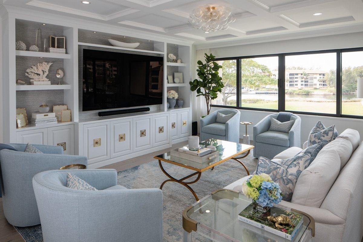
Brass or gold hardware and frames bring warmth that keeps light blue from reading too cool. The glass coffee table here has a gold frame, and the built-ins use gold cabinet pulls.
Small swaps work: switch out existing hardware on cabinets or side tables, or add a brass picture frame or two. Gold feels warmer than silver against blue, and it suits most wood tones you already have in the room.
2. Dusty Pink Armchair
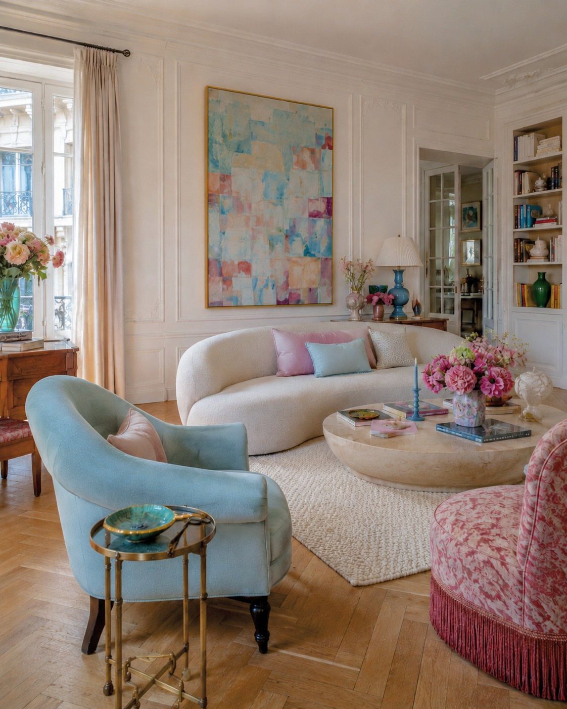
A dusty pink chair next to light blue furniture creates a soft, approachable contrast without fighting for attention. The fringe detail here adds texture, and the combination feels relaxed rather than overly styled.
This pairing works particularly well if your light blue leans cooler or gray-toned. Dusty pink brings warmth to light blue without the shock of a bright accent color.
3. Layer Blue Cushions
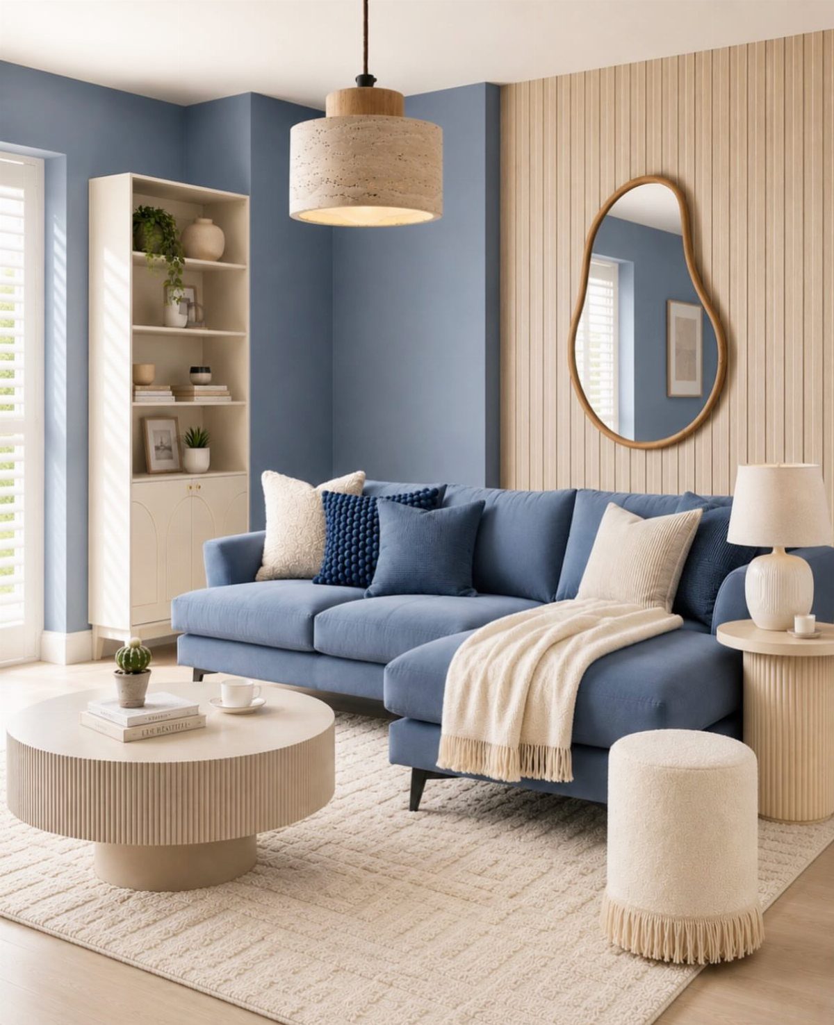
Stacking different shades of blue cushions on a blue sofa adds depth without introducing new colors. The mix here includes darker blue, soft cream, and textured weaves that break up the solid tones.
I like this approach when you want a cohesive blue room but need to avoid flatness. Vary the textures and add at least one lighter neutral to keep the layering from feeling too matchy.
4. Muted Blue-gray Paint
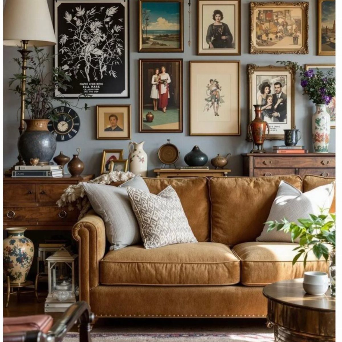
A muted blue-gray on the walls anchors darker furniture without making the room feel dim. The brown sofa holds its own against the blue-gray wall and gives the gallery wall something solid to hang above.
This shade works well in rooms with limited natural light. It reads as blue in bright conditions and shifts toward gray in softer light, which gives you flexibility across the day.
5. Blue Built-in Shelves
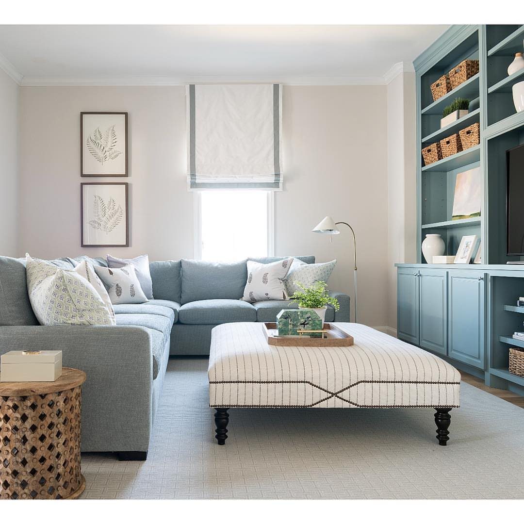
Painting built-in shelves the same light blue as the rest of the room extends the color onto functional surfaces and makes the architecture feel intentional. The shelves here hold baskets and decor that keep the look from feeling too uniform.
If your built-ins are plain or builder-grade, this treatment gives them presence. Use a satin or semi-gloss finish so the shelves hold up to handling and wipe clean easily.
6. Natural Wood Furniture
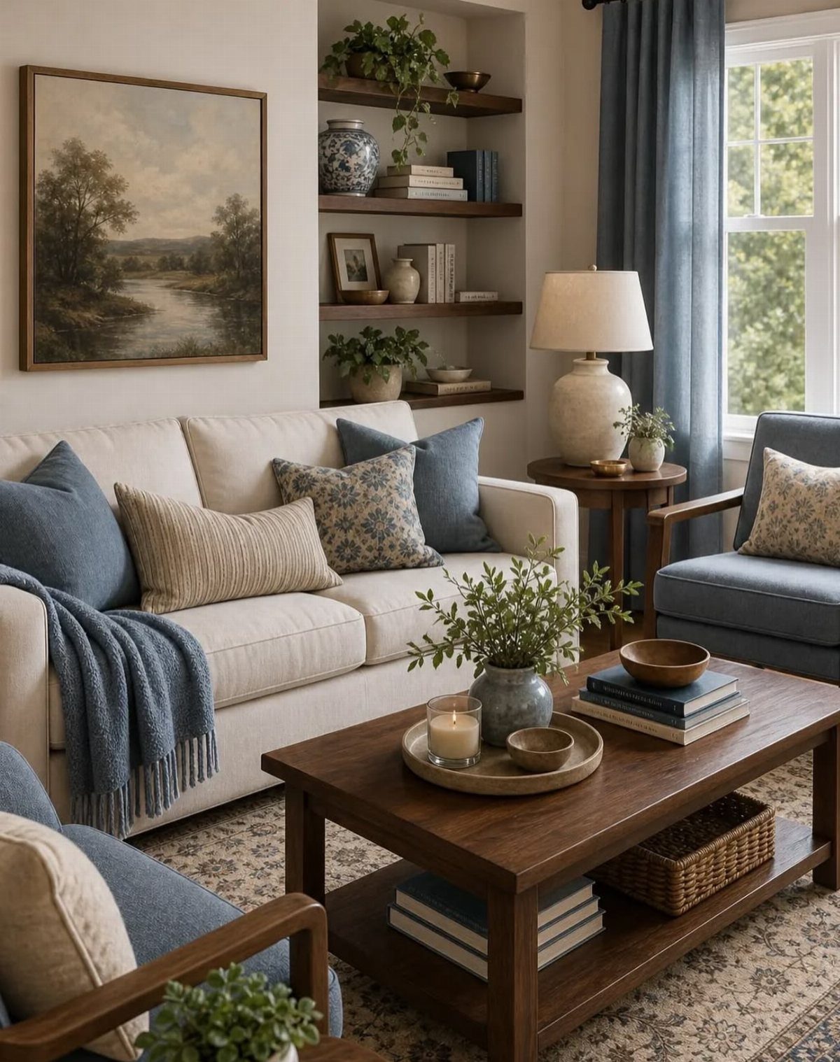
Natural wood coffee tables, side tables, and open shelving add warmth that balances the coolness of light blue walls or upholstery. Dark wood ties the cream sofa and blue chairs together and keeps the palette from floating.
Wood tones in walnut, oak, or cherry work particularly well. Lighter woods can feel washed out next to pale blue, so choose something with visible grain and medium to dark color.
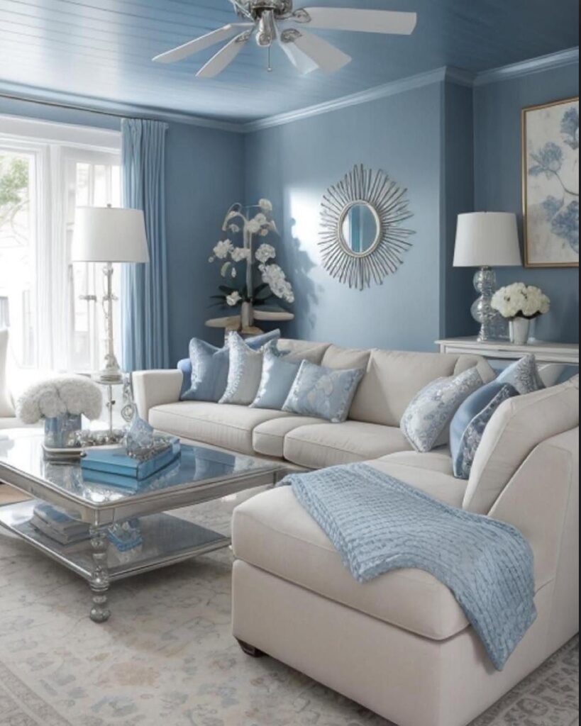
7. Light Blue Ceiling
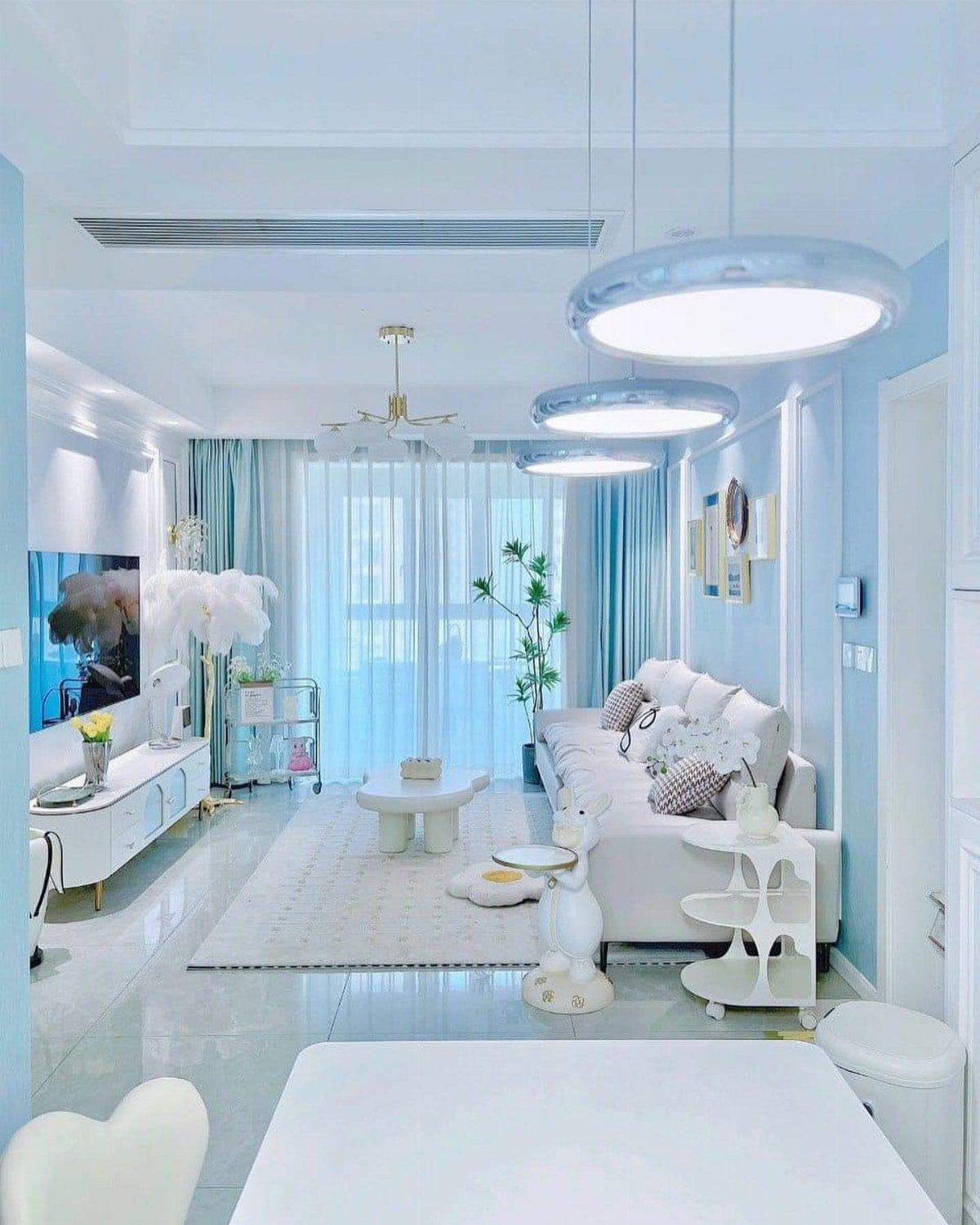
I paint the ceiling the same shade as the walls when I want the room to feel taller and wrapped in one continuous color.
The white furniture here stays grounded by the pendant lights, which break up the expanse of blue overhead.
This approach works best in rooms with good natural light. In dimmer spaces, a blue ceiling can feel heavy, so test a sample on the ceiling and check it at different times of day before committing to the full room.
In this living room, the light sky blue walls are fresh and brightening and they work so well with the soft pinks and slightly deeper blues going on in the rest of the room.
8. Choose a Blue Area Rug
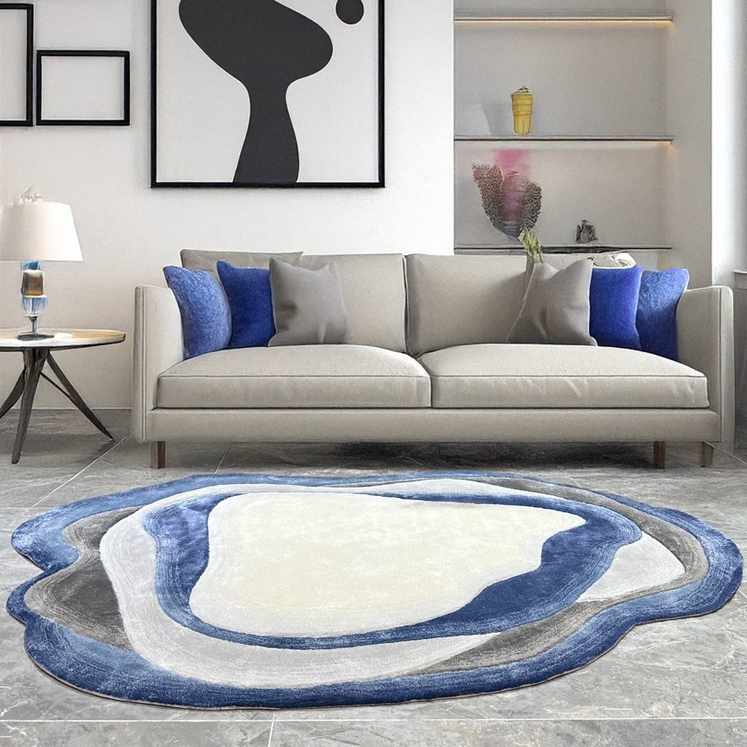
A blue area rug with an organic shape introduces color at floor level and defines the seating area without hard edges.
An abstract rug pulls the beige and blue together so the floor carries some of the palette instead of vanishing into tan.
Choose a rug with some white or cream in the pattern if your walls are light.
A solid blue rug can feel too heavy in a room that already has blue elsewhere, and the pattern gives you more flexibility with other accent colors.
9. Incorporate Blue Artwork
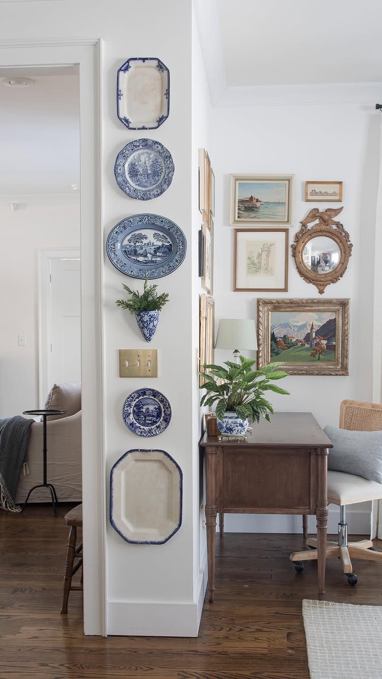
Blue and white ceramic plates arranged on the wall bring color into a neutral room without committing to paint.
Thrift stores and estate sales are the easiest places to build a collection. Look for plates with similar blue tones but varied patterns, and hang them with plate hangers or adhesive disc hangers that won’t damage the ceramics.
10. Warm White Trim
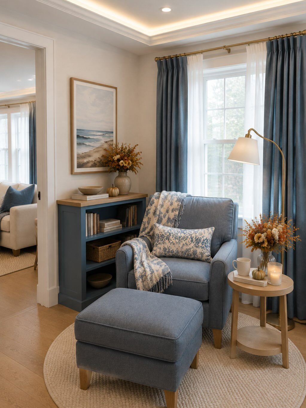
Warm white trim against warm white walls keeps the room soft and cohesive when light blue appears elsewhere. The trim here frames the window and baseboards in a white that leans slightly cream rather than bright white.
Bright white trim can make light blue walls look cold, especially in rooms with limited natural light. A warmer white like Benjamin Moore Simply White or Sherwin-Williams Alabaster brings the 2 colors closer together.
11. Light Blue and Sandy Beige
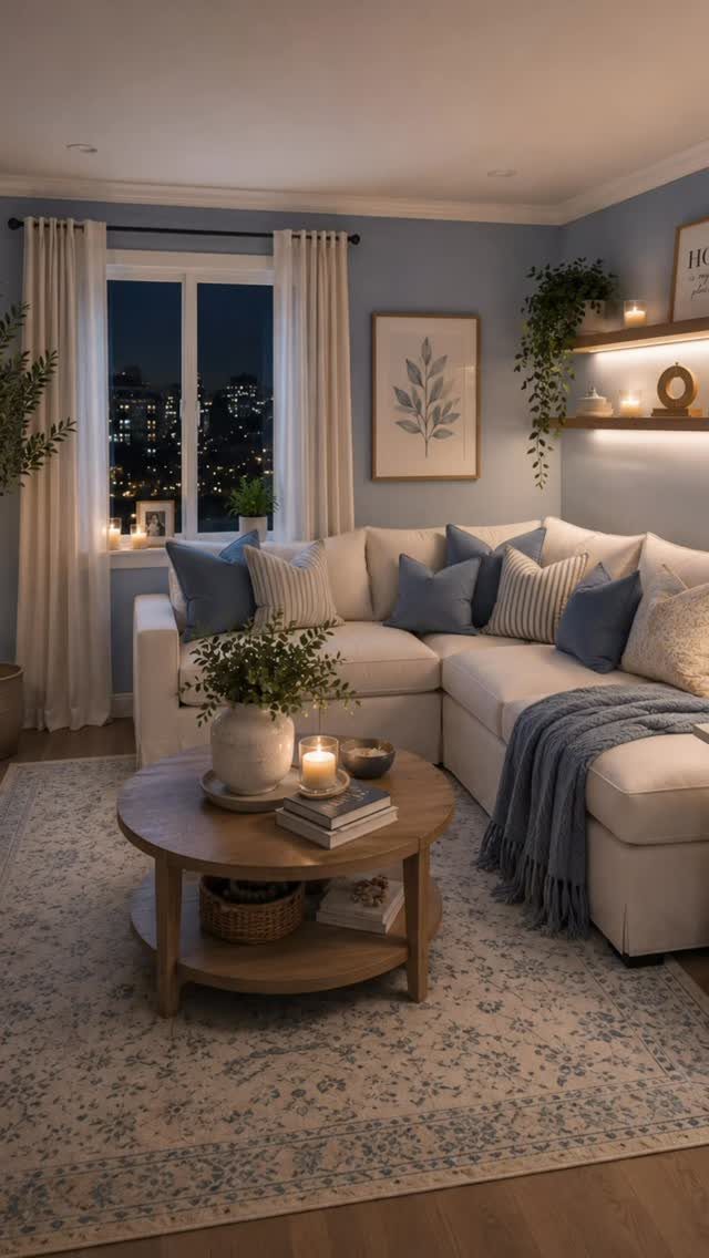
Sandy beige furniture and textiles next to light blue walls create a soft, coastal feel without tilting into beach theme territory.
The round wood coffee table and beige sectional here anchor the room in warm tones that balance the cool blue.
This combination works well in small spaces where too much blue can feel overwhelming. The beige breaks up the color and adds warmth without introducing a strong contrast that fragments the room.
12. Blue Sofa
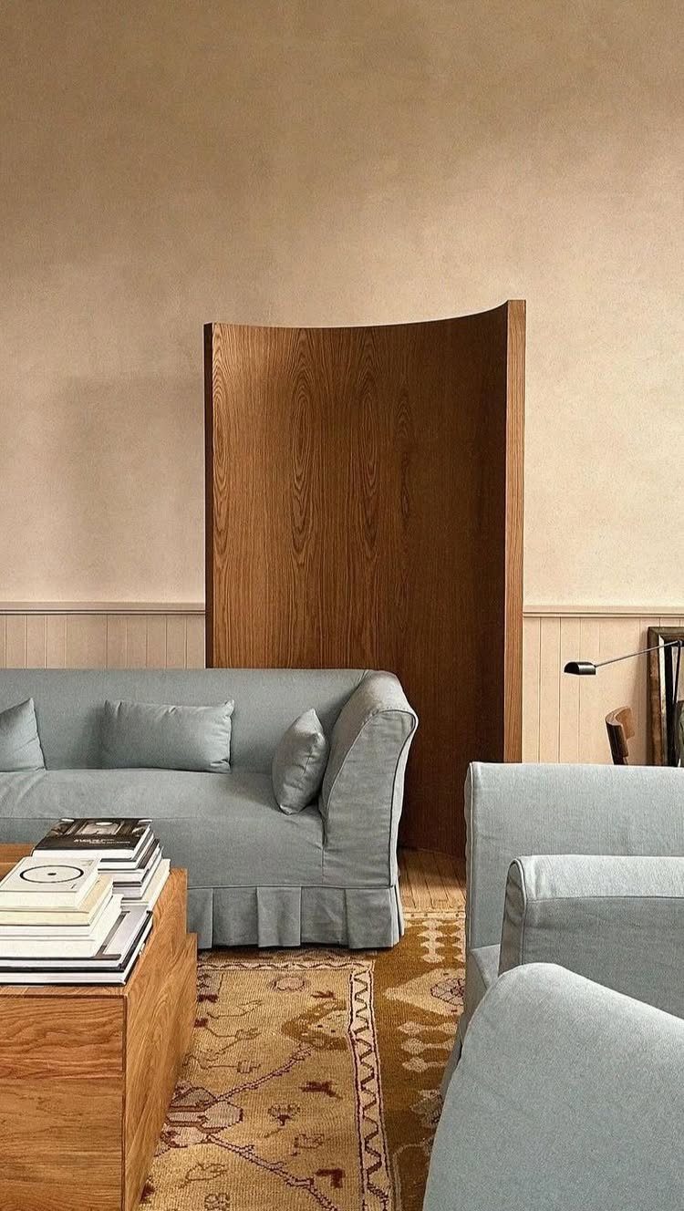
A light blue sofa becomes the main color statement in a room with neutral walls and flooring.
The slipcover here keeps the look casual and makes the sofa easy to clean, and the matching armchair extends the blue without filling every seat.
Slipcovered sofas work particularly well if you have pets or kids, since you can remove and wash the covers.
Choose a medium-weight linen or cotton blend that holds its shape but isn’t too stiff to tuck back into place after washing.
13. Light Blue Armchairs
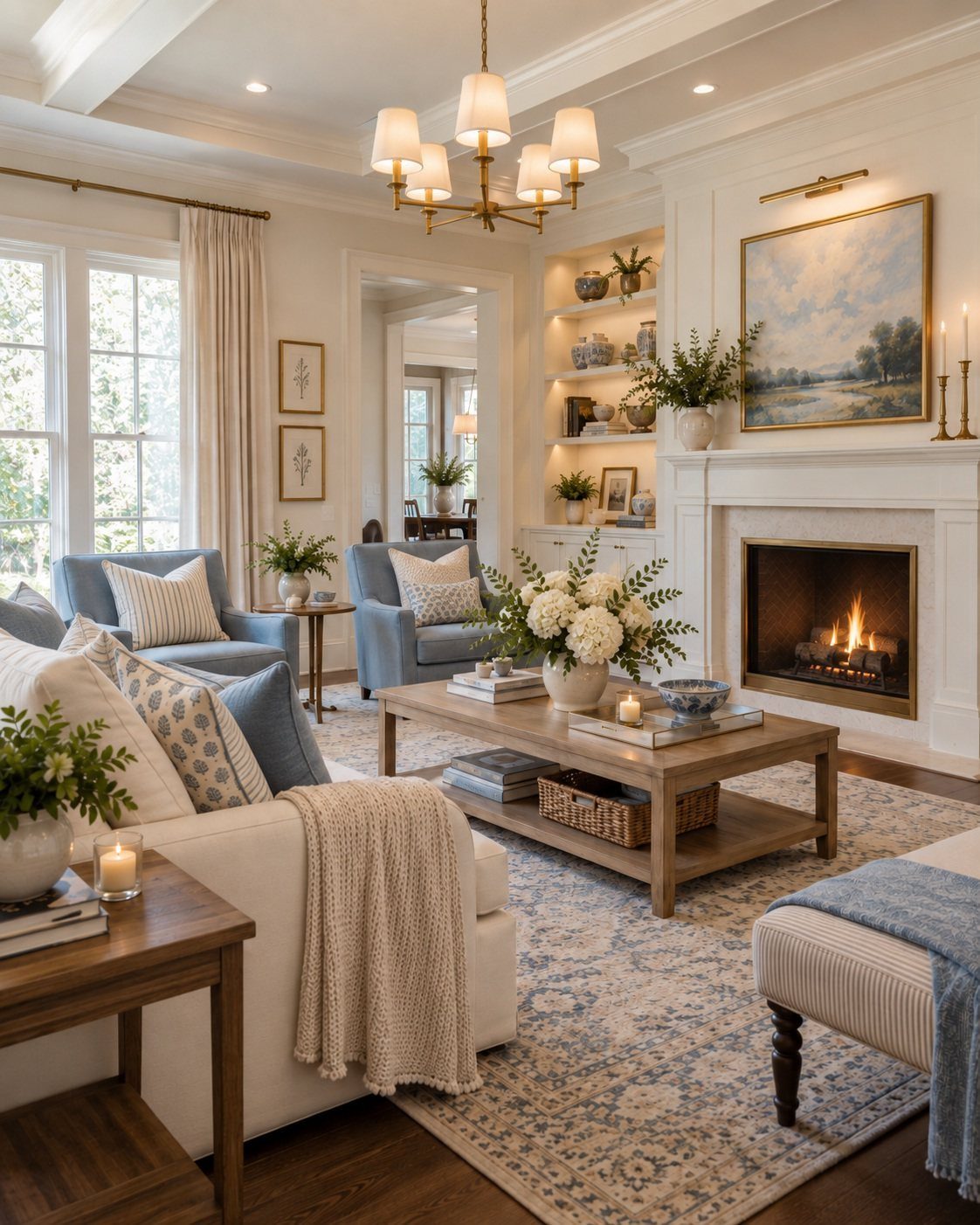
A pair of light blue armchairs flanking a coffee table brings the color into the room without covering a full sofa in it.
The chairs here face each other and create a conversation zone that feels more flexible than a single large seating piece.
This setup works well if you already have a neutral sofa and want to add blue without replacing your largest piece of furniture. Choose chairs with visible legs rather than skirted bases so they don’t visually block the floor.
14. Light Blue Walls with Orange Sofa
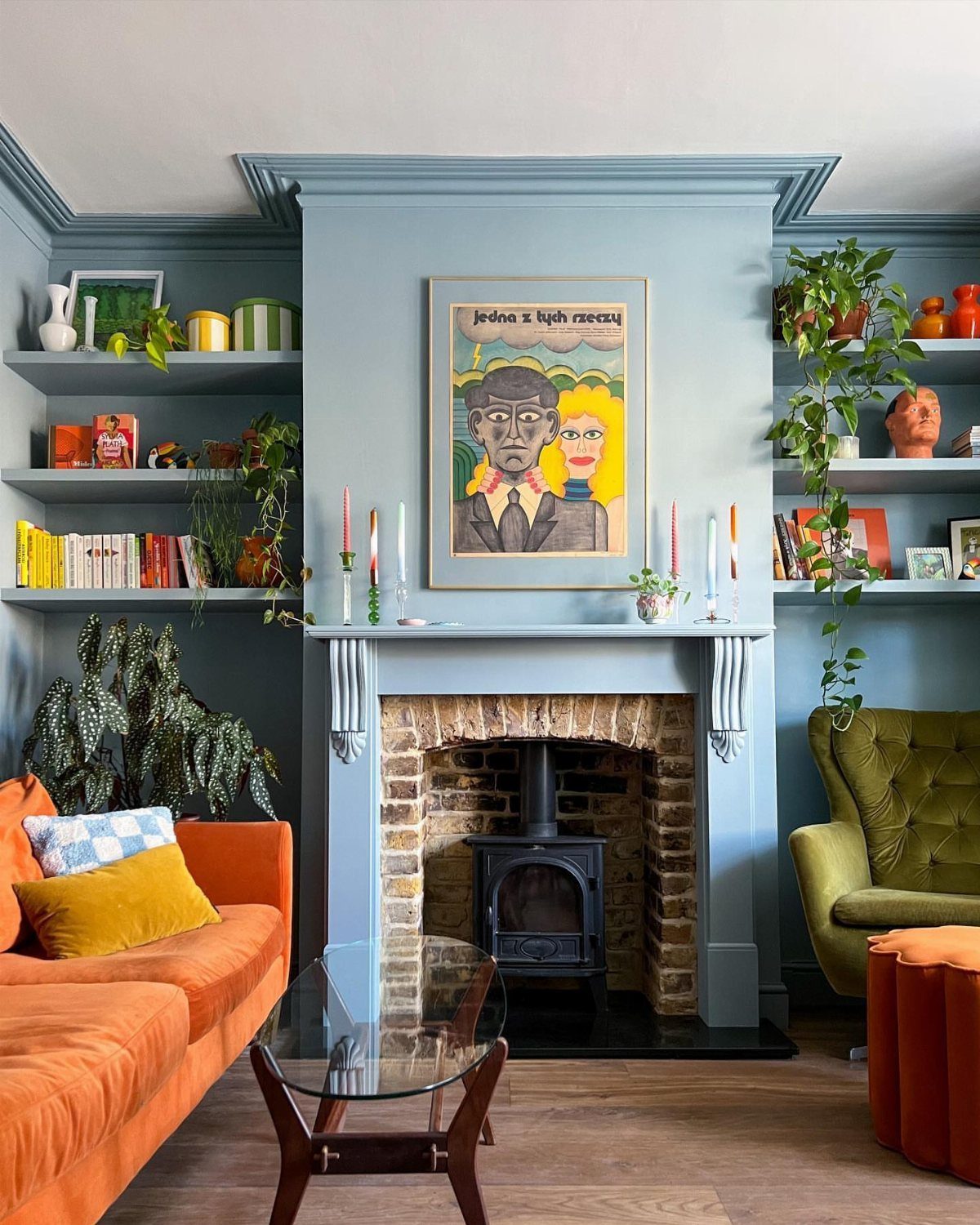
An orange sofa against light blue walls creates a warm, high-contrast pairing that feels energetic without clashing. The green armchair and colorful shelf styling here build on that warmth and keep the blue from dominating.
This combination works best if you want a bold, lived-in look rather than a soft, neutral space. The orange brings enough warmth to balance cool blue walls, and the contrast gives each color more presence than it would have alone.
15. Brown Leather Couch Contrast
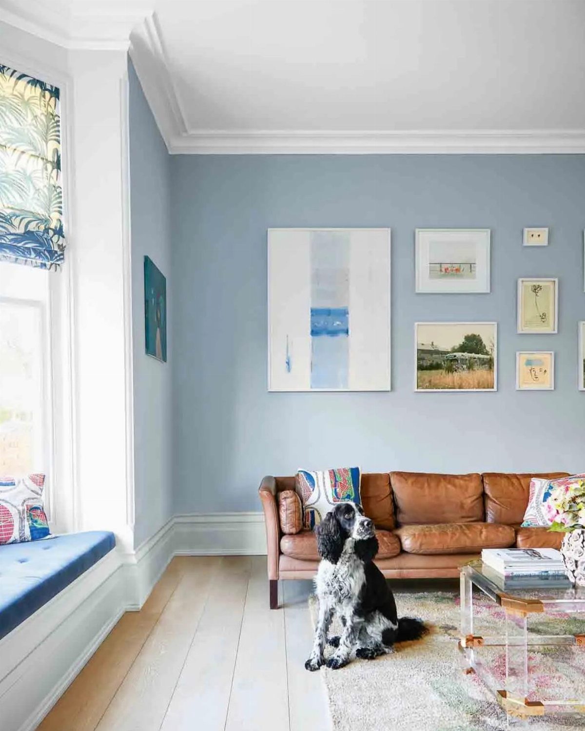
A brown leather sofa against light blue walls brings warmth and texture that softens the coolness of the paint. The leather here ages visibly and adds a casual, worn-in feel that keeps the room from looking too polished.
This pairing works well if you want a blue room that still feels grounded and comfortable. The leather grounds the wall above it without competing for attention.
16. Light Blue Window Seat Nook
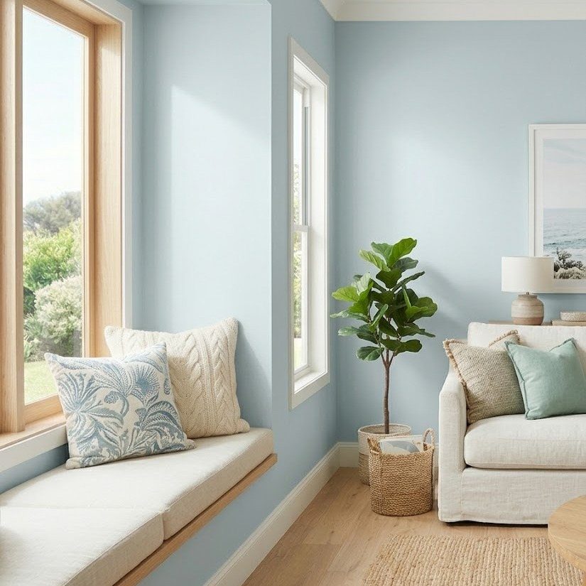
A white built-in window seat in a light blue room creates a dedicated reading or lounging spot that feels part of the architecture.
The cushions and pillows here make the seat comfortable, and the surrounding blue walls give the nook a wrapped, cozy feel.
If you have an underused window or alcove, a built-in seat adds function without taking up floor space. Carry the wall color into the nook so the space feels intentional, not tacked on.
Choosing the Right Blue Shade
I look for a blue that leans slightly warm, with a touch of red, violet, or warm gray instead of a steel or ice tone.
Powder blue, dusty periwinkle, and pale French blue feel soft and easy to live with, while icy or cyan blues can look harsh.
Light blue changes more than almost any other color as the light shifts, and a shade that looks right at noon can feel completely different by 7 PM.
If your living room is small or low on natural light, softer blues like dusty blue, blue-gray, or muted sky blue hold up better than deep navy on all 4 walls.
Creating Warmth in Blue Rooms
A rust-toned or terracotta area rug adds warmth at floor level, and deep orange or red accents in pillows or decor pull the palette away from cool.
Textured materials like patterned rugs, soft cream curtains, and wood pieces surround blue with comfort rather than leaving it to stand alone.
Warm lighting makes a measurable difference in how cozy a blue room feels. If you have a fireplace, that helps too, but even swapping in warm-white bulbs softens the coolness that blue can carry in the evening.
Blue’s Psychological Effects
Blue brings a calming quality that makes living rooms feel more serene, and lighter blues in particular can make a space feel larger and airier.
Dark navy or monochromatic blue across all walls creates a cocooning, sanctuary-like space that draws people in with its coziness.
Light blue feels fresh and welcoming, almost acting as a cool neutral in the same way you’d use white or pale gray.
In small rooms, stick with lighter blues like sky blue or powder blue and keep furniture light.
Mirrors help bounce light around. If you go with dark navy, keep it to a single accent wall or the space will start to feel smaller.
Frequently Asked Questions
Is light blue good for a living room?
Yes, light blue creates a calm, welcoming atmosphere and can make a room feel larger and airier.
It works as a cool neutral similar to white or pale gray, bringing freshness without overwhelming the space. In small rooms or low-light spaces, stick with softer blues like powder blue or dusty periwinkle rather than icy tones.
What does blue represent in interior design?
Lighter blues also reflect more natural light, which helps open up smaller rooms. Navy anchors a room and pairs well with warm wood and brass, while pale blue works with whites and soft grays for an airy look.