
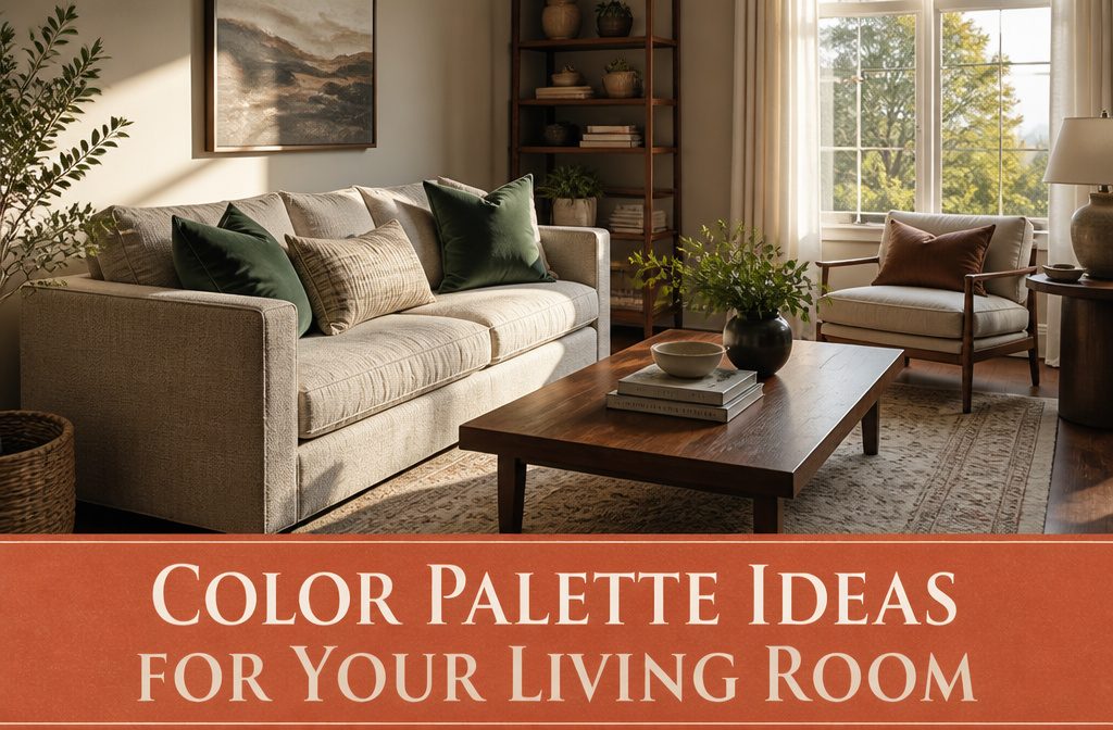
A monochromatic or analogous palette holds the room together with less guesswork than complementary or triadic schemes, but you lose contrast unless you layer texture or let one color dominate by a clear margin.
Agreeable Gray (SW 7029) with Chantilly Lace trim gives you a neutral base that works under navy, rust, or jewel tones without repainting when you want to shift direction six months later.
1. Monochromatic
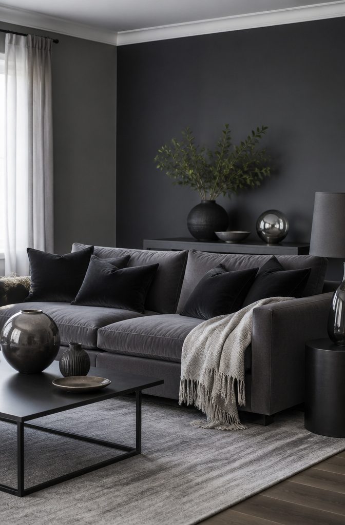
Variations in lightness and saturation of a single color build the whole palette here, so depth comes from tone rather than from jumping between different hues.
You might use a deep charcoal on the feature wall, mid-gray on the remaining walls, and pale dove for the trim, all pulling from the same color family.
The look stays cohesive without the guesswork of matching colors from opposite sides of the color wheel.
I find monochromatic schemes calming because nothing competes for attention.
The room reads as one idea instead of several. Texture matters more in this setup than it does elsewhere, since you lose the contrast that pattern or color blocking would provide.
A linen sofa in one shade, velvet pillows a step darker, and a wool throw two steps lighter give the eye something to catch without breaking the harmony.
2. Analogous
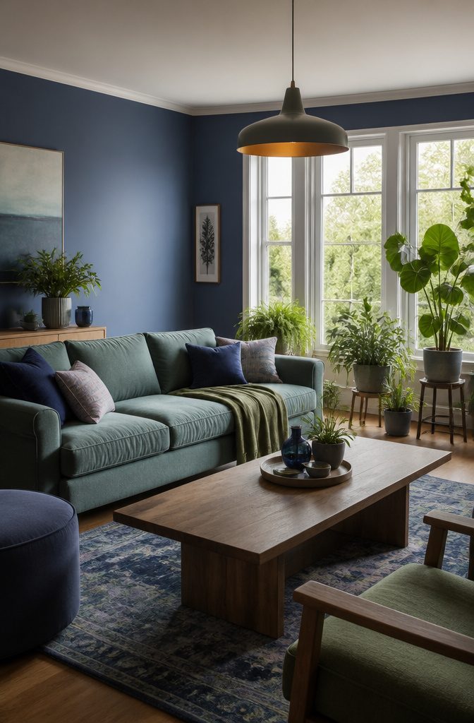
An analogous palette pulls the two colors sitting on either side of your main color on the color wheel. Pick blue, and you work with blue-green and blue-violet.
Pick yellow, and you move into yellow-orange and yellow-green. The approach keeps contrast low because the colors share pigment and read as variations on a single idea rather than separate blocks.
One color dominates the room, one supports it, and the third shows up as accent. A blue living room with green and blue-green accents feels fresh and cohesive because the eye moves between them without jumping.
The walls might take the blue, the sofa a muted blue-green, and pillows or throws pull in the supporting green.
The palette flows across furniture, walls, and smaller pieces without fighting for attention, and that harmony is what makes it work in a space you live in every day.
3. Complementary
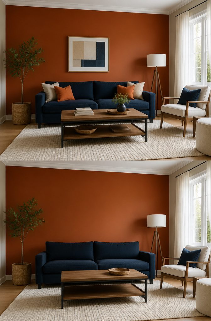
Complementary colors sit opposite each other on the color wheel, and that position is what makes them work.
Blue and orange, red and green, purple and yellow: the contrast is built into the structure, so the pairing feels intentional rather than accidental.
The high contrast creates visual energy. A navy sofa against a burnt orange accent wall reads as bolder than either color would alone, because each one makes the other more saturated.
That energy is the point of the scheme, but it’s also the risk. If you give both colors equal weight, the room can feel like it’s vibrating.
Balance comes from making one color the dominant presence and the other the accent.
A blue sofa, blue rug, and walls in soft white with orange throw pillows and a single orange ceramic lamp keeps the blue calm and lets the orange punctuate. Flip the ratio and the room tips into overwhelm.
4. Triadic
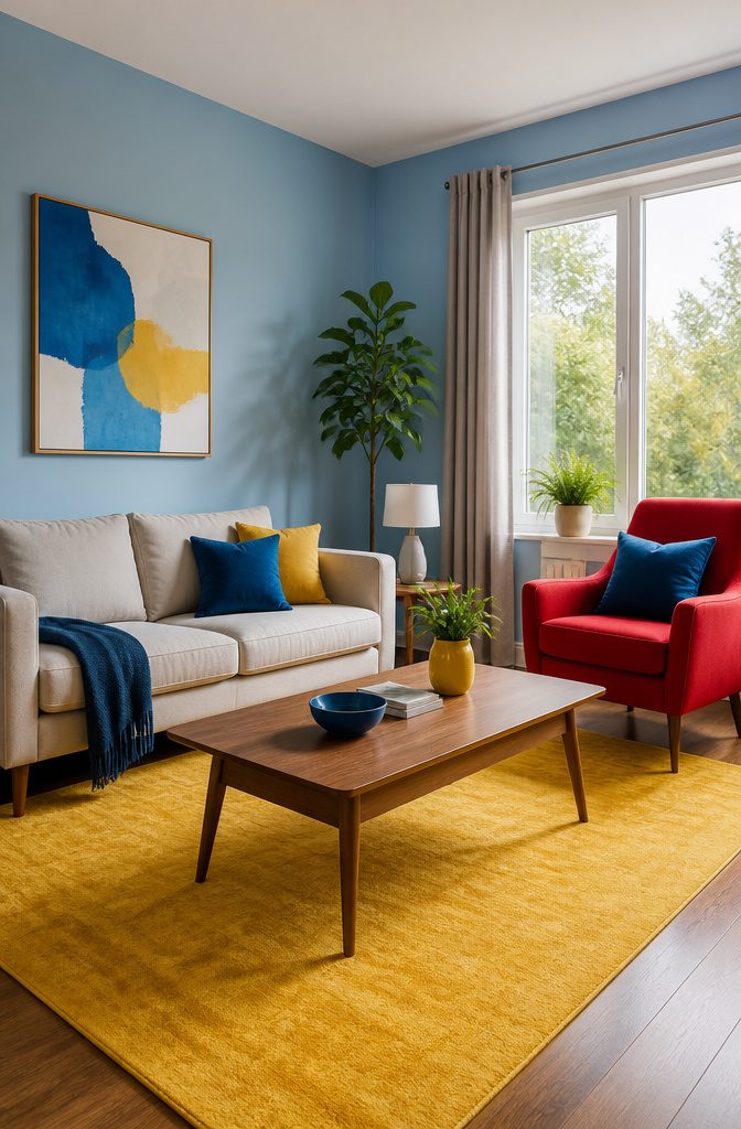
Triadic
A triadic scheme picks three colors equally spaced around the color wheel, forming a triangle if you were to connect them.
Red, yellow, and blue is the textbook example, though you can start anywhere on the wheel and follow the same spacing.
The result lands somewhere between analogous and complementary: more variety than sitting with neighbors, more cohesion than jumping straight across.
The challenge with three distinct colors is keeping one from shouting over the others.
I lean on the 60-30-10 rule here: one color takes most of the wall space, the second shows up in upholstery or a rug, and the third hits as an accent in pillows or a single chair.
That proportion keeps the room balanced instead of turning it into a color wheel demonstration.
Neutrals fill in the gaps, and they’re doing more work here than in a two-color scheme, since three hues can start to feel busy without something to settle them.
5. Tetradic
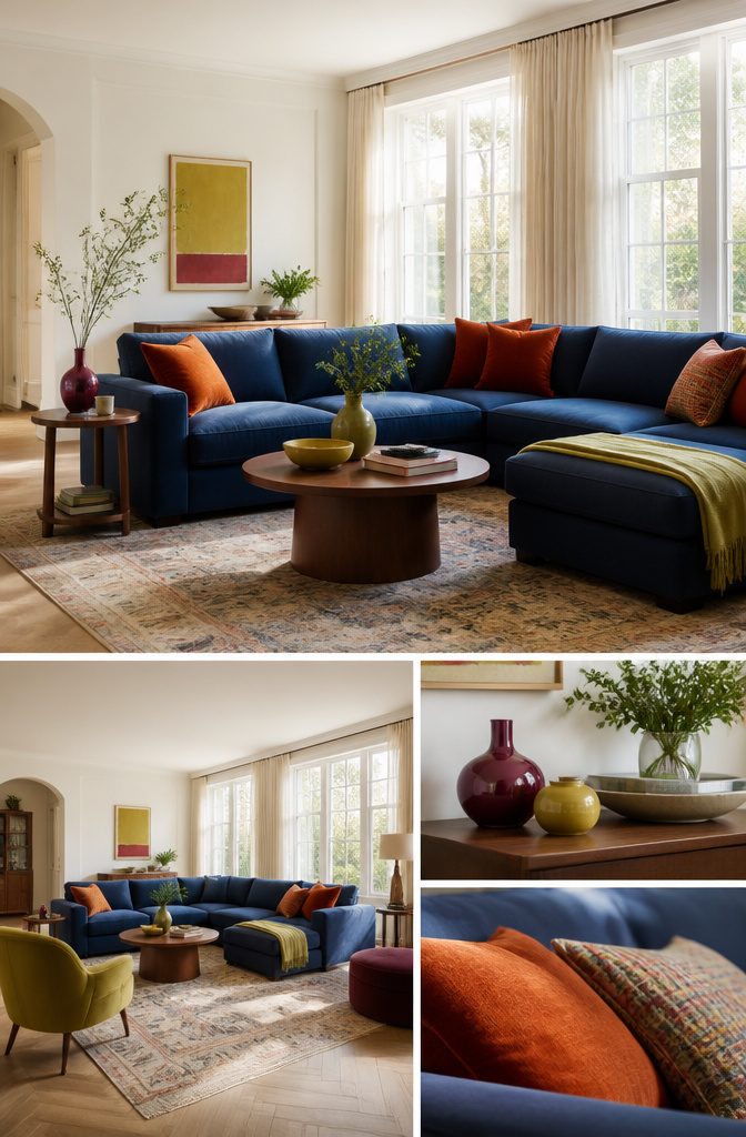
Two pairs of complementary colors spaced evenly around the wheel give you a tetradic scheme.
One common example: blue and orange on one axis, yellow-green and red-violet on the other. The result is richer and more complex than anything a three-color scheme can deliver, but it demands more room to breathe.
I’d reach for tetradic in a larger living room where you have enough surfaces to distribute four distinct hues without crowding the eye.
A smaller space doesn’t give you the walls, upholstery, rugs, and accent pieces you need to keep each color in its own zone. When everything sits too close, four strong colors start competing instead of balancing.
You get depth.
You can layer warm and cool tones in the same room and still hold the scheme together, because the pairs anchor each other across the wheel. Just finish with neutrals to give the palette somewhere to rest.
6. Neutral
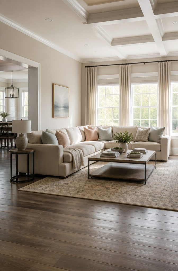
Agreeable Gray (SW 7029) and Chantilly Lace are the combination I keep coming back to when nothing else feels settled yet.
The greige body reads warm enough to hold the room together, the crisp white trim keeps it from going flat, and you can drop almost any accent color or furniture finish on top of it later without repainting.
That flexibility matters when you’re still figuring out the rest.
Gray alone works if the light is strong.
Benjamin Moore’s Cloud Cover bounces southern light deep into a room, and Light Pewter balances cool and warm well enough that it backs both a navy sofa and a rust throw without looking wrong. Beige needs more care.
Pair a warm beige around LRV 60 with Urbane Bronze (SW 7048) on a single surface so the room reads layered instead of washed out, and save it for south or west windows where the warmth has enough light to work with.
7. Bold and Vibrant
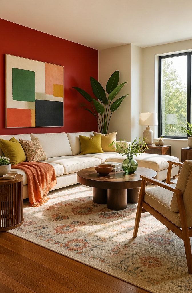
Red, yellow, and teal make a statement when you want a living room that feels energetic rather than restrained.
Balance matters here. A single red accent wall works better than four, and I’d pair it with neutral furniture so the color lands as a choice rather than a mistake you’re stuck with.
Benjamin Moore Apricot Chiffon 136 (a vivid peach) and Kiwi 544 (bright yellow-green) show what happens when two bold hues meet: you need a third to ground them, something like Benjamin Moore White Zinfandel 880, a crisp white with a hint of pink.
Red reads as exciting and passionate.
Orange brings warmth and energy. Yellow skews cheery and optimistic.
This approach wins when the room needs personality and you’re willing to commit to a color that won’t blend into the background. It fails in small spaces where too much saturation closes the walls in.
8. Earthy Tones
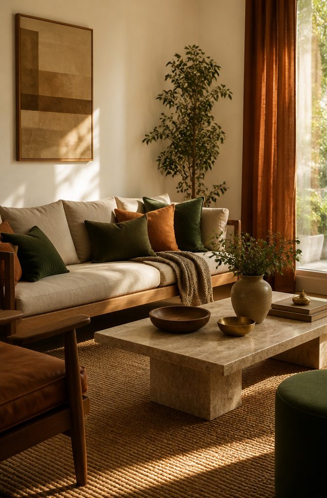
Greens, browns, and beiges anchor a room without announcing themselves. The palette works because it borrows directly from materials you already trust: terracotta, raw linen, oak, stone.
I’ve found that earthy tones read as warm rather than cold even when the walls stay light, which matters in a north-facing room or a rental where you can’t repaint.
Dark greens, plums, warm woods, and golds pair so nicely with a soft, warm neutral and by painting the walls a lighter hue, it allows us to layer these rich, darker colors without weighing down the room.
Start with a warm white or beige on the walls, then bring in a deep green or terracotta through pillows, drapery, or upholstery.
Metals like antique brass or gold keep the palette from feeling too matte. The layering is what makes it feel grounded rather than flat.
How Color Psychology Shapes the Room

Color shapes mood more directly than any other design choice in the room. Blue slows the heart rate and drops cortisol, which is why it works in a living room meant for unwinding after work.
Red does the opposite: it raises energy and makes conversation faster, better for a space where you entertain than one where you collapse with a book.
The effect changes with saturation. A deep violet reads formal and dramatic, while the same hue tinted with white becomes lavender and feels like a spa.
Brightness matters too. Buttery yellow feels cozy, orange reads warm and social, green makes the space feel safe or outdoorsy depending on whether it leans gray or lime.
I pick calming tones for the walls where I want to relax and save the energizing ones for accent pieces in the zones where guests gather. That way the room can do both without fighting itself.
The 60-30-10 Rule for Balance
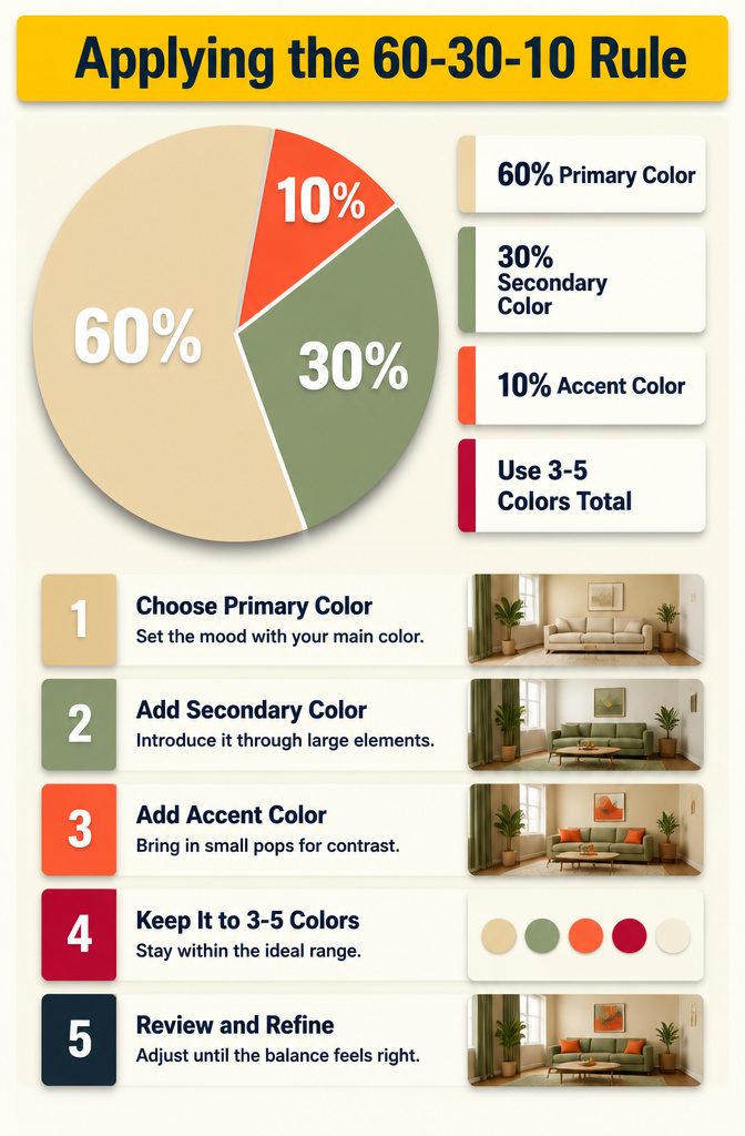
The 60-30-10 split keeps a room from feeling scattered. Sixty percent of the space carries the primary color, which usually means the walls.
Thirty percent goes to the secondary color, and that shows up in upholstery, curtains, or a large rug. The final ten percent is the accent, and you see it in throw pillows, artwork, or a single painted piece of furniture.
I like this breakdown because it stops you from spreading five colors evenly and ending up with no anchor.
The dominant color sets the mood, the secondary color adds depth without competing, and the accent gives the eye somewhere to land.
Most pleasing palettes hold three to five colors total, and this rule keeps them in proportion. Fewer than three reads flat, more than four starts to look busy unless the extras are tight neutrals that support the main three.
Test Colors in Your Actual Space
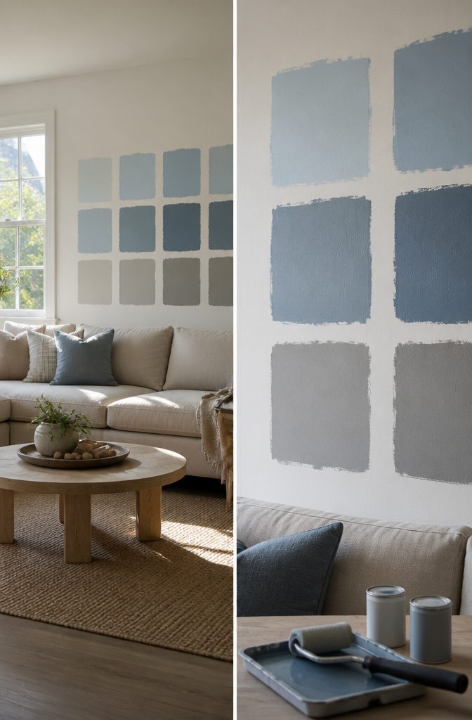
Paint sample squares directly on your living room wall rather than judging a color from a two-inch chip at the store.
A sky blue that looks perfect under fluorescent hardware-store light can shift gray or green once it covers all four walls under your own windows.
Sample cans run about $3 to $5 each, and a 12-inch square on the wall shows you what the color actually does in your space.
Check the samples at different times of day. Morning light through east windows will make the same color look cooler and sharper than it does at sunset, and evening lamplight brings out yellow undertones you won’t see at noon.
Give it at least a full day before committing, and paint the sample on the wall that gets the most natural light as well as one in a dimmer corner if your room has both.
This is also the moment to see how your living room palette reads against the rooms next to it.
A deep red living room can look jarring next to a powder blue kitchen, and you may need to rethink one or adjust the other so the transition between spaces feels intentional rather than accidental.
Using Neutrals as a Base
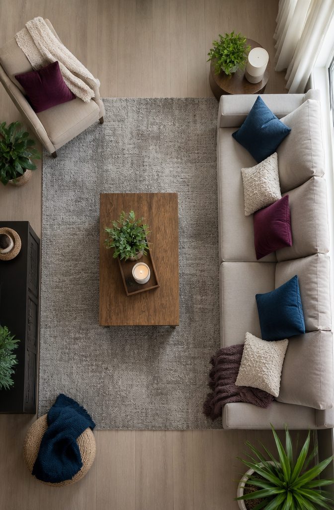
Warm whites and soft grays let you shift accents without repainting. I use a neutral base on the walls because it holds up when tastes change.
A soft white like Benjamin Moore White Zinfandel 880 gives you room to layer sapphire blue, plum, peachy tones, or dark greens in pillows, drapery, and upholstery without the room feeling chaotic or weighted down.
The lighter backdrop keeps rich jewel tones from closing in the space.
The real advantage shows up when you want something different six months later. Swap a set of throw pillows or a blanket and the whole room reads differently.
You can go from warm golds in fall to blush and cyan in spring without touching a paint roller. A neutral foundation means the seasonal shifts stay quick and affordable, and you’re never locked into one direction.
Frequently Asked Questions
What is the best color for a living room?
White is the most popular choice because it works with any accent color and keeps the room feeling open. Warm whites and soft grays offer the same flexibility while adding a bit more warmth than stark white.
How do I choose the right color scheme for my living room?
Start with the mood you want: calming blues and greens for relaxing, warm yellows and oranges for social energy, or neutrals if you plan to change accents seasonally.
Then pick a palette structure like monochromatic, analogous, or complementary based on how much contrast feels right for the space.
How many colors should be in a living room color scheme?
3 to 5 colors work best, distributed as 60% dominant, 30% secondary, and 10% accent. Fewer than 3 can look flat, and more than 4 starts to feel scattered unless the extras are tight neutrals that support the main colors.
What colors are in for living room decor?
Earthy tones like terracotta, sage green, and warm beige are popular right now, along with deep navy and rich jewel tones like plum or teal used as accents.
Neutrals remain the most common base because they let you swap accent colors without repainting.
How do I pick colors for a room?
Paint 12-inch sample squares directly on the wall and check them in morning, afternoon, and evening light before committing.
A color that looks perfect under store lighting can shift gray, green, or yellow once it covers the full wall in your actual space.