
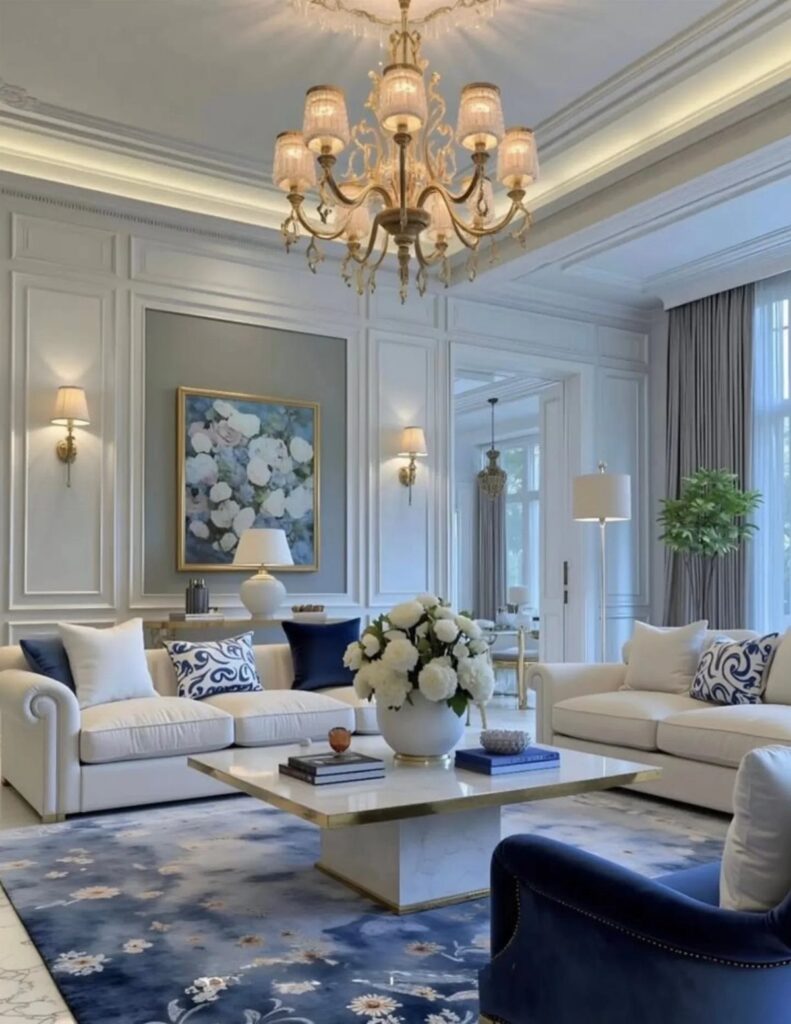
Blue and white decor works because the palette borrows from nature and reads as timeless rather than temporary.
Navy anchors the room and reads formal next to crisp white trim, while powder blue lifts the ceiling and suits a narrow layout.
1. Blue Gallery Wall
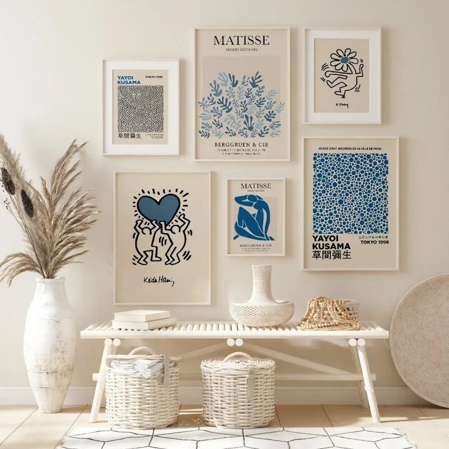
A gallery wall in blue and white gives you a focal point without repainting.
I pick a few oversize prints in similar tones and fill in the gaps with smaller frames, all matching the same white mat or frame finish so the color stays consistent.
The bench below keeps the arrangement grounded. Space the frames evenly and the wall looks intentional; cluster them tight and it reads busy.
If your frames are different sizes, lay them out on the floor first and measure the outer dimensions so you know your anchors go in the right spots.
2. Blue and White Curtains
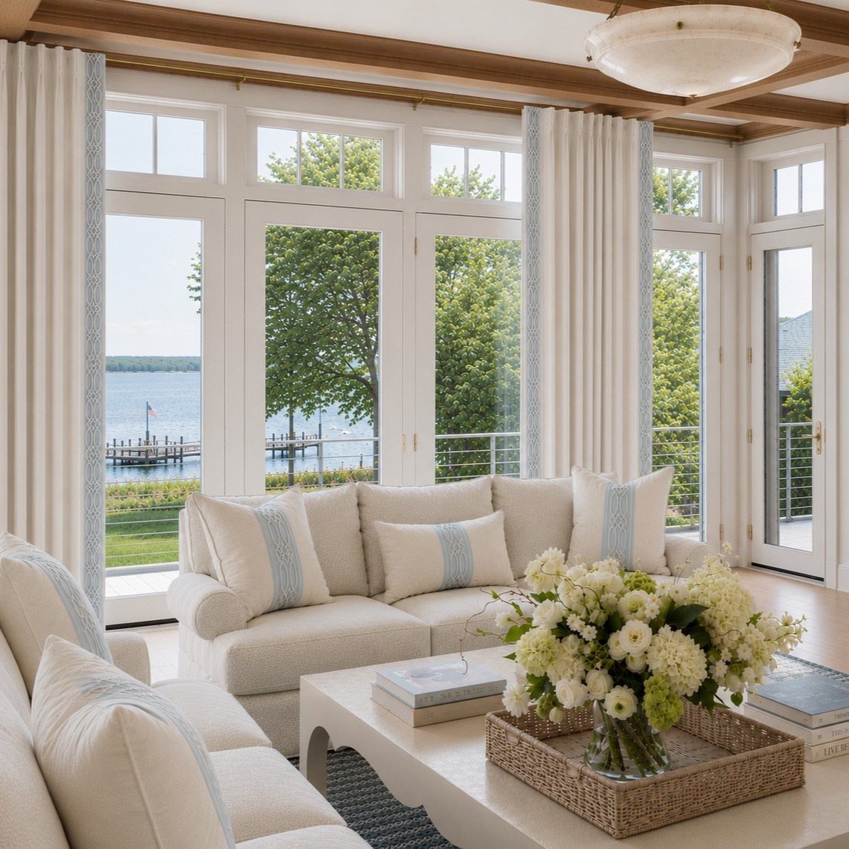
Curtains in blue and white bring the palette in at eye level, which matters more than most people expect. A trim or border along the leading edge, like the one here, reads crisp without overwhelming the room.
Solid white panels with a blue band work in spaces where the sofa or rug already carries pattern.
If your walls and furniture are neutral, a small repeating print on the curtain fabric adds interest without making the room feel closed in.
Hang the rod a few inches above the window frame and let the panels skim the floor for the most finished look.
3. Blue Sofas
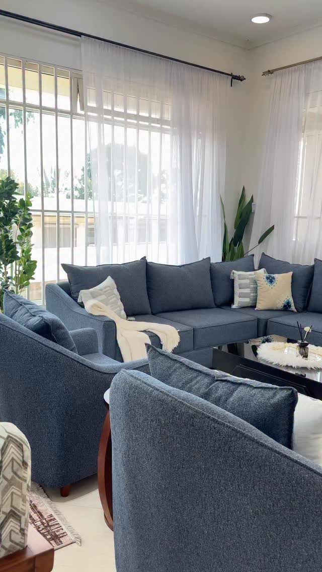
A blue sofa anchors the room in a way accent pillows never will. I go for a true mid-tone blue rather than navy or powder, which gives you flexibility with the rest of the palette.
White pillows and a throw keep it from feeling heavy. If you are buying a sectional, check the seat depth; a deep seat works better with extra back support.
Performance fabric in a tight weave holds up to daily use and cleans more easily than linen or cotton blends, which matters if this is your main seating.
4. Blue and White Living Room Rug
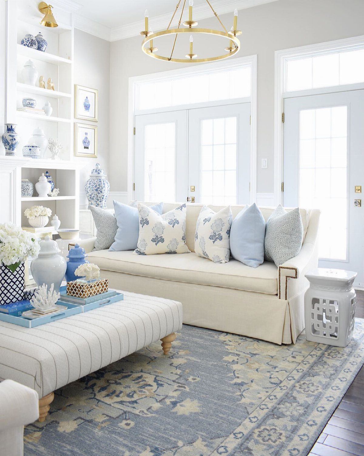
A patterned rug in blue and white ties the whole room together, especially when your sofa and walls are neutral.
I look for rugs with a clear repeat and enough contrast that the pattern stays visible even with furniture on top.
Size it so the front legs of your sofa and chairs sit on the rug, not floating in front of it.
Flat-weave or low-pile rugs stay easier to vacuum than high shag, and they photograph better too.
5. Patterned Blue Upholstery
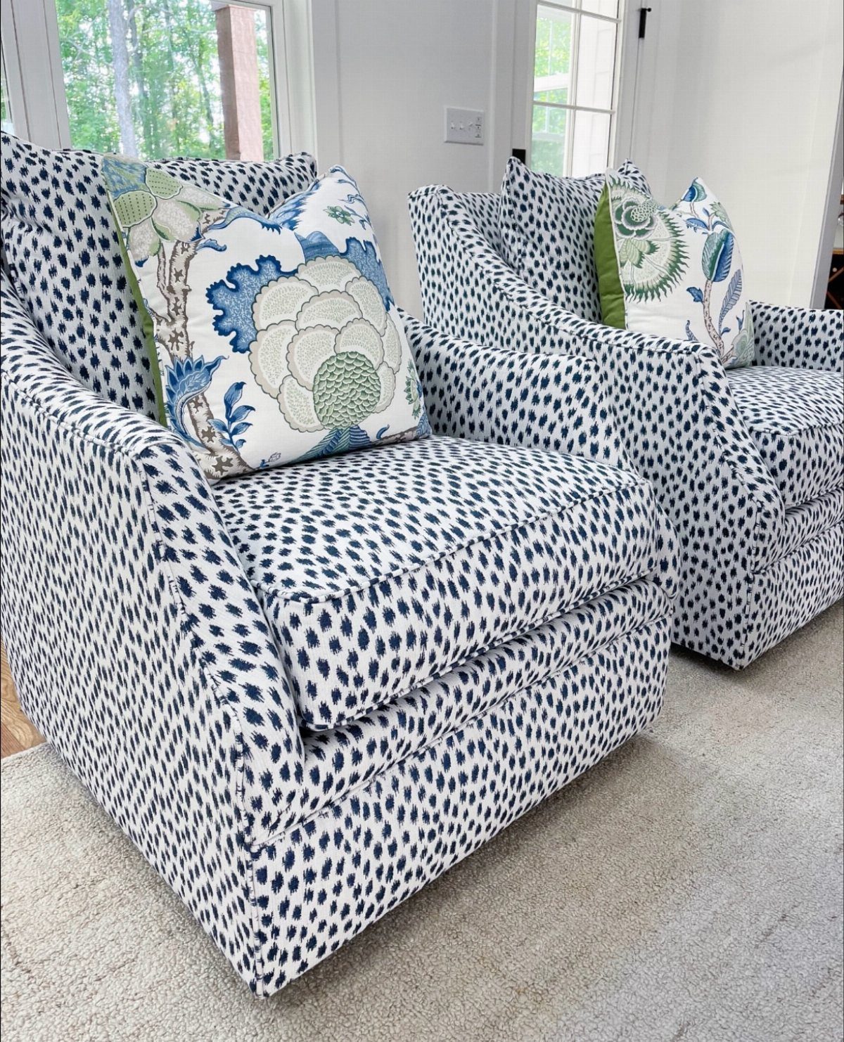
Patterned upholstery on a pair of chairs gives you color and texture in one move. I like a small-scale pattern like this spotted fabric because it reads as solid from across the room but holds interest up close.
Two chairs work better than one; they balance each other and give you flexible seating that can face the sofa or angle toward a window.
Look for patterns with a white or cream ground so the blue stays light and the chairs do not dominate.
If the fabric has a repeat, ask how many yards you need before you commit. Some patterns require extra yardage to match at the seams.
6. Blue and White Living Room with Wood
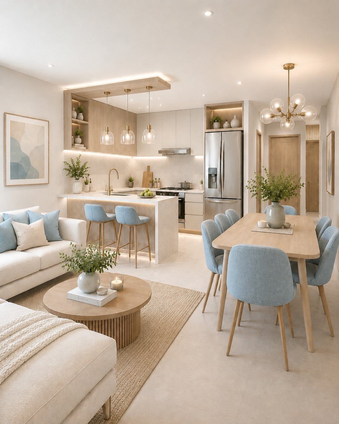
Wood tones in light oak or ash warm up a blue and white room without adding another color.
The light wood on the cabinetry and side table keeps the space feeling open while the blue chairs and pillows bring in structure.
I prefer natural or matte finishes over anything too glossy, which can look builder-grade. If your floors are already dark, light wood furniture balances the contrast and lets the blue accents pop.
Mixing wood into a mostly white room also gives you something to layer with, so rugs and throws feel intentional rather than like an afterthought.
7. Bold Artwork
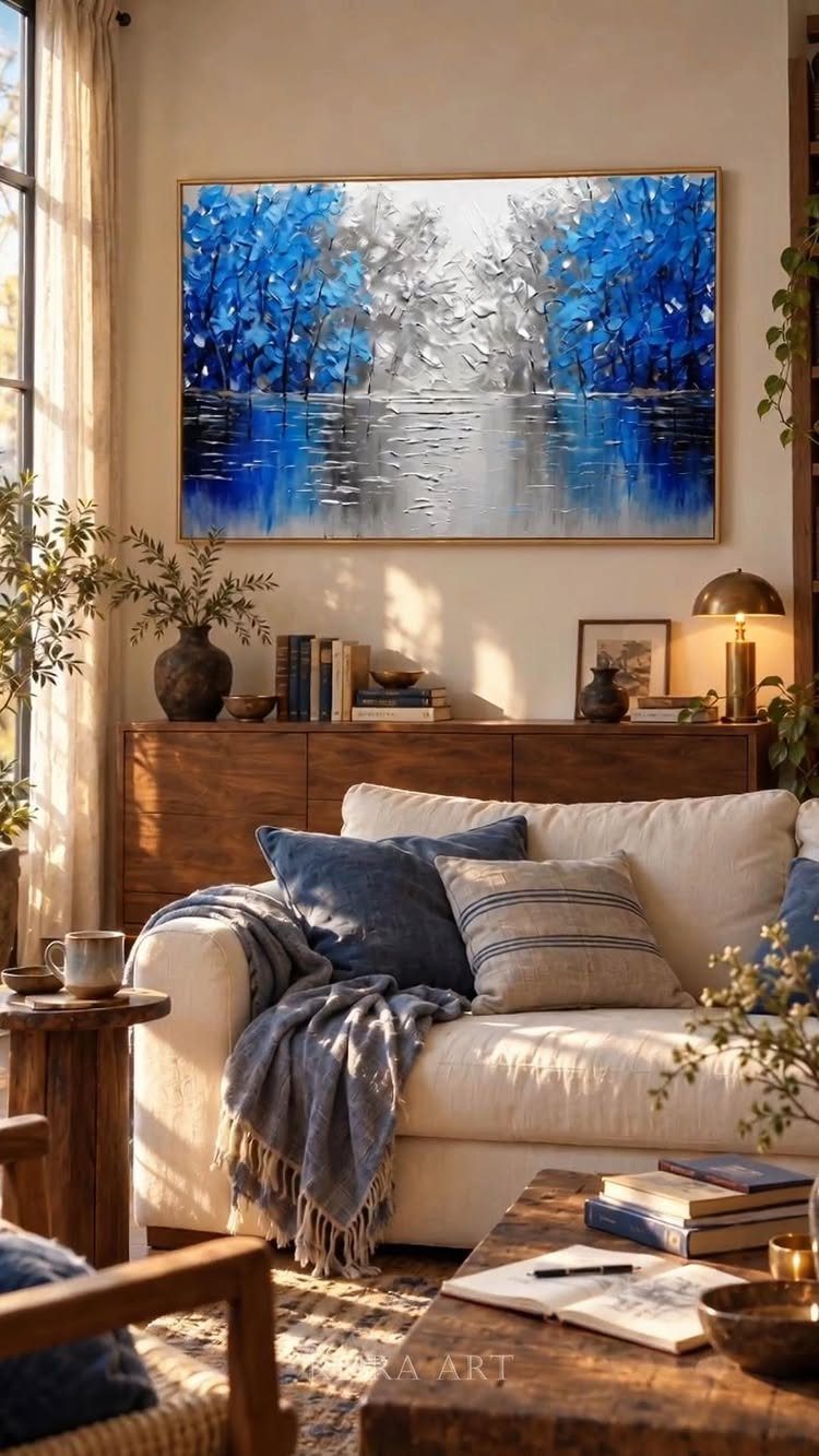
A large-scale piece in blue and white gives the room a finished feeling that smaller accents cannot match. I look for something with enough contrast that it reads clearly from the doorway but enough detail to hold up close.
Hanging it above a console or sideboard rather than floating it on the wall gives the piece context and makes the whole setup feel intentional.
A wooden frame or no frame at all works better than anything too ornate, which can fight the simplicity of the palette.
8. Blue and White Stripes
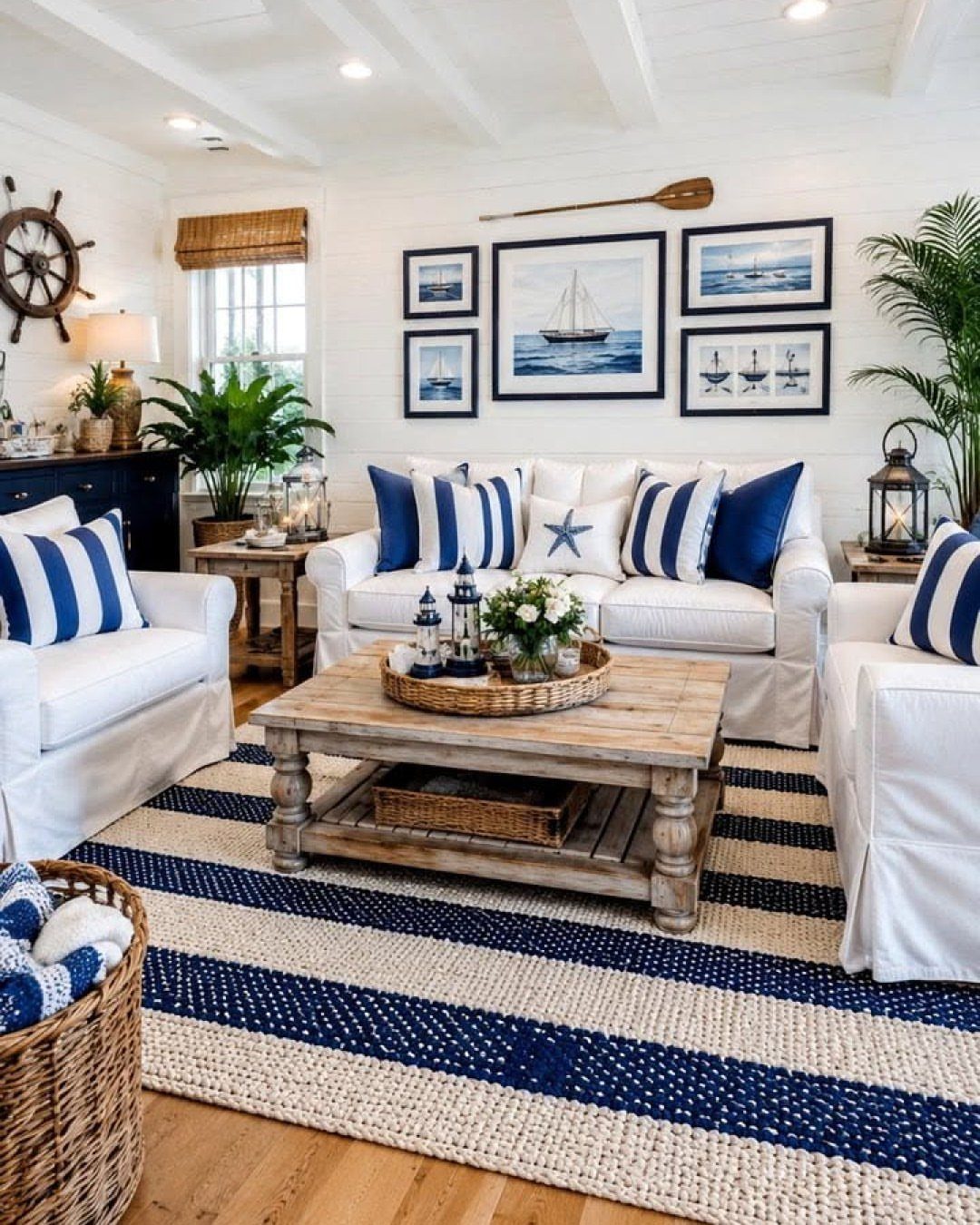
Stripes in blue and white keep the room feeling coastal without tipping into theme territory. A striped rug and matching pillows tie the look together, and the repetition makes it feel deliberate rather than accidental.
Horizontal stripes widen a narrow room visually.
Vertical stripes on pillows add height. If you are mixing stripe widths, keep one element wide and one narrow so they do not compete.
Stripes photograph cleanly and work in rentals because they read as classic rather than trendy.
9. Blue and White Porcelain
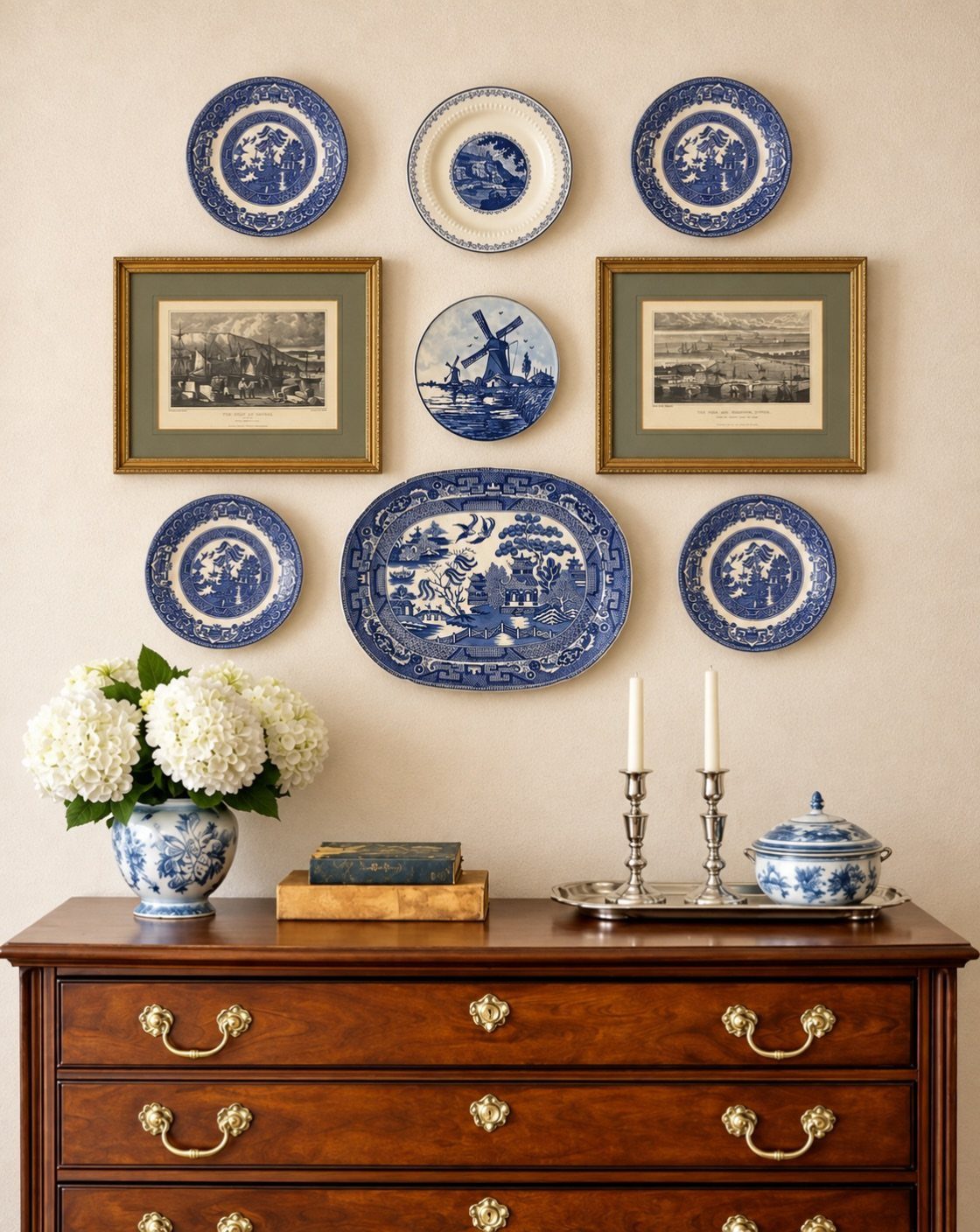
Porcelain plates and vases bring blue and white into the room at a smaller scale.
I hang plates in a loose grouping above a dresser or console and add a vase or tureen on the surface below to tie the arrangement together.
Look for pieces with varying patterns so the collection feels personal rather than matched. Plate hangers with spring clips work better than adhesive discs, which can fail over time.
Thrift stores and estate sales are the best sources for affordable porcelain in good condition.
10. Blue LED Accent Lighting
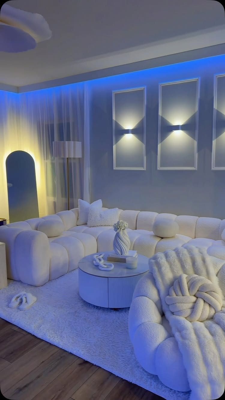
LED strips along the ceiling edge add blue light without taking up floor or wall space. The glow reads as atmospheric rather than functional, which works in a modern room where the furniture is clean-lined and white.
I run the strips in a recessed channel or behind a trim piece so the bulbs themselves stay hidden and only the light shows. Dimmable LEDs let you adjust the intensity depending on the time of day.
This look skews contemporary, so it fits best in spaces where the rest of the furniture is minimal.
Benefits of Blue and White Decor
Blue slows your heart rate and signals stability, which is why it works so well in a room where you spend hours at a time.
White amplifies that effect by adding light and making the space feel open rather than enclosed.
The combination reads as timeless because it borrows from nature: sky, water, clouds. That association keeps it from feeling like a decorating trend that will look dated too soon.
If your walls are already white, you can build the whole palette with accent pieces and skip the paint.
If you are starting over, the blue and white framework gives you enough structure that the room holds together even when furniture changes.
This palette works in traditional spaces and contemporary ones because the colors themselves carry no fixed style. What shifts is the saturation and the scale of the pattern you choose.
Accessorizing with Blue and White
A set of pillow covers swaps out in minutes, which matters if you are testing the palette or working in a rental.
Curtains bring color up to eye level and frame the window, so they have more impact than a single throw pillow.
If your walls are neutral, these smaller pieces let you adjust the intensity. Start with 2 or 3 accessories in the same shade of blue so the room feels intentional rather than scattered.
Choosing the Right Shades
Navy paired with white creates high contrast and works in spaces where you want the room to feel grounded. Light blue with white softens the look and suits smaller rooms where too much saturation can make the walls feel close.
Mixing shades adds depth.
A pastel blue pillow next to a sky blue throw gives you variation within the same family, and pairing navy with a softer midnight tone keeps a dark room from feeling flat when you add off-white instead of pure white.
Beige-toned whites warm up a navy room.
Bright whites keep light blues crisp. The difference is subtle in a paint chip but obvious once the furniture is in place, so test samples on the wall in both morning and evening light before you commit.
Frequently Asked Questions
What color should I choose for my living room?
Blue paired with white gives you a palette that works in traditional and contemporary spaces without looking dated quickly.
Navy paired with beige anchors the palette and adds weight, while pale blue keeps things airy in tight quarters. White walls let you layer in blue through pillows, throws and furniture instead of committing to paint.
Which color goes well with blue and white?
Blonde oak or ash introduces warmth naturally and doesn’t fight the coolness of blue.
The natural finish balances the coolness of blue and keeps the space from feeling too stark. Pale wood furniture lifts the scheme when your flooring runs dark and helps blue pop.
Should I paint my living room white?
White walls let you build the blue and white palette with furniture and accessories, so you can adjust the look without repainting.
White bounces light around the room and stretches it visually, which counts most in small footprints. A white backdrop holds steady when you swap accent colors or refresh the scheme later.
What does blue represent in interior design?
Blue reads calm and dependable, which suits spaces where you linger for more than a quick task.
Sky and water anchor the color in memory, so it reads familiar rather than dated. That quality keeps blue and white from dating quickly and makes it adaptable to both traditional and modern spaces.
How do I add texture to a blue and white living room?
Wood furniture in natural or matte finishes adds warmth and gives you something to layer rugs and throws against.
Low-pile rugs with defined geometry clean fast and hold their pattern under furniture legs. Mixing textures keeps the room from feeling flat when your color palette is limited to 2 tones.