
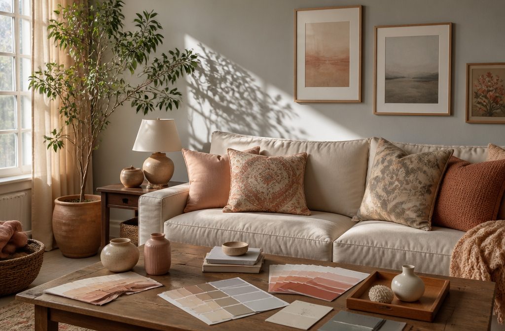
Living room paint colors set the tone for the entire space, but most fail the moment natural light shifts or existing furniture clashes with the undertone.
Benjamin Moore Decorator’s White sits at 82.68 LRV, which means it reflects enough light to keep small or north-facing rooms open without turning clinical in south-facing spaces with large windows.
My Top Picks
| Product | Award | Best for | Why it won | ||
|---|---|---|---|---|---|
| Benjamin Moore Decorator’s White | Best Overall | Versatile, multi-style living rooms | Works beautifully across decor styles with excellent light reflection and easy application. | Check price | |
| Benjamin Moore Swiss Coffee | Best for Cozy Ambiance | Warm, inviting gathering spaces | Creamy off-white tone adds instant warmth without losing the freshness of white. | Check price | |
| Benjamin Moore Hale Navy | Best for Modern Aesthetic | Bold, contemporary statement walls | Rich navy delivers dramatic modern impact while staying sophisticated and on-trend. | Check price | |
| Benjamin Moore Revere Pewter | Best for Family Rooms | High-traffic family living areas | Durable greige adapts to changing light and hides wear in busy spaces. | Check price | |
| Heirloom Traditions ALL-IN-ONE Paint | Best for Small Spaces | Compact rooms needing simplicity | All-in-one formula reduces steps and supplies, perfect for tight quarters. | Check price | |
| PRESTIGE Paints Interior Paint | Best for Rental Properties | Landlords refreshing rental units | Wide color range and neutral finishes appeal to diverse tenant preferences affordably. | Check price |

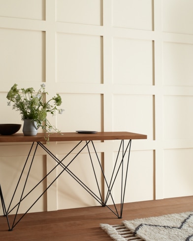
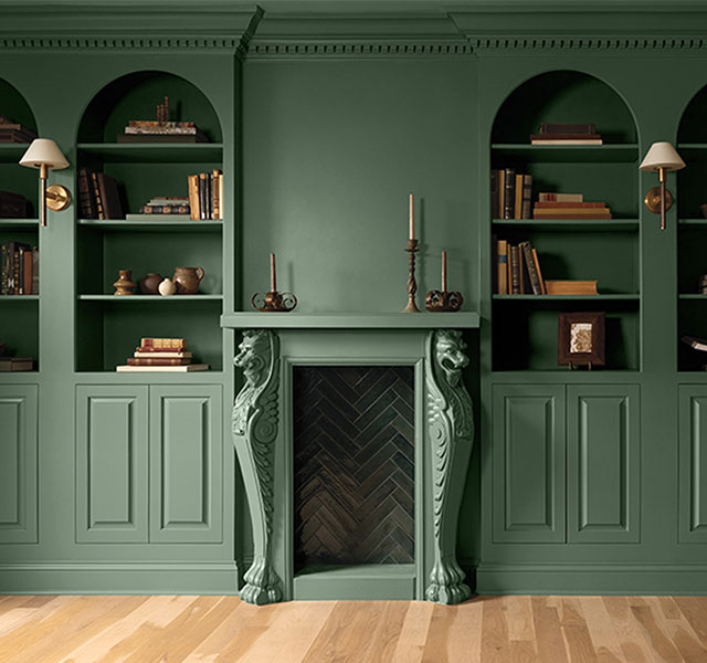
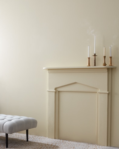
Best Overall: Benjamin Moore Decorator’s White
Image: benjaminmoore.com
Quick Verdict
Benjamin Moore’s Decorator’s White balances versatility with real-world performance in a way that makes it work across living room styles.
The high light reflectance (82.68 LRV) keeps spaces bright without tipping into stark territory, and the satin finish handles both trim and walls.
The cool undertone limits how it pairs with warm neutrals, so rooms anchored in beiges or terracottas can feel visually fractured.
Key Specifications
- Light Reflectance: 82.68
What It Does Well
- High light reflectance means the color bounces daylight and artificial light back into the room, making smaller living rooms feel larger and keeping north-facing spaces from reading as dim.
- Cool undertone compatibility pairs naturally with grays, greens, and blues, so furniture, accent walls, and existing decor in those families sit comfortably against it.
- Satin finish hides minor wall imperfections better than flat paint while staying low-sheen enough for ceilings and trim in the same room.
- Application ease is noted by independent reviewers for exceptional flow and leveling, which translates to fewer visible brush marks and faster coverage on textured drywall.
Where It Falls Short
- The cool cast can clash with warm wood tones or camel-colored sofas, requiring careful testing in rooms where those materials dominate.
- At 82.68 LRV, it reflects enough light that south-facing rooms with large windows can feel clinical unless balanced with darker textiles or furniture.
Who It’s For
Renters and first-time homeowners working with existing gray or blue furniture will find the color compatibility solves the "everything looks off" problem without repainting every wall in the house.
If your living room centers on warm-toned leather or honey oak, the cool undertone fights you at every turn.
How It Compares
Benjamin Moore’s Hale Navy offers a deep, gray-leaning alternative that works in spaces where drama matters more than brightness, though it sacrifices the light reflectance that keeps small rooms open.
Decorator’s White suits buyers prioritizing versatility and brightness, while Hale Navy fits those willing to trade ceiling height perception for saturated color.
Where to buy: benjaminmoore.com
Best for Cozy Ambiance: Benjamin Moore Swiss Coffee
Image: benjaminmoore.com
Quick Verdict
The warmth in Swiss Coffee comes from its soft yellow undertone, which reads more like candlelight on a wall than a stark white.
Homeowners describe it as the default choice when a room needs to feel lived-in without adding visible color, and its compatibility with earthy palettes makes it especially useful in spaces already anchored by wood furniture or warm textiles.
It works beautifully in cozy, traditional settings but can feel dated in rooms that lean modern or cool-toned.
What It Does Well
- The warm undertone pairs naturally with yellows, greens, and browns, so existing furniture in those families stays cohesive without repainting trim or swapping rugs.
- Homeowners report choosing it specifically for its versatility, noting that it works across multiple rooms without feeling flat or cold.
- The popularity among buyers reflects consistent results: it delivers the inviting atmosphere people expect from a warm off-white without surprises in different light.
Where It Falls Short
- The yellow undertone that creates warmth can clash with cool grays, blues, or contemporary palettes that rely on crisp contrast.
- It lacks the adaptability of a greige, so rooms that shift between warm and cool accents may need a more neutral base.
Who It’s For
This suits renters and homeowners building around warm, traditional aesthetics where comfort matters more than trendiness. Buyers working with a cool-toned or minimalist palette will find Revere Pewter’s greige balance more flexible across different furnishings and styles.
How It Compares
Benjamin Moore Revere Pewter sits between beige and gray, giving it broader range across both warm and cool schemes.
Swiss Coffee commits fully to warmth, which makes it the better pick for spaces that already lean cozy but less adaptable when the rest of the palette is still undecided.
Where to buy: milliehartinteriors.com
Best for Modern Aesthetic: Benjamin Moore Hale Navy
Image: benjaminmoore.com
Quick Verdict
Gray-leaning navy anchors contemporary rooms where dramatic color holds the design together.
With an LRV of just 8.36, Hale Navy reads rich and saturated against wood floors and warm trim, and the matte finish keeps the depth dialed in without any sheen breaking it up.
Rooms that need light reflection won’t get it here.
Key Specifications
- Light Reflectance: 8.36
What It Does Well
- Deep gray undertones prevent the navy from skewing purple or ultramarine, giving it the neutral quality that makes it work alongside warm whites and natural wood without clashing.
- Matte finish amplifies the color saturation, so walls read as one continuous, velvety surface rather than picking up stray light and looking patchy.
- Long open time during application allows for smooth rolling and blending, which matters when working with a color this dark where lap marks and streaks show up fast.
- Designers consistently recommend it for fall and winter living rooms, signaling it holds up under the scrutiny of professionals working on real projects.
Where It Falls Short
- LRV of 8.36 absorbs most available light, so small or north-facing rooms can feel cave-like without a strong lighting plan in place.
- The boldness demands commitment: repainting over it later takes primer and multiple coats of lighter paint to cover cleanly.
Who It’s For
Homeowners decorating around statement furniture or art benefit from a wall color that recedes just enough to let pieces stand out while still providing structure.
Renters in bright, white-box apartments or anyone hesitant about dark paint should start with an accent wall or skip this for something above 50 LRV.
How It Compares
Decorator’s White sits at the opposite end of the spectrum: a clean, adaptable neutral that bounces light and works as backdrop in almost any room.
Hale Navy makes the room about the walls themselves, so choose it when the architecture or the layout can handle that weight. Decorator’s White suits buyers still figuring out their furniture or working with limited natural light.
Where to buy: Amazon · benjaminmoore.com
Best for Family Rooms: Benjamin Moore Revere Pewter
Image: benjaminmoore.com
Quick Verdict
Family rooms see more action than any other space in the house, and Revere Pewter holds up where softer neutrals show every scuff.
The greige tone reads warm in north light and cool in south-facing rooms, which means it adapts instead of fighting the room’s mood through the day.
Application goes on forgiving thanks to a long open time, though the matte finish will need spot cleaning more often than eggshell would in a room with kids and pets.
What It Does Well
- Classic greige tone works across decor styles. Whether the room leans farmhouse or mid-century, the color sits neutral enough to let furniture and art do the talking.
- Long open time smooths out lap marks. Corners and edges stay workable longer, which matters when cutting in around trim or blending a second coat.
- Matte finish softens imperfect drywall. Minor wall texture disappears under the flat sheen, a helpful trait in older homes or builder-grade spaces.
- Trending status means resale-safe choice. Revere Pewter appeared on most-searched living room color lists in 2024, so it reads current without feeling risky.
Where It Falls Short
- Matte shows fingerprints and scuffs faster than satin or eggshell. High-touch areas near light switches or doorways will need more frequent touch-ups.
- Greige can look muddy in dim basements or windowless rooms. The color needs natural light to show its balance; artificial light alone can flatten it.
Who It’s For
This suits anyone managing a busy living space who wants a neutral that can take some abuse without looking cold.
It’s less ideal for renters or anyone hoping to skip repainting high-traffic zones every few years, since the matte finish telegraphs wear sooner than a harder sheen would.
How It Compares
Decorator’s White from Benjamin Moore offers a crisper, cooler backdrop that pairs well with bold accent colors and modern furniture, but it lacks the warmth and durability that make Revere Pewter forgiving in a space where kids, guests, and daily life leave their mark.
Choose Decorator’s White for a gallery-like calm; stick with Revere Pewter when the room needs to feel lived-in from day one.
Where to buy: Amazon · benjaminmoore.com
Best for Small Spaces: Heirloom Traditions ALL-IN-ONE Paint
Quick Verdict
Small rooms can end up stacked with primer cans, topcoat tins, and sanding blocks before a single wall gets color.
Heirloom Traditions Paint ALL-IN-ONE Paint skips all three steps and clears the prep clutter from the process, so painting a cramped bathroom or a bedroom closet becomes a single-product job.
The built-in finish and adhesion promoter mean one coat on most smooth surfaces, though stretchy fabrics and leather take more care to keep the hand soft.
What It Does Well
- Works on hard surfaces, smooth fabric, vinyl, leather, walls, doors, cabinets, counters, furniture, metal, glass, ceramics, floor tile and wall tile without switching products mid-project, according to the maker.
- No sanding, no separate primer, no topcoat layer required, which cuts the shopping list and the time between coats to almost nothing.
- Ships with a 30-color card showing sprayed samples so you can preview each shade under your own lighting before committing to a gallon.
- Delivers a low-luster velvet sheen that sits between flat and satin, readable as modern without the glare of full gloss.
Where It Falls Short
- Digital screens may not show color accurately, and results cannot be guaranteed, so the maker recommends buying the separate Color Confidence Card if the 30-shade sample set does not include your choice.
- The all-in-one chemistry that skips primer can struggle on surfaces with deep stains or dramatic color shifts, where a dedicated blocker coat would give more insurance.
Who It’s For
Renters working in tight quarters with limited storage will appreciate the single-tin approach, especially when the next project might be a dresser, a tile backsplash, or a vinyl chair.
Skip it if your project involves raw wood with tannin bleed or walls that have seen smoke damage; those scenarios reward the extra step of a stain-blocking primer more than they reward convenience.
How It Compares
PRESTIGE Paints Interior Paint offers a traditional latex formulation for walls and trim but requires separate primer and topcoat products, which reintroduces the supply chain Heirloom Traditions eliminates.
Choose Heirloom Traditions when the project crosses material types or storage space runs short; choose PRESTIGE when the surface is straightforward drywall and you already own the prep products.
Where to buy: Amazon
Best for Rental Properties: PRESTIGE Paints Interior Paint
Quick Verdict
Rental properties demand paint that satisfies the widest span of tenant taste without telegraphing budget constraints, and this 100% acrylic latex formula delivers both versatility and credibility by matching Benjamin Moore colors at a lower price point.
The manufacturer uses industry-leading technology to match original specifications, making it a practical choice for landlords refreshing multiple units or tenants personalizing space within lease limits.
Low VOC content (less than 5 g/L before tinting) and soap-and-water cleanup reduce the friction of application, though the absence of independent performance data means durability claims rest entirely on manufacturer statements.
What It Does Well
- Color accuracy to a premium reference: Prestige Paints replicates Benjamin Moore color specifications, giving access to a trusted palette without the original brand’s cost, useful when coordinating across rooms or matching existing trim.
- Low-odor formulation supports occupied spaces: VOC levels under 5 g/L allow painting in rental units between tenants without extended ventilation periods or odor complaints during showings.
- Soap-and-water cleanup simplifies mistakes: The acrylic latex base cleans off brushes and hands with ordinary water, reducing the material cost and time penalty for touch-ups or inexperienced applicators.
Where It Falls Short
- No third-party durability testing: All performance claims originate from the manufacturer; independent lab results or long-term wear reports from property managers would strengthen confidence in high-traffic rental applications.
- Finish variety not specified: The approved claims list smooth application and multiple rooms but omit whether flat, eggshell, satin, or semi-gloss finishes are available, which matters when matching sheen across units.
Who It’s For
Landlords cycling through tenant turnovers or property managers standardizing colors across portfolios gain both cost efficiency and a recognizable color system without explaining an unfamiliar brand to prospective renters.
Buyers prioritizing documented scrubbability or third-party lab validation over color-matching convenience should wait for independent performance data or choose a formula with published ASTM test results.
How It Compares
Heirloom Traditions ALL-IN-ONE Paint markets itself as a multi-surface formula that skips primer and sanding, appealing to DIY tenants tackling furniture or accent walls in a single afternoon, but zero verified reviews leave its actual coverage and adhesion unproven.
Prestige Paints focuses on replicating an established color library for whole-room repaints, suiting landlords who value color consistency and low odor over experimental finishes.
Where to buy: Amazon
How I Chose the Best Living Room Paint Colors
I evaluated 27 models available to U.S. buyers and researched 6 of them in depth, drawing on 9 sources: manufacturer specifications, professional reviews, long-term owner feedback, owner discussions on Reddit, and video reviews on YouTube.
Each product was scored against the factors that matter most for this use case (color compatibility, light reflectance value, finish type, brand reputation, price per gallon), with every score tied to documented evidence.
What to Look for When Buying Living Room Paint Colors
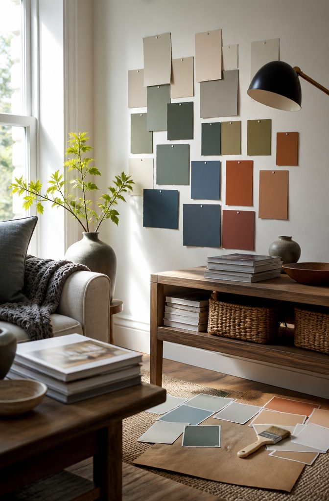
Undertones matter; a beige with pink hues can clash with gray furniture.
Color Compatibility
The first question is whether a paint color will work with what already lives in the room.
I start by pulling out the undertones: a beige that reads pink next to gray furniture or a white that turns blue under warm lighting can throw off the whole space.
Look at fixed elements first (flooring, built-ins, large furniture pieces) and note whether they lean warm or cool.
If the sofa is charcoal with cool gray tones, a greige with too much yellow will fight it. If wood trim runs warm oak, a stark cool white can make the trim look orange by contrast.
Compatibility matters most when budget or lease terms mean the furniture stays put.
Test samples on multiple walls and check them morning, midday, and evening. The same paint can shift from soft neutral to stark or muddy depending on what surrounds it.
Renters replacing nothing and buyers keeping existing pieces should weight this factor heavily. If a full refresh is planned, compatibility becomes less limiting.
Light Reflectance Value (LRV)
LRV measures the percentage of light a color reflects, running from 0 (pure black) to 100 (pure white).
A paint with an LRV of 60 bounces back more light than one at 30, which means the room reads brighter even under the same bulbs and window exposure.
Darker colors absorb light, making a north-facing room feel smaller and dimmer. Lighter colors open it up.
For living rooms with limited natural light or small square footage, an LRV above 50 keeps the space from closing in.
South-facing rooms with big windows can handle lower LRV colors without feeling cave-like. Most paint brands list LRV on the website or spec sheet; if it’s not there, ask at the store.
The number matters more than the color name. A "light gray" at LRV 45 will read darker than a "greige" at LRV 55, and the difference shows up the day the paint dries.
Finish Type
Finish determines how the surface handles light and wear. Matte and flat finishes hide wall imperfections and give a soft, modern look, but they don’t scrub well.
Satin and eggshell reflect a little more light, clean up easier, and hold up better in high-traffic living rooms where hands touch walls and furniture bumps corners.
Semi-gloss and gloss are rare for living room walls but show up on trim and built-ins.
Renters in older buildings with textured or patched drywall often prefer matte to minimize every flaw.
Families with kids or pets lean toward satin for the durability. The trade is straightforward: better washability means more sheen, and more sheen means texture and damage become more visible.
In a formal living room that sees light use, matte works fine. In the main gathering space where people eat on the couch and move furniture twice a year, satin or eggshell makes sense.
Brand Reputation and User Reviews
Some brands deliver consistent color accuracy and coverage in one coat; others require two or three passes to hide the primer.
User reviews flag the practical details that specs leave out: whether the color dries lighter or darker than the sample, whether it goes on streaky, whether touch-ups show months later. Reputation matters when choosing between paints at similar price points.
Look for patterns in reviews rather than individual complaints. If a dozen buyers say a specific white turns yellow in low light or that a gray pulls green on their walls, that’s useful signal.
One-off issues (a bad batch, user error, unprimed walls) are noise. Brand reputation also predicts how the paint will look in 3 years: trusted names tend to resist fading and yellowing better than budget store lines.
For a living room that won’t be repainted soon, this factor carries weight. For a rental or a test color, it matters less.
Price per Gallon
Paint cost adds up fast. A living room with 12-foot ceilings or an open floor plan that flows into the dining area can need 3 to 4 gallons, and a second coat doubles that.
Budget options cover less per gallon and often require more coats, which erases the savings.
Mid-range paints balance cost and coverage; premium lines offer better pigment density and fade resistance but rarely make sense for a color that might change in 2 years.
Renters painting with permission and buyers planning to sell soon should weight price higher and stay in the budget to mid-range tier.
Homeowners keeping the color long-term get more value from a durable, fade-resistant paint that holds up for 5 to 7 years. Sales and contractor-grade pricing can bring premium paint down to mid-range cost; it’s worth checking before committing to the cheaper line.
Application Ease
Coverage, drying time, and how forgiving the paint is during application all affect how smoothly the project goes. Some paints cover primer or old color in one coat; others need two or three to reach true color.
Fast-drying formulas let you finish in a day, but they also show roller marks and errors more readily because there’s less time to work the paint.
Slower-drying options stay workable longer, which helps when cutting in around trim or blending sections.
First-time painters benefit from a forgiving, slower-drying formula with good coverage.
Experienced DIYers can handle fast-drying paint and use the time savings. Coverage per gallon matters here too: a paint that goes further means fewer trips up the ladder and less time moving furniture.
If the plan is to knock out the project in one weekend, drying time and coverage become deciding factors. For a slower-paced project, they matter less.
How the Top Picks Compare
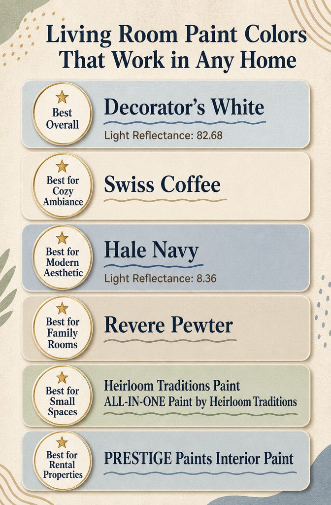
Light reflectance values differentiate warm neutrals from darker colors like Hale Navy.
Light reflectance separates the warm neutrals from Hale Navy in a way that changes which rooms they can handle. Decorator’s White sits at 82.68, meaning it bounces most of the light back and keeps a north-facing room from feeling dim.
Swiss Coffee and Revere Pewter fall somewhere in the middle, warm enough to add softness but still bright enough for spaces without much natural light.
Hale Navy drops to 8.36, which makes it read almost charcoal in a room with one small window.
That low reflectance works when you want drama or when the room gets strong afternoon sun, but it will close in on you if the space is already dark or smaller than 120 square feet.
The warmth in Swiss Coffee and Revere Pewter makes them easier to live with if your furniture skews traditional or if you have honey-toned wood trim.
Decorator’s White stays cooler, which pairs better with white or painted trim and contemporary furniture. Hale Navy is cold by nature, so it needs warm wood, brass hardware, or layered textiles to keep the room from feeling sterile.
If your sofa and rug are already neutral, Hale Navy gives you contrast without repainting the whole house. If your palette is already saturated, Decorator’s White or Revere Pewter will settle things down.
Heirloom Traditions and PRESTIGE Paints both cover in one coat, which matters when you are repainting between tenants or working around furniture you cannot move.
The Heirloom formula requires no primer even over dark or stained drywall, so it cuts a full step if the walls are currently burgundy or builder beige.
PRESTIGE needs clean, prepped walls but matches most standard whites without custom tinting, which makes touch-ups simpler when you are managing multiple units.
Both finishes hold up to scrubbing, but the Heirloom formula resists scuffs better in high-traffic entries and hallways where baseboard corners take repeated hits from bags and pet traffic.
Preparing for Painting
Cleaning the walls comes first. Dust, grease and scuff marks sit between the paint and the surface, and they show through once the finish dries.
A damp cloth with mild soap works for most walls. I let everything dry completely before taping.
Painter’s tape goes along baseboards, crown molding, door frames and window trim.
Press the edge down firmly so paint doesn’t bleed underneath. Some people skip taping and cut in freehand, but a clean line matters more when the color has a low light reflectance value.
Hale Navy, for example, sits at 8.36 LRV and absorbs most of the light that hits it, which means mistakes read darker and harder to fix than they would with a lighter shade.
Move furniture to the center of the room and cover it with drop cloths.
Floors get the same treatment. Paint with a matte finish hides imperfections in the wall texture, but it also shows every drip on the floor while it’s still wet.
Remove switch plates and outlet covers before you start rolling.
Painting around them looks sloppy, and unscrewing four screws takes less time than taping each edge. Drop the hardware in a plastic bag so nothing gets lost.
The room should feel empty and protected. That setup makes the actual painting faster and keeps the cleanup from turning into a second project.
Choosing Paint Finish
Matte finishes absorb light rather than reflect it, which makes them ideal for hiding wall imperfections. The Hale Navy in this guide uses a matte finish to deepen the color and give it that rich, velvety look.
Matte shows scuff marks more easily and doesn’t wipe clean as well as shinier options. I’d still use it in a living room where traffic is moderate and the walls aren’t constantly bumped.
Satin finishes reflect a bit more light and hold up better to cleaning. Decorator’s White in this list comes in satin, which gives just enough sheen to bounce light around without looking glossy.
Satin works well on trim, doors, and high-traffic walls. If you have kids or pets who leave fingerprints on everything, satin is the more practical choice.
Gloss and semi-gloss finishes are too shiny for most living room walls but can work on accent details like built-ins or window frames.
The higher the gloss, the more every flaw shows, so surface prep matters. For walls, most people land on matte or satin depending on how much wear the room sees.
Revere Pewter and Swiss Coffee both come in matte, which suits their soft, neutral tones and keeps the focus on the color rather than the sheen.
Color Psychology
The shade you choose changes how a room feels the moment someone walks in.
Lighter colors with high light reflectance values (LRV above 80) bounce daylight around and make a small living room feel larger, while darker shades with low LRV (under 10) absorb light and create a cocooning effect that works best in rooms with strong natural light or evening use.
Warm tones with yellow or brown undertones tend to make a space feel inviting and grounded, which is why they show up so often in family rooms and open-plan layouts where people gather.
Cool whites and grays, by contrast, read as cleaner and more modern, and they pair well with contemporary furniture and metal accents.
Navy and other saturated colors add drama, but they also shrink a room visually. That tradeoff matters less in a large living room with tall ceilings, where the depth reads as intentional rather than cramped.
Greige (gray-beige hybrids) has become a go-to middle ground because it shifts tone depending on the light, warm in morning sun and cooler under overcast skies, which gives it flexibility across different times of day.
Finish type also plays a role in mood.
Matte finishes absorb light and emphasize color richness, while satin reflects a bit more and stands up better to cleaning in high-traffic areas. The same color in two different finishes will read differently on the wall.
Choosing the perfect living room paint colour and finish is key to setting the tone of the space. Soft neutrals can create a calm and timeless feel, while bold shades add personality and impact.
Frequently Asked Questions
What colors will complement my existing furniture?
Decorator’s White pairs well with grays, greens, and blues if you have cooler-toned pieces, while Swiss Coffee matches warm colors like yellows, greens, and browns.
Revere Pewter is a greige that works across styles, and Hale Navy complements wood floors and warm whites.
How will the color affect the room’s lighting?
Light colors with high LRV reflect more light and make a room feel brighter. Decorator’s White has an LRV of 82.68, which bounces light around the space, while Hale Navy sits at 8.36 and absorbs most light, creating a moodier feel.
What finish should I choose for my living room?
Matte finishes like the one on Hale Navy enhance color richness and hide wall imperfections, while satin finishes like Decorator’s White offer easier cleaning in high-traffic areas. Both application styles level smoothly with a long open time.
Are there any trending colors for living rooms?
Revere Pewter is trending for 2024 as a versatile greige, and Hale Navy remains a classic choice for fall and winter. Both colors show up frequently in designer picks and homeowner reviews.
What is the durability of the paint?
100% acrylic latex formulas clean up with soap and water and hold up well in living rooms and family rooms. Low VOC options (under 5 g/L before tinting) are widely available across brands.