
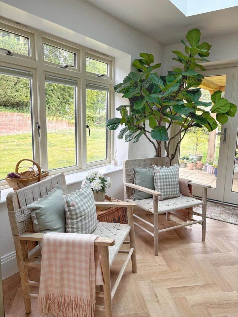
Most farmhouse palettes run from crisp white with wood contrast all the way to soft taupe, sage green, or muted blue-green that still reads neutral.
If your room gets strong natural light, whites like alabaster and simply white stay warm without turning stark.
In spaces with less sun or where you want more warmth without leaving farmhouse territory, warm taupe or cozy grey-beige works on every wall and pairs easily with the same wood and metal you already have.
1. Alabaster Walls and Trim
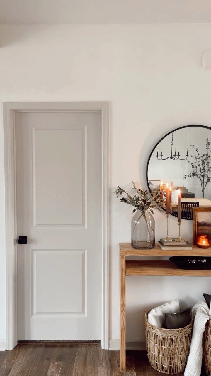
Alabaster pulls off something most whites cannot: it reads warm without looking yellow. The slight cream undertone keeps a room from feeling stark while still bouncing plenty of light around.
I prefer running the same color on both walls and trim here.
It simplifies the whole room and lets wood furniture and metal accents do the talking. If your space gets good natural light, alabaster stays soft all day without turning dingy in the evening.
The finish matters. Flat or matte on walls, satin on trim.
2. Warm Taupe
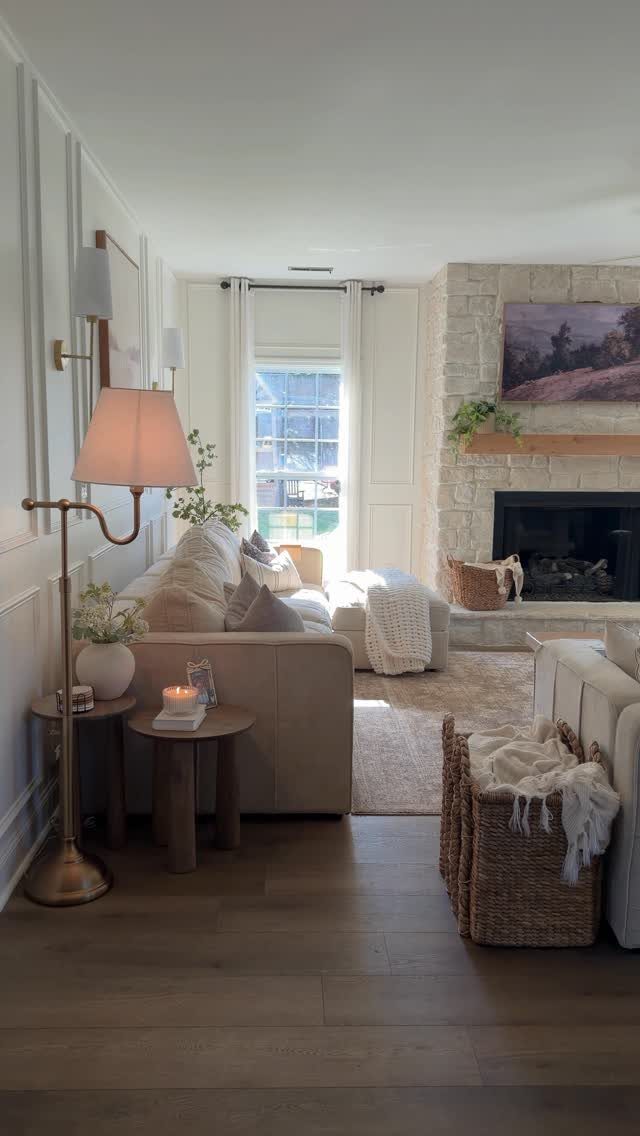
Taupe sits right between grey and beige, which makes it forgiving with existing furniture.
If your sofa is cream, your rug is grey, and your throw pillows cover both, taupe walls will tie them together without forcing you to start over.
I like it best in rooms with wood floors and natural textures.
Stone, linen, and unfinished wood all look better against taupe than they do against pure white. The color has enough warmth to feel lived-in but stays neutral enough to work year-round.
3. Butter Yellow Against Dark Wood
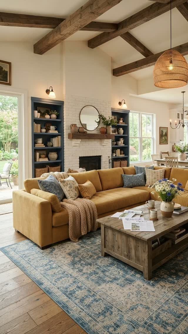
Butter yellow on upholstery gets risky fast, but it works when the rest of the room anchors it with darker tones.
Dark wood beams overhead or a charcoal rug on the floor keeps the yellow from feeling too bright or childish.
Keep the yellow soft and grayed down, not bright.
You want the color of actual butter, not mustard or highlighter. If your room has white brick or painted shiplap, the yellow reads warmer without competing with the texture.
4. Muted Blue-Green
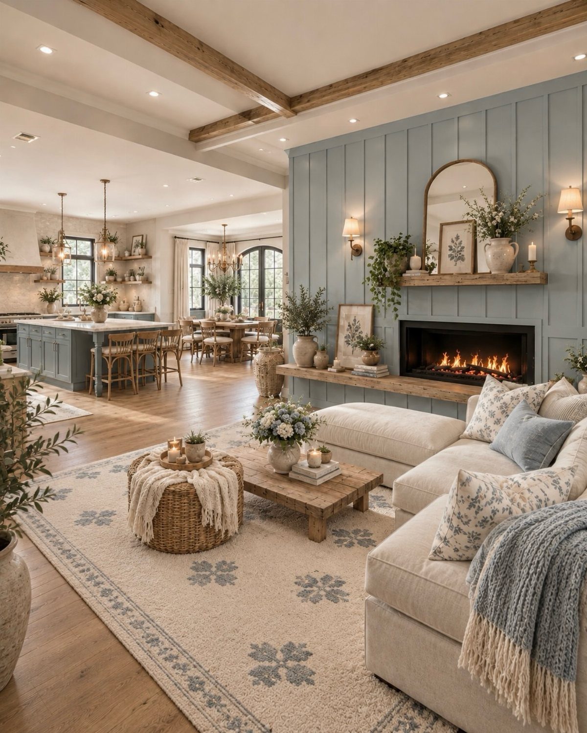
Muted blue-green brings in color without committing to full coastal decor. The shade leans more grey than turquoise, so it pairs with neutral furniture and wood tones instead of demanding seashells and rope accents.
I like it on paneled walls where the groove lines add depth without extra paint colors. If your living room opens to a kitchen or dining area, this color works across both spaces without feeling repetitive.
5. Simply White with Natural Wood Tones
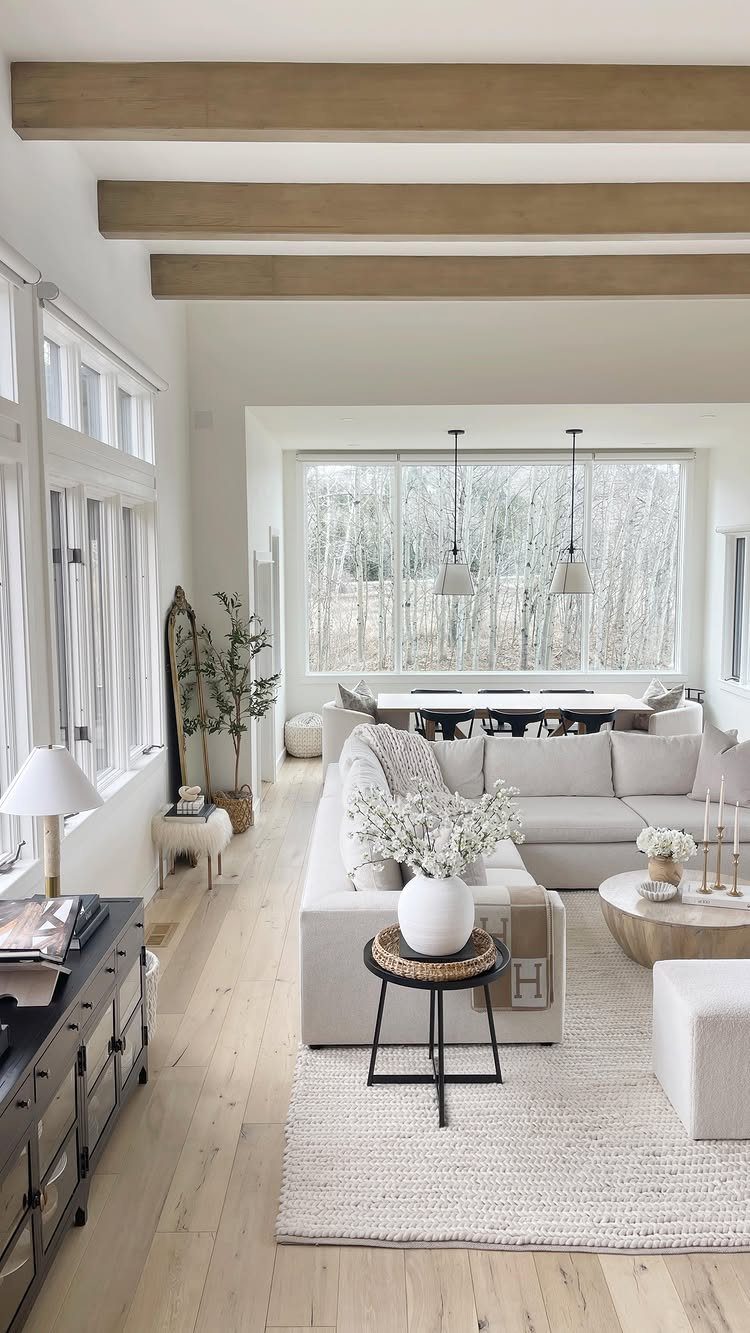
Simply White is cleaner and crisper than alabaster, and it shows off natural wood better than any off-white. If your ceiling has exposed beams or your floors are light oak, the contrast reads subtle but clear.
This combination needs good light to avoid feeling cold.
Rooms with big windows or glass doors facing trees or a yard get enough warmth from the view. I would skip it in a basement or a north-facing room where the white could turn grey.
6. Sage Green
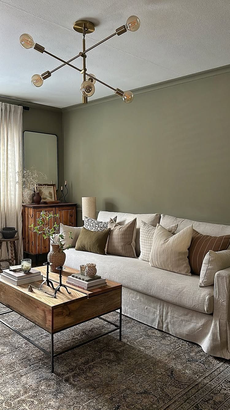
Sage green is soft enough to work as a neutral but still registers as color. It pairs well with brass, black iron, and natural wood, which makes it easier to furnish than a bolder green.
I prefer it on every wall rather than as an accent. The color is muted enough to surround the room without overwhelming it, and it makes white trim and cream upholstery look intentional instead of basic.
If your space has a lot of natural light, sage stays calm. In a darker room, it can read muddy.
7. Cozy Grey and Beige
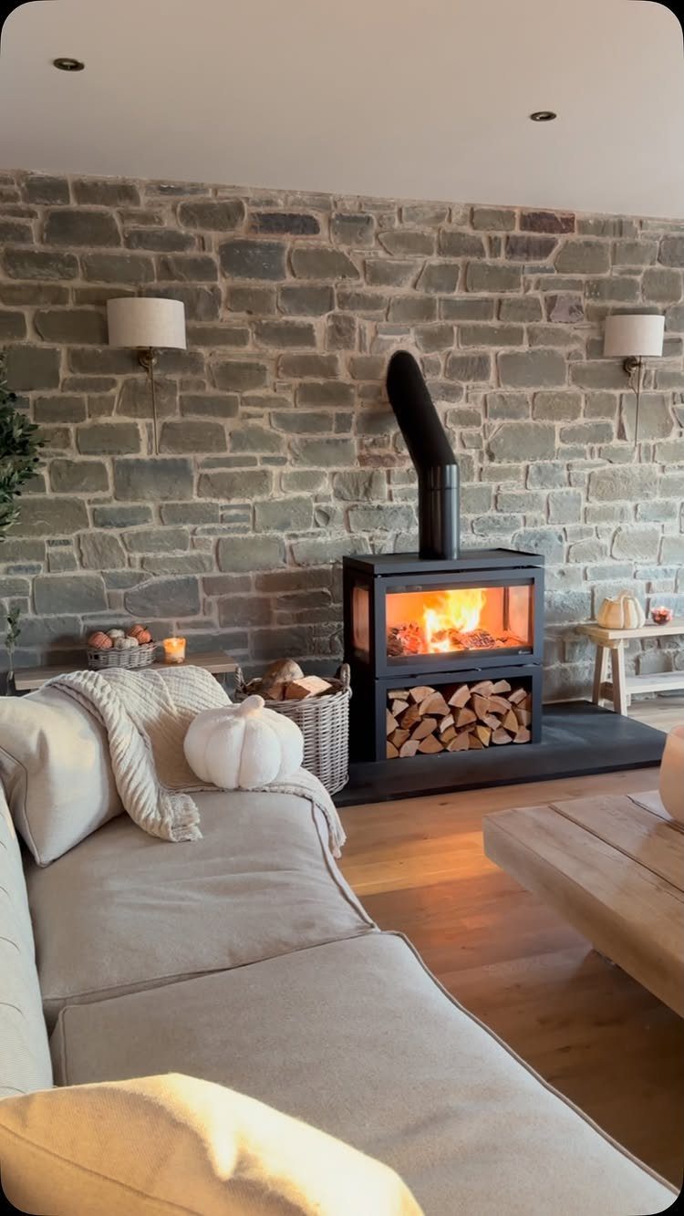
Grey and beige together solve the problem of choosing one or the other. The grey comes in through stone or painted shiplap, the beige through upholstery and rugs, and neither one has to carry the whole room.
A stone accent wall adds texture without pattern, which keeps the space calm.
If you have one wall with the most visible square footage, that is where the stone goes. The rest stay white or a soft warm grey.
Light wood floors warm up the grey without competing with the beige. Keep metal accents black or matte bronze.
Impact of Natural Light
A color that looks right on a chip can shift completely once it covers 4 walls. Paint samples under $5 let you test before committing to gallons.
Apply sample squares in at least 3 spots: the wall that gets the most sun, the one in shadow most of the day, and a corner near a lamp you use at night.
Use a foam brush if you want to keep the cost down.
Check the samples morning, afternoon, and evening.
A soft grey that looks warm in afternoon sun can turn cold and flat under overhead lights after dark. Natural light pulls out different undertones than artificial light does, and both matter.
Hold the samples next to white paint or white paper to see the actual tonal shift. Colors look different when your eye has a neutral reference point.
Testing Paint Samples
Buy samples in small sizes and paint them directly on the wall, not on poster board. The texture of your wall and the color underneath both change how the new paint reads.
Paint a large enough square that you can stand back and actually read the color.
A tiny swatch does not give you enough information, and taping up a painted card skips the step where you see how the color actually covers your surface.
Come back to the samples at different times over 2 or 3 days. Morning light shows whether a white goes too cool.
Late afternoon tells you if a warm color turns orange. Evening reveals whether a soft neutral disappears or holds its own under lamps.
2 chips that sit next to each other in the store can land in completely different places once they’re up. Test both.
Choosing Between Warm and Cool Tones
Warm tones with red or yellow undertones feel more lived-in and work better in larger rooms where the color has space to breathe. Cool tones that lean grey or blue make a small room feel like it has more air.
Room size is not the only factor. Warm walls pair easily with wood furniture and natural textures without needing much else.
Artificial light warms up cool paint colors, which can make a grey-blue look more neutral than you expected at night. Natural light does the opposite and makes warm colors read truer during the day.
Farmhouses have a natural coziness about them. Lean into that feeling by using a warm paint color that makes it feel as if you are in a cocoon.
Frequently Asked Questions
What colors are suitable for a farmhouse living room?
Soft whites like alabaster or simply white, warm taupe, sage green, and muted blue-green all work well in a farmhouse living room. They let wood tones and linen textures do the talking without fighting for attention.
What are some examples of rustic colors?
Rustic colors include warm taupe, sage green, muted blue-green, and soft whites with cream undertones.
These shades pair well with wood floors, stone, linen, and unfinished wood without forcing you to replace existing furniture. Butter yellow anchored by dark wood beams or a charcoal rug also reads rustic without turning too bright.