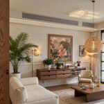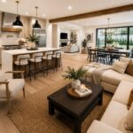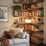
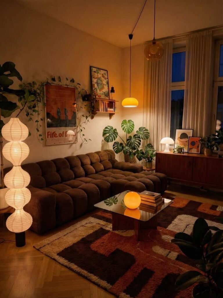
The palette runs from soft beige and taupe through sage, olive, rust and terracotta, with accent options in burnt orange, mustard yellow and deep brown.
The choice comes down to how much contrast you want: cooler tones like sage and teal pair with warmer rust or mustard if you need definition, while beige and taupe together create a base that lets accent colors rotate without repainting.
1. Earth Tone Living Room Palette
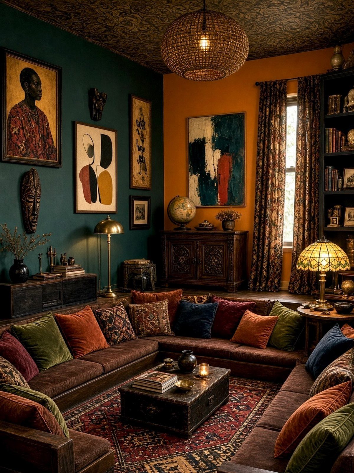
An earth tone palette pulls from the colors outside: terracotta, clay, sand, olive, rust, warm brown. Teal and burnt orange both ground themselves well enough to sit with brown upholstery and woven texture without competing.
Start with 2 or 3 colors from that range and let one cover more area than the others.
I like pairing a cooler tone like sage or teal with a warmer rust or mustard so the room has contrast without needing brights. Rugs, art and pillows can carry the supporting colors once the larger pieces are in place.
2. Layer in Sage Green
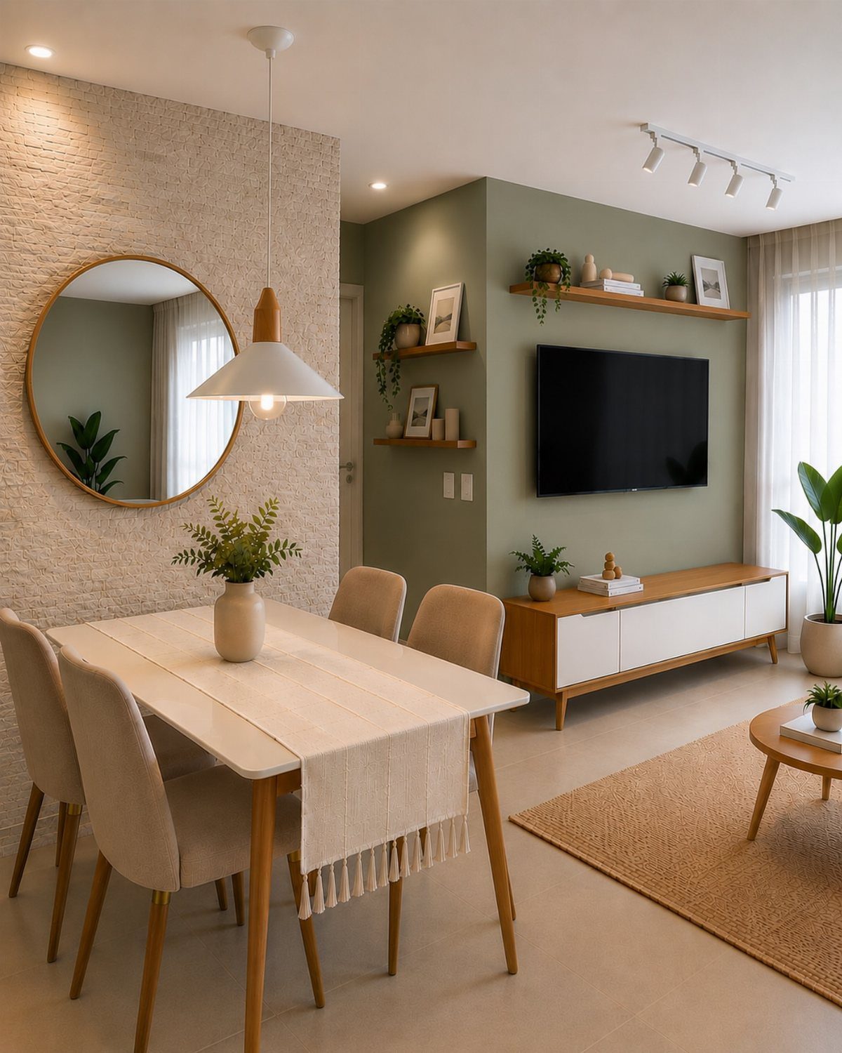
Sage green reads warm in soft light and cool against white trim, so it lives more comfortably than a committed jewel tone. The wall holds the composition without overpowering neutral furniture or the plants on the console.
One accent wall does the job if everything else stays light.
I would keep the surrounding walls white or off-white so the green has room to sit without closing the space in. Pair it with natural wood, linen or jute so the earthy feel stays consistent.
3. Earth Tone Paint and Flooring
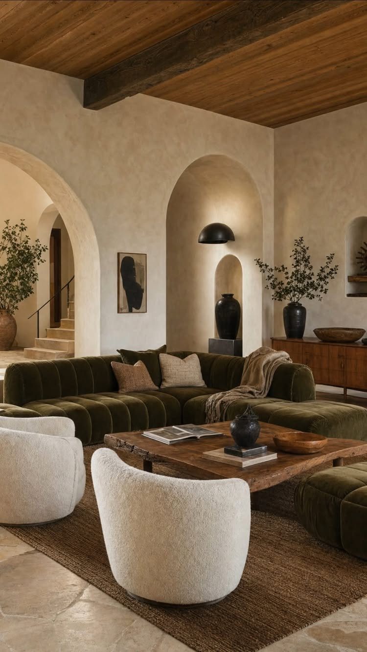
Plaster walls and stone floors bring texture without pattern, and that restraint lets the furniture colors do more work.
Stone or tile in beige, terracotta or gray works as flooring if the subfloor can support the weight and the budget allows for professional install.
If not, luxury vinyl tile in a stone finish costs less and goes down over most surfaces. Layer a wool or jute rug under the seating to soften the room and mark the conversation area.
4. Live Plants and Clay Planters
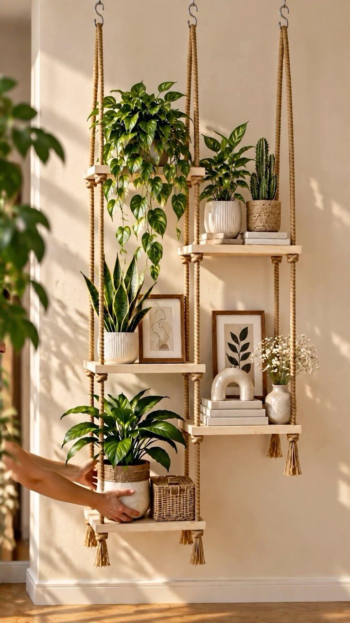
Live plants fill in the corners and shelves without adding clutter, and clay pots keep the palette consistent.
Pothos, philodendron and snake plants tolerate low light and need water once a week or less.
I group them by size rather than spacing them evenly so the arrangement looks collected instead of staged. Unglazed terracotta pots wick moisture away from the roots, which helps if you tend to overwater.
5. Beige and Taupe Living Room
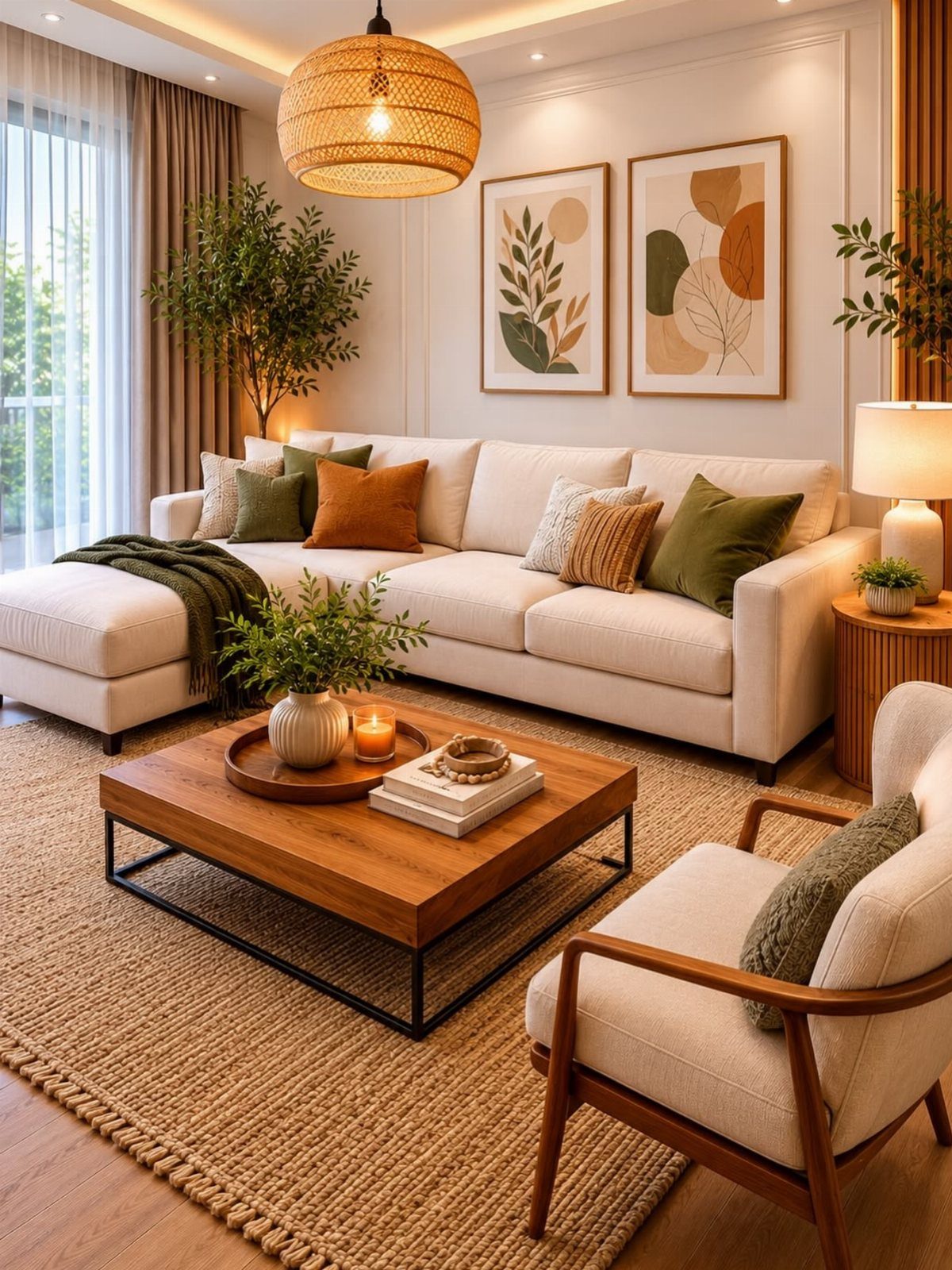
Beige and taupe together create a warm base that lets accent colors like rust, olive or mustard rotate in and out without repainting.
The sectional holds the room in a lighter beige while the rug, pillows and art bring deeper browns and greens.
A jute or sisal rug under the table adds texture without pattern, so the floor stays calm when pillows and throws already carry detail.
I would choose a sectional in a neutral linen or cotton blend so spills wipe off and the fabric ages without looking worn.
6. Earth-Reflective Artwork
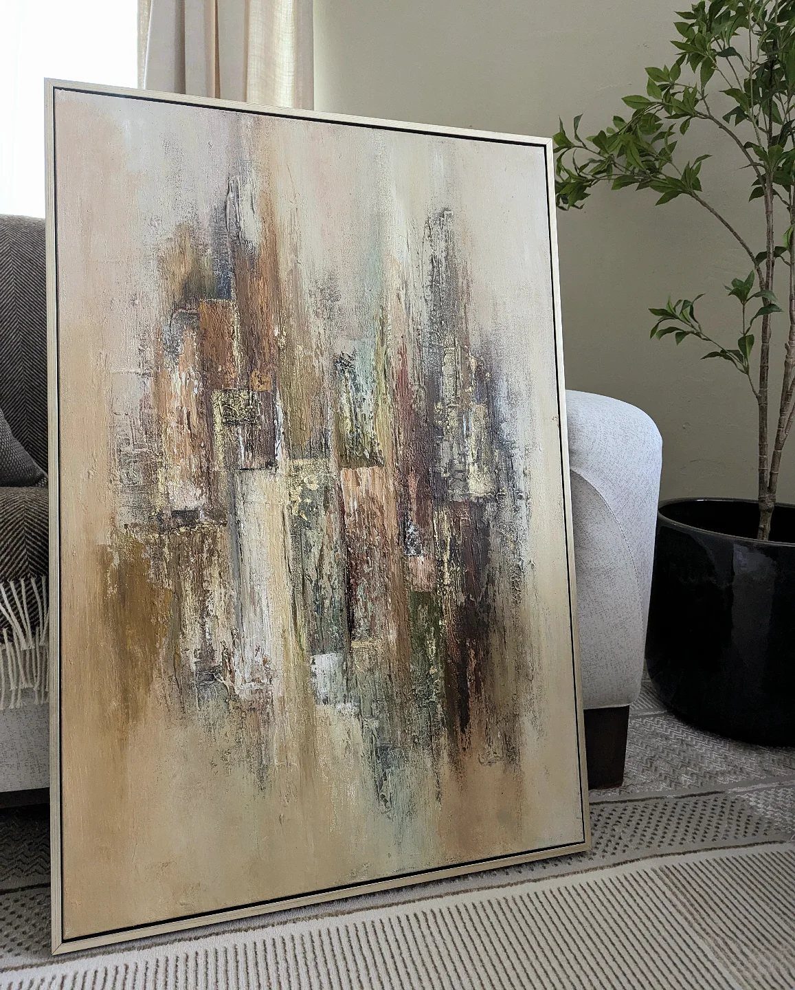
Abstract art in earth tones ties the palette together without literal landscape scenes.
Oversized art does more for calm than a gallery wall. I look for pieces that pull from the room’s existing palette so the art feels like it belongs rather than something added later.
Leaning a large canvas against the wall instead of hanging it keeps the look casual and makes swapping it out easier.
7. Olive Green and Burnt Orange
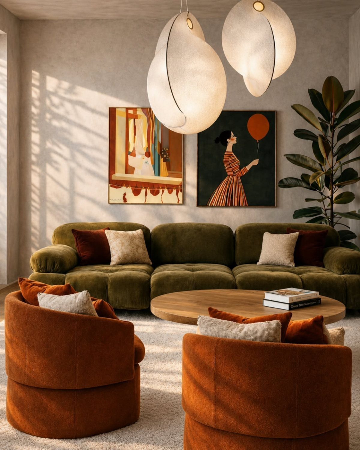
Olive green and burnt orange sit together because they share warmth without landing in the same temperature range. The velvet sofa anchors the seating while the rounded armchairs bring a warmer contrast that doesn’t fight for attention.
I would keep the rest of the palette neutral so these 2 colors can hold the room. Wood tones and white walls let the green and orange do their work without needing a third accent color.
8. Green and Mustard Yellow Accents
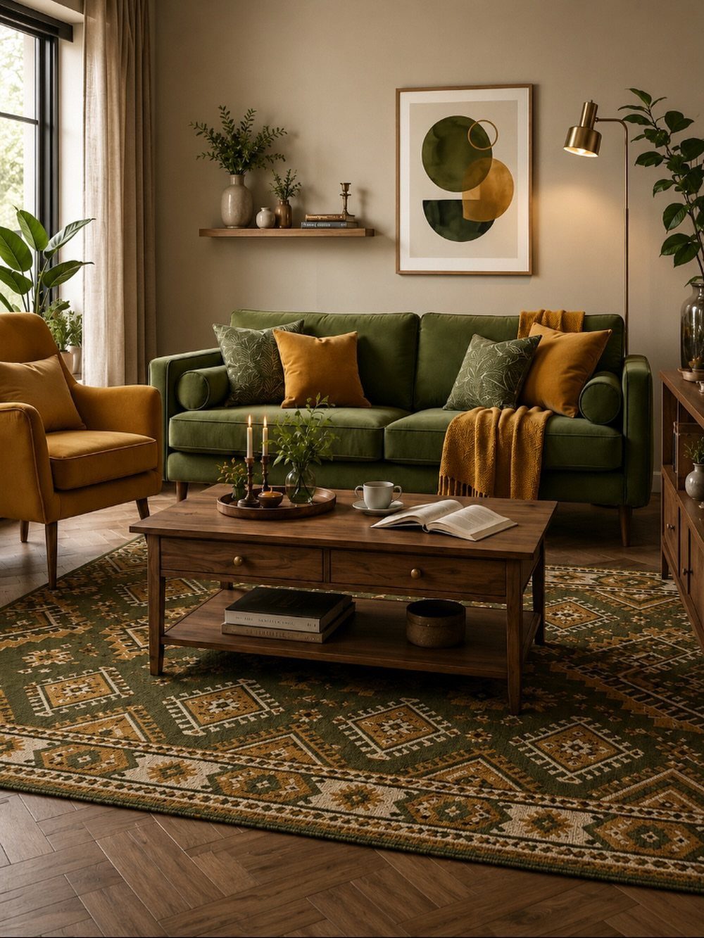
Green velvet paired with mustard yellow adds richness without going dark. The herringbone floor gives the room texture at ground level, so the furniture can stay simple in shape.
Mustard reads warmer than a true bright yellow and holds up better next to saturated green.
I would keep the mustard to one chair and a few pillows rather than spreading it across every surface, so the green stays the anchor.
9. Earth-Toned Throw Pillows
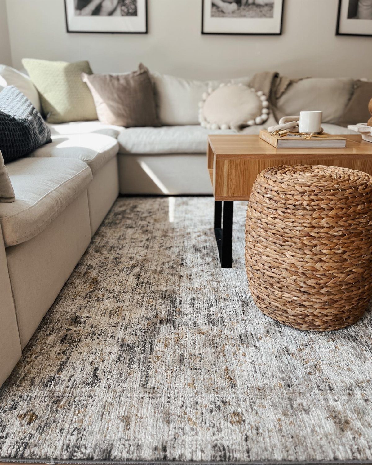
Pillows in sage, brown and cream layer texture and color onto a neutral sectional without replacing the sofa itself. The jute pouf carries the same woven material as the rug, tying the floor and seating together.
I mix pillow colors in different sizes rather than matching pairs so the arrangement looks collected. Covers in linen or cotton twill hold up better than synthetics and feel better against bare arms.
10. Warm Brown and Beige Furnishings
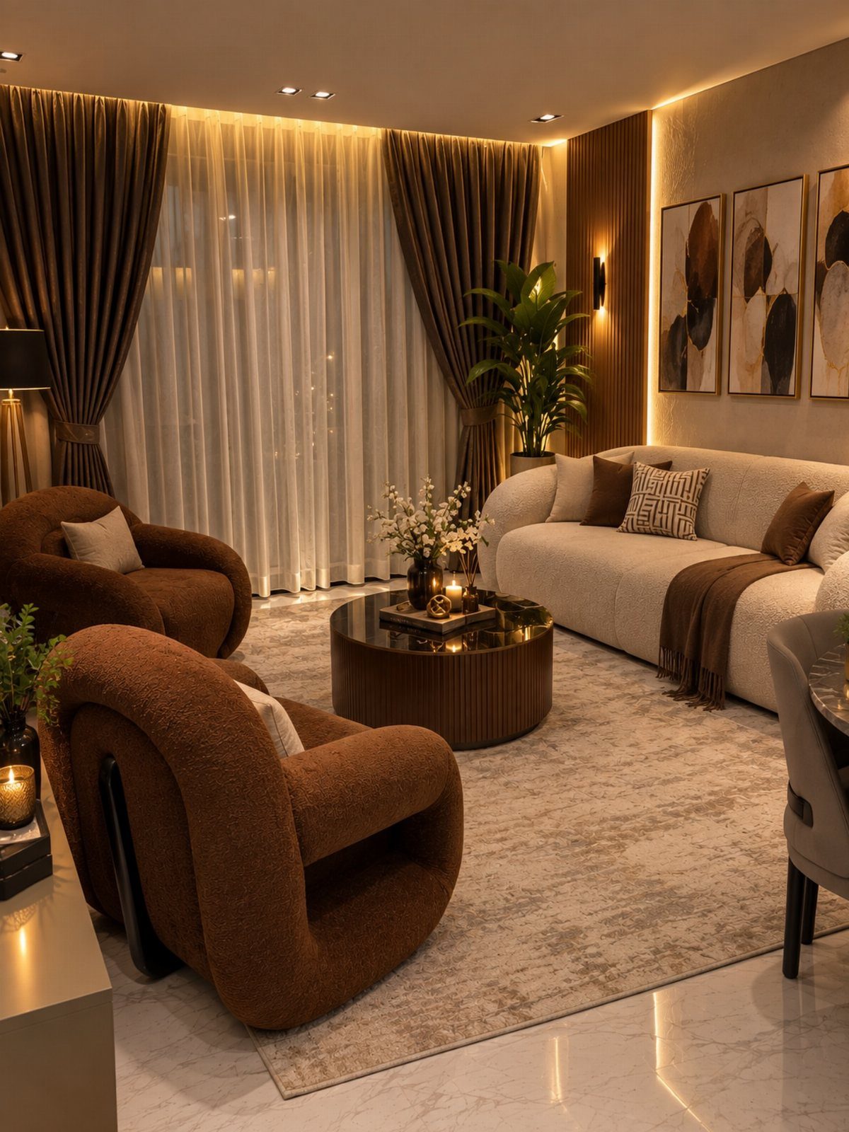
Brown textured armchairs paired with a beige sofa create depth without pattern. The round coffee table softens the straight lines of the seating, and the curtains repeat the warm brown to close the palette.
Textured upholstery on the chairs gives the room visual weight so it doesn’t feel too light. I would choose a beige with warm undertones rather than gray-beige so the brown tones sit comfortably next to it.
11. Rustic Beams with Earth Tones
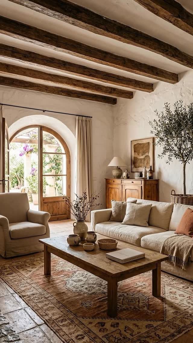
Exposed ceiling beams bring vertical texture and anchor a rustic palette that might otherwise feel too soft. The dark wood contrasts with the light seating and lets the patterned rug carry color without competing with heavy furniture.
If the ceiling is already vaulted, adding faux beams is a manageable materials cost for a standard room. Real reclaimed beams run higher and need structural support, so faux is the practical route for most budgets.
12. Earth-Toned Console Table Styling
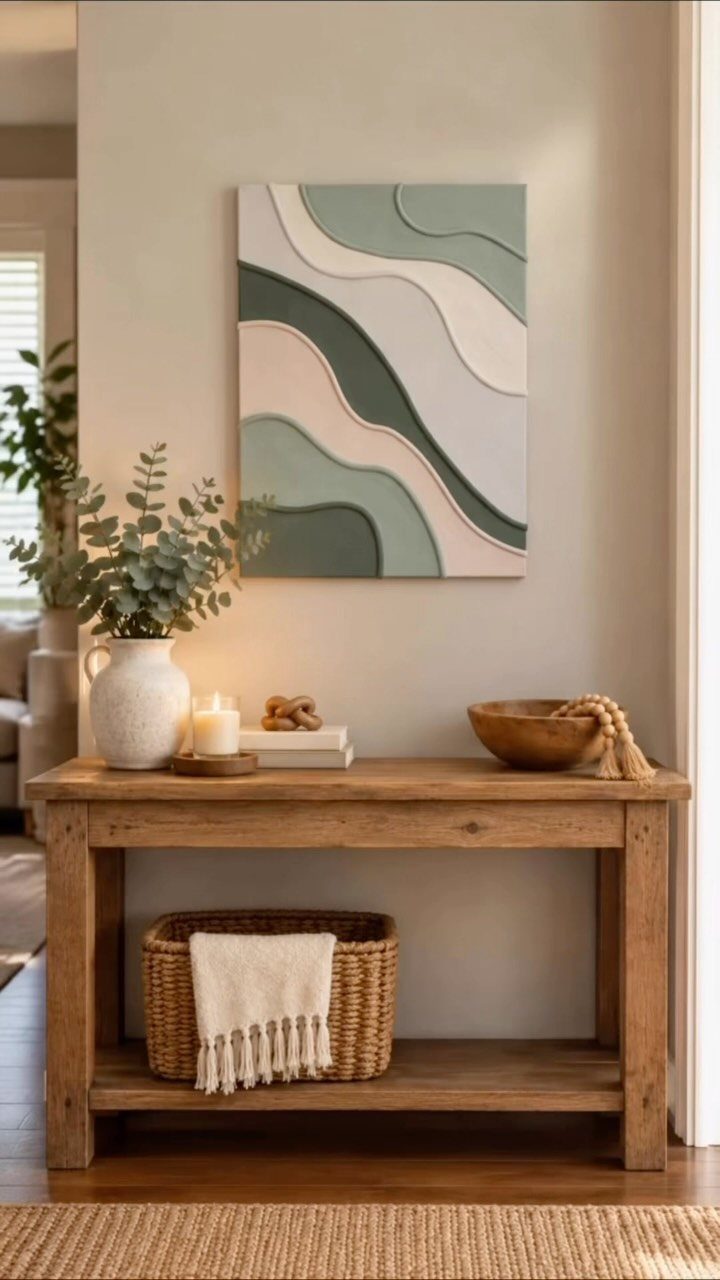
A console table styled with a few natural items keeps the surface functional without looking staged. The woven basket holds a throw, the vase brings in greenery, and the abstract art ties the palette to the wall.
I keep the arrangement to a small group of objects and vary their height so it has rhythm. Unfinished wood, clay and linen read as earth tones without needing to match exactly.
Common Mistakes to Avoid
If every surface reads as the same mid-tone beige, nothing anchors the lighter colors or gives them definition.
Add a true dark. One piece of true black, a lamp base or picture frame, gives the palette an anchor that makes every warm tone look more deliberate.
Photographers call it a black point: without it, the whole image reads washed out no matter how good the colors are. The same applies here.
The other mistake is bulb temperature. Daylight bulbs at 5000K or higher make earth tones look sickly and green.
Bulbs in that range glow like a late afternoon window, and that warmth brings out the depth in terracotta and rust without the sickly cast that daylight temps create.
You can spend serious money on a sofa, but the wrong bulb will make it look like something you pulled off the curb.
Psychological Benefits of Earth Tones
Earth tones come from nature, and they make indoor spaces feel more grounded and welcoming. Colors like oatmeal, clay, sage and espresso are soft and subdued, so they work across different furniture styles without feeling forced.
Living rooms suit these colors because they create a calm environment.
The palette leans rustic and organic, with a warming quality that feels collected rather than staged. Rust and clay read as grounded and calm because they borrow their weight from the dirt itself.
Sunset-inspired tints like warm ochre and burnt orange are bold enough to catch the eye but still peaceful. These tones anchor a room and make it feel more comfortable without needing pattern or bright contrast.
Importance of Lighting
Bulb temperature changes how earth tones read.
Harsh fluorescent lighting drains richness from even expensive upholstery.
When the whole room feels lifeless, the usual culprit is either a bulb running too cool or a palette that never leaves mid-tone. Swap in 2700K bulbs, bring in something dark and layer in a second texture.
Frequently Asked Questions
What color for my living room?
Earth tones like terracotta, sage, olive, rust and warm brown make the room feel calm and grounded.
How to make the living room attractive?
Start with 2700K bulbs instead of daylight bulbs so earth tones read warm instead of sickly, then layer in texture through jute rugs, linen pillows and unglazed terracotta pots.