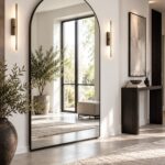
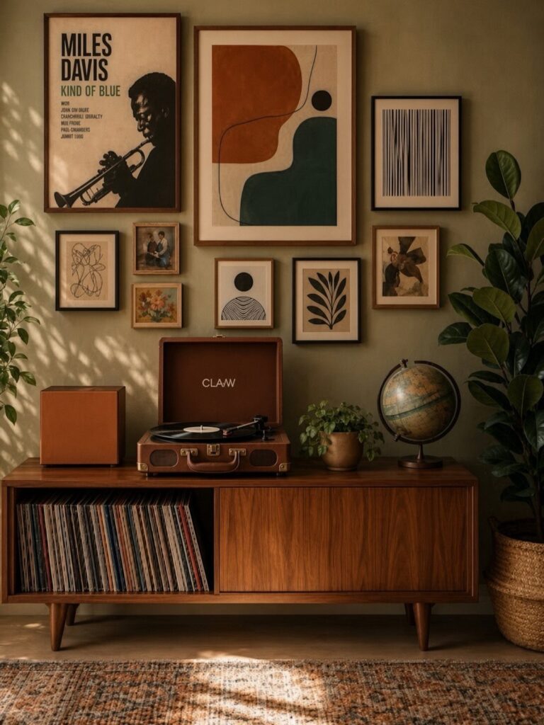
Some of these ideas cost an afternoon; others ask for new furniture and a weekend. The choice comes down to whether you’re working with what you already own or starting fresh.
Furniture here sits low to the ground with tapered legs and thin frames, and the palette holds to white walls, wood tones, and accent colors repeated in small doses across pillows, rugs, art, and plants.
1. Sleek-Lined Furniture
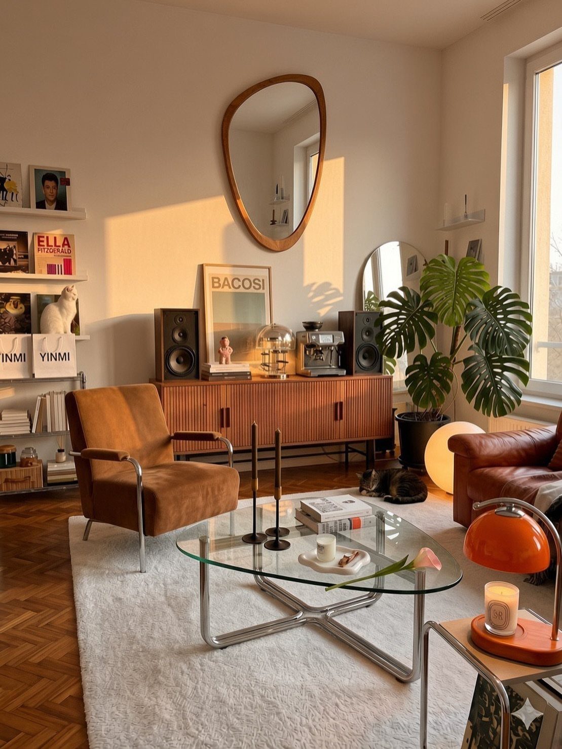
Furniture with clean, straight edges and no extra detail defines the mid-century look. The pieces sit low to the ground, and the silhouette stays simple.
A brown leather armchair paired with a glass-top coffee table and a low wooden sideboard gives you the formula. The glass keeps sightlines open, the wood adds warmth, and the leather ages well without looking worn.
Look for tapered legs, thin frames, and flat surfaces. Avoid anything carved, tufted, or overstuffed.
2. Minimalist Mantels
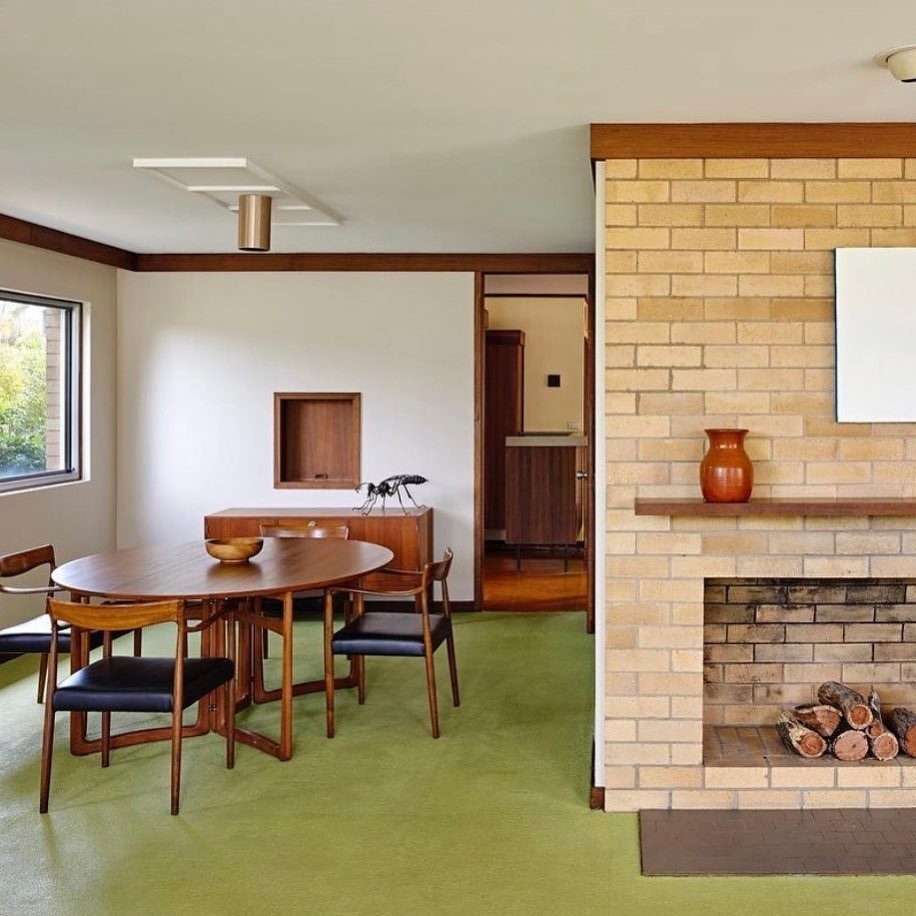
A single object on the mantel beats a crowded arrangement when the fireplace is already doing the work. The brick face and the wood shelf are the texture here, and one tall vase in a warm glaze is enough.
This approach works best when the mantel wood has grain worth seeing.
Let the material show, and choose one piece in a color that contrasts with the brick. Orange, mustard, or deep teal all read well against tan or red brick.
If you need more, add one small object on the opposite end. 2 is the limit.
3. Pops of Color
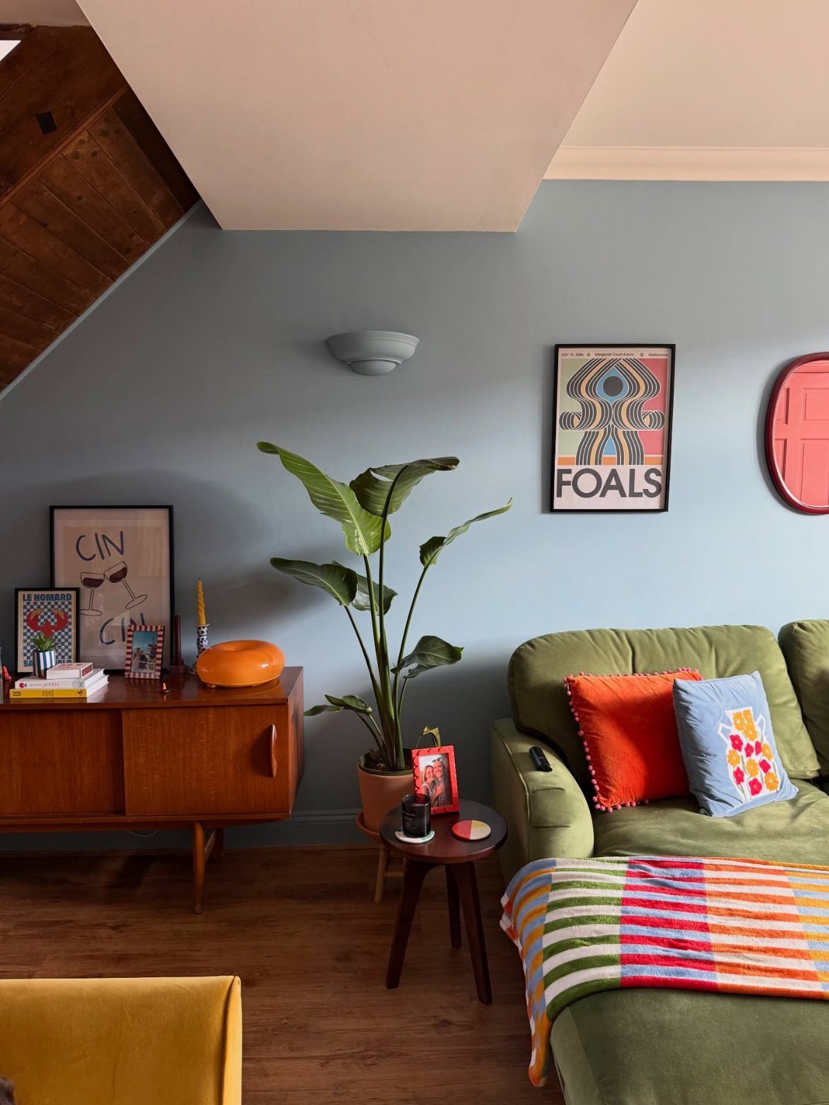
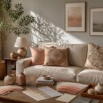
Saturated pillows, throws, and small objects bring energy to a neutral base without committing the whole room to one color. A green sofa becomes the anchor, and orange, blue, and yellow accents shift the mood without repainting.
Choose 3 colors and repeat them in pillows, art, and objects.
One pillow on the sofa, one blanket, and a small object on the sideboard tie the palette together. The colors themselves can be bold, but the pattern stays geometric or solid.
This is the fastest way to change the feel of a room on a small budget.
4. White Walls
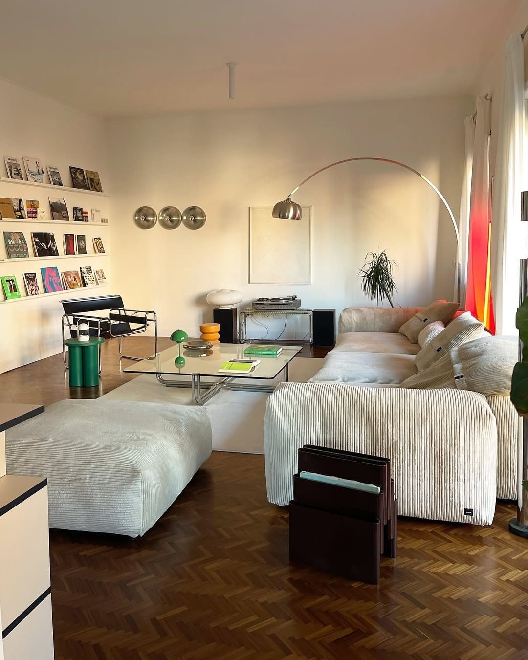
Bright white walls reflect light and let the furniture and art carry the color. The walls recede, and the room feels larger.
This works especially well in small spaces or rooms with limited natural light. The white amplifies whatever light comes in, and darker furniture stands out instead of blending into darker walls.
Use a true white, not a warm cream. The contrast with wood tones and metal frames is what makes the look sharp.
5. Wood Paneling
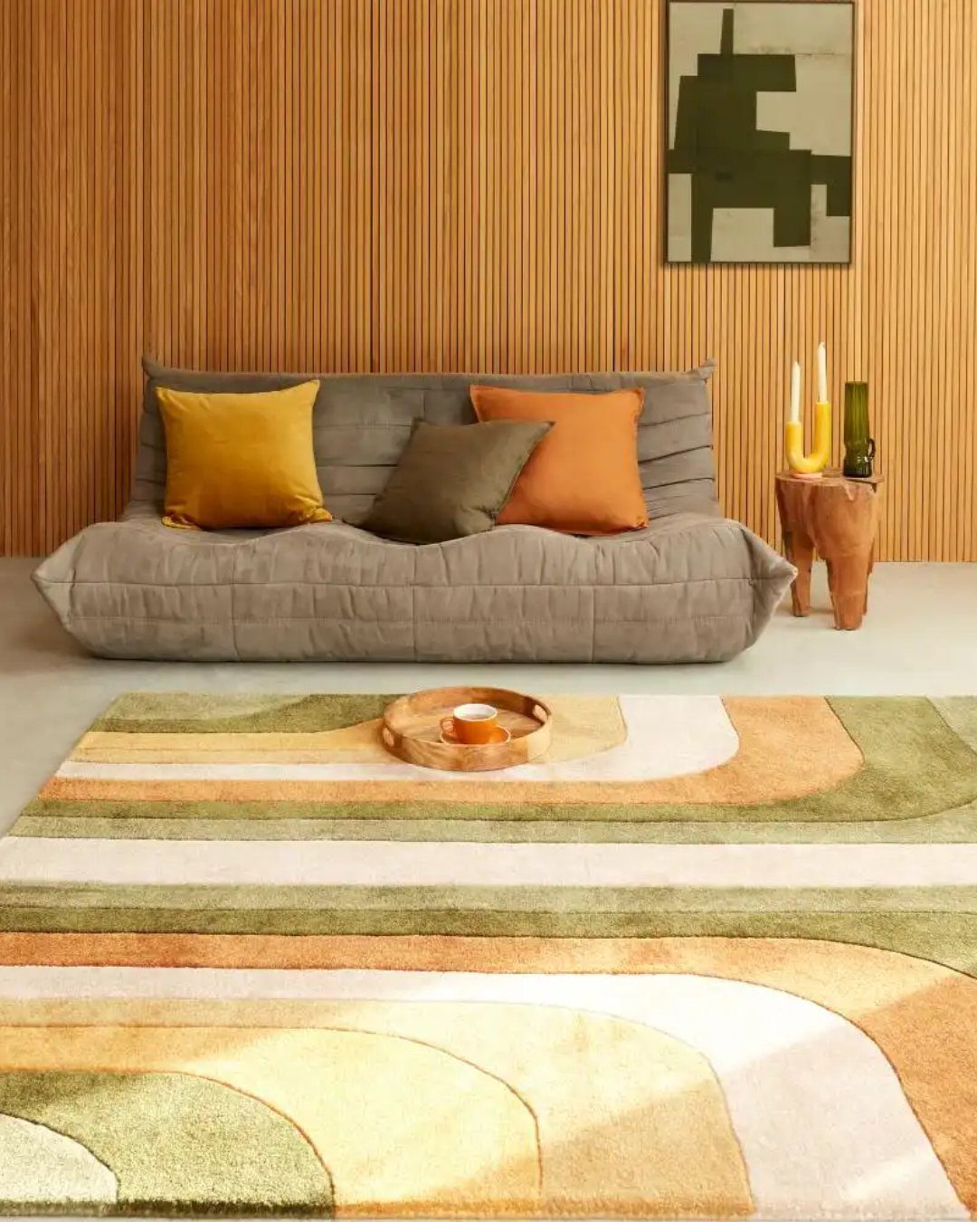
Vertical boards on one wall add texture without pattern, and the grain brings warmth that paint cannot. The paneling runs floor to ceiling, and the lines draw the eye up.
This treatment works on a single accent wall.
Cover the whole room and it reads as cabin instead of mid-century. Choose a wood with visible grain, and finish it with a matte or satin sealer to keep the natural color without gloss.
Install the boards with spacing between them or butted tight, depending on how much shadow you want. Spacing creates more depth but collects dust.
6. Open Shelving
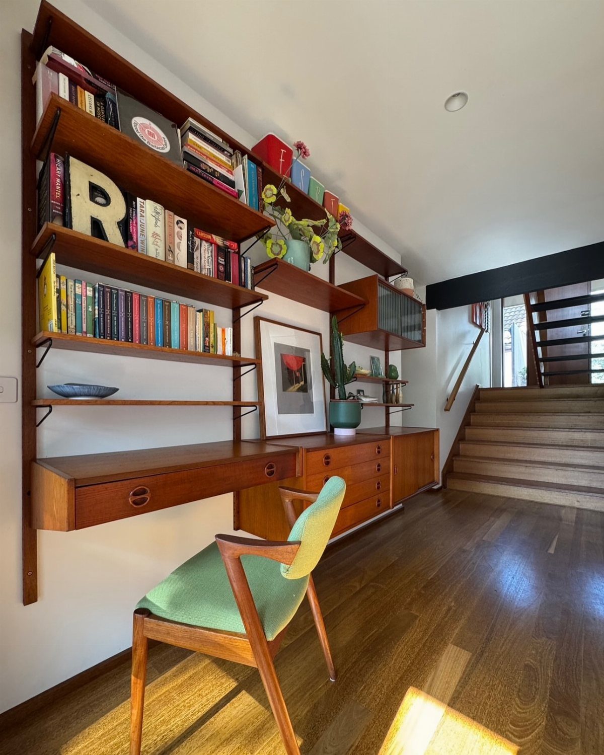
Wall-mounted shelves in wood with thin metal brackets keep books and objects visible and give you storage that does not close off the room. The shelves float, and the wall behind them stays part of the composition.
This setup works when you have a small collection worth showing. Too many objects and it looks cluttered; too few and the shelves feel empty.
Fill most of the shelf space but leave some breathing room, mixing books laid flat with a few small objects in contrasting materials like ceramic or glass.
Match the wood finish to other furniture in the room. The brackets should be slim and set back so the shelf appears to float.
7. Statement Artwork
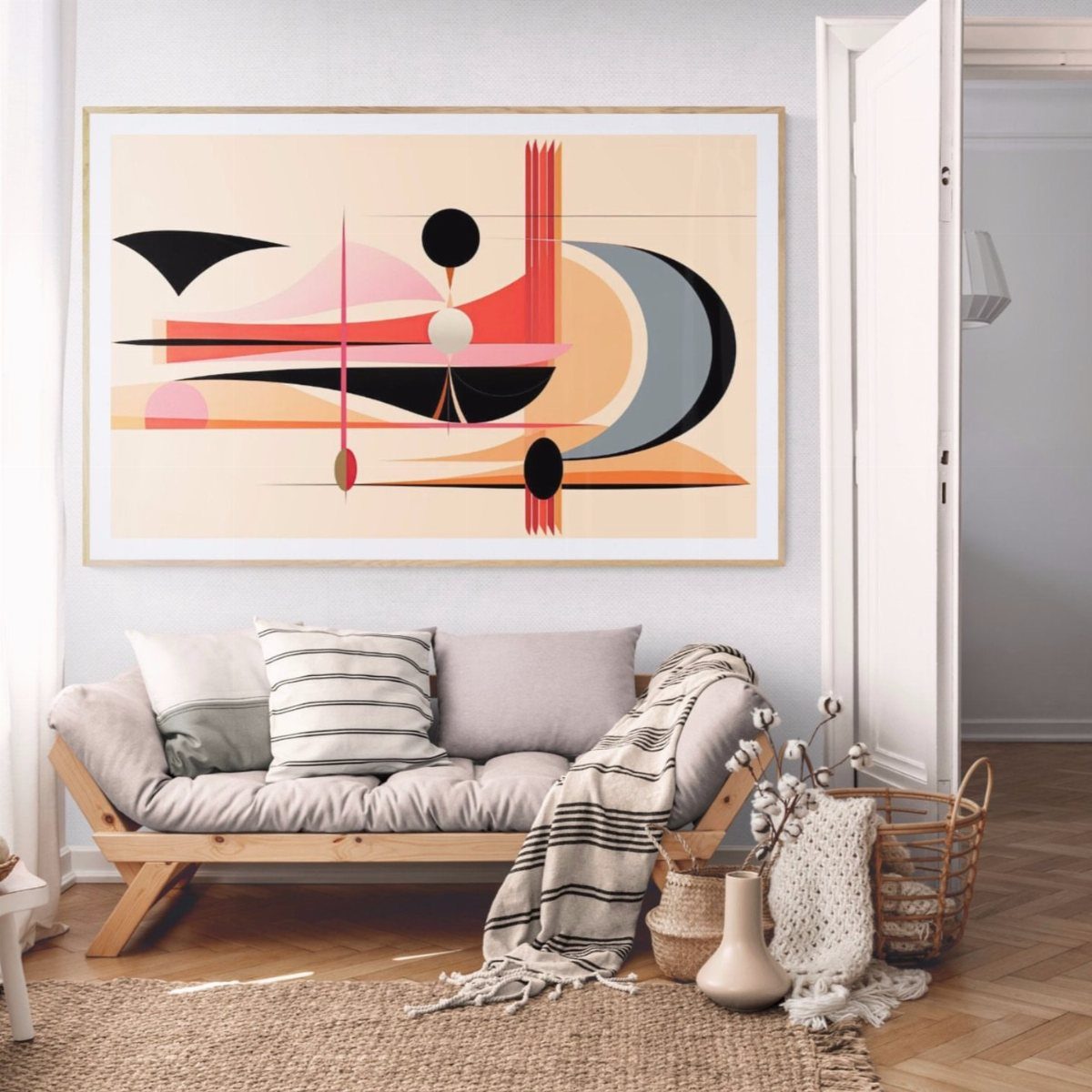
A large abstract piece on the wall above the couch anchors the room and gives the eye somewhere to land.
The scale matters more than the subject; the painting should span at least half the width of the sofa below it.
Geometric shapes, bold color blocks, and asymmetrical compositions all fit the period. Choose a piece with 2 or 3 colors that already appear in the room’s furniture or textiles.
Frame it simply or leave it unframed. A heavy ornate frame pulls the look in the wrong direction.
8. Retro-Inspired Area Rug
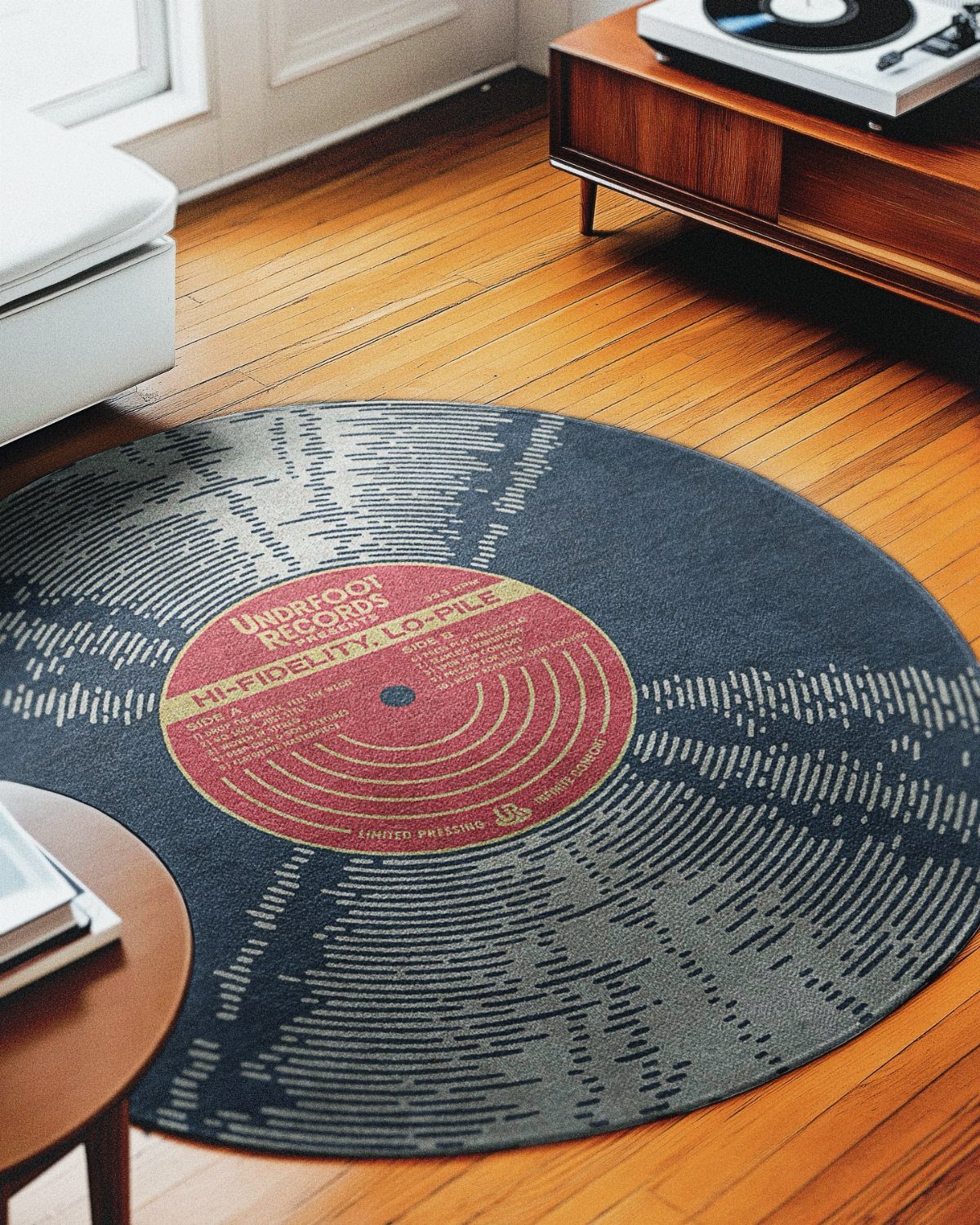
A rug in an unexpected shape or graphic pattern adds personality to the floor alone. Circular rugs soften the hard edges of rectangular furniture, and a design that references mid-century motifs ties the room together.
Size it so the front legs of the sofa and chairs rest on the rug. Too small and it reads as a doormat; large enough and it pulls the furniture into a zone.
Look for flat-weave or low-pile construction in most cases, though a white shag can work if the rest of the room stays true to mid-century lines.
9. Funky Wallpaper
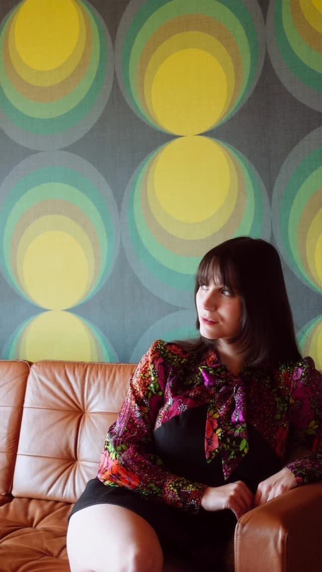
Bold pattern on one wall changes the room faster than paint and gives you a backdrop that reads as deliberate. Concentric circles, overlapping ovals, and starburst patterns all reference mid-century graphics without copying them exactly.
Covering the whole room turns it into the subject instead of the setting. Choose colors that match or contrast with your sofa; either works as long as the palette stays tight.
Peel-and-stick versions let renters try this without a lease issue.
10. Mid-Century Lounge Chairs
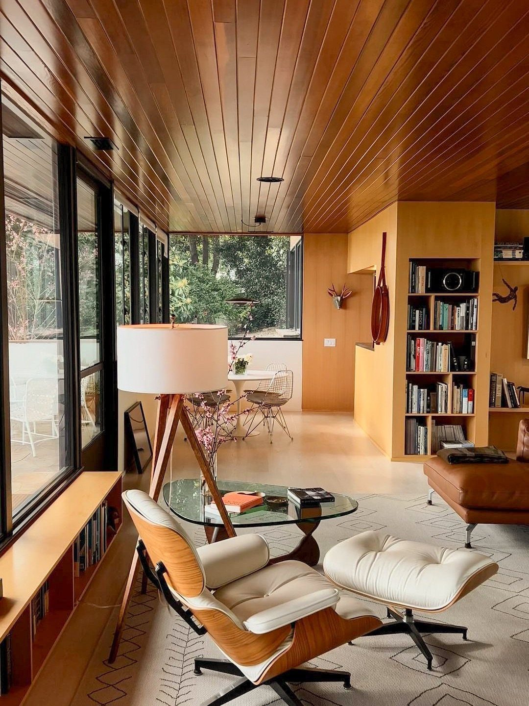
A lounge chair with a matching ottoman fills a corner and gives you a second seating spot that does not fight the sofa.
Leather upholstery in white or tan keeps the look light, and the low profile stays in proportion with the rest of the furniture.
Position it at an angle to the sofa rather than facing it directly. The angled placement feels more casual and opens up conversation without formal symmetry.
Look for a wood shell frame or molded plywood back. The chair’s structure should be visible, not buried under thick cushions.
11. Statement Lighting Fixtures
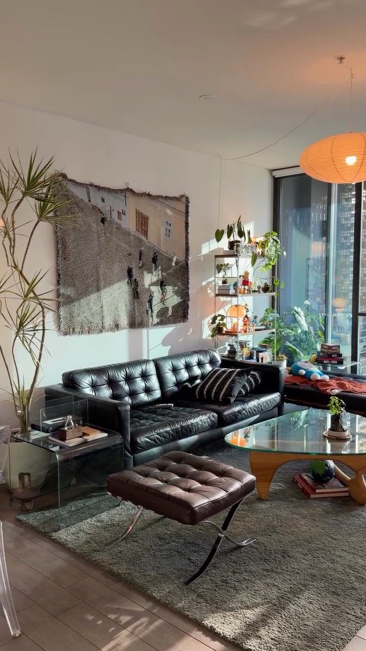
An oversized pendant lamp or a sculptural floor lamp becomes an object in the room, not just a light source.
The fixture hangs low enough to matter but high enough to clear heads, and the shape should be interesting from below.
Paper lanterns, Sputnik chandeliers, and arc lamps all fit. Choose one large fixture over several small ones; the single statement reads cleaner.
Brass with brass, black with black. Mixing metals works only if you commit to it everywhere.
12. Vintage-Inspired Bar Cart
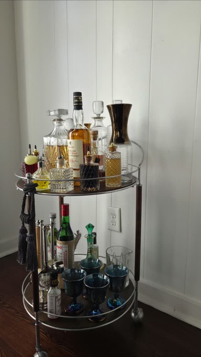
A 2-tier cart in metal or wood holds bottles and glassware in plain sight and moves where you need it. The cart tucks into a corner when not in use and rolls out for guests.
Stock the top tier with liquor and the bottom with glassware and mixers.
Keep the bottles varied in height and the labels facing out. A tray on the top shelf corrals smaller items and keeps the surface from looking scattered.
Choose a cart with casters that lock. Unlocked wheels let it drift, and a spill is harder to clean off a rug than off the cart itself.
13. Organic Shapes
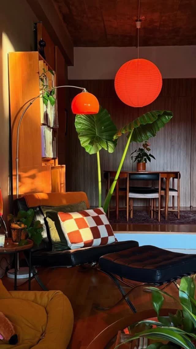
Rounded chairs, curved lamps, and sculptural objects soften the hard angles of mid-century furniture without losing the clean look.
The sphere shows up in pendant lights, table bases, and planters, and it contrasts with the straight lines of wood paneling and rectangular seating.
A black leather chair stays angular, but round orange lamps soften the edges and keep the room from feeling too severe.
The curve also works in small doses: a kidney-shaped side table, a bowl on the coffee table, or a round mirror.
Keep the organic shapes in accent pieces, not in every major piece of furniture.
14. Layering Textures
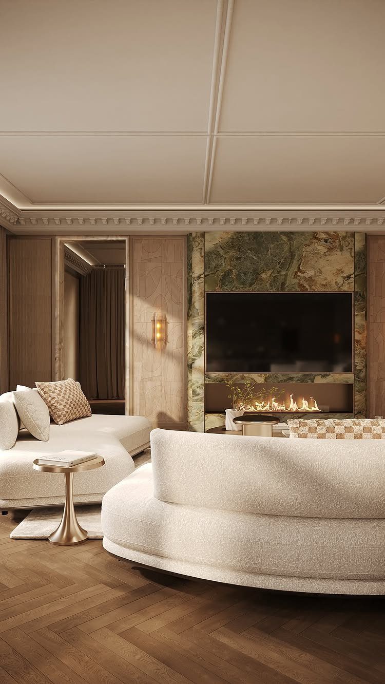
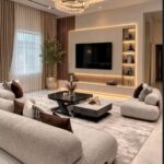
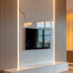
Mixing smooth and textured surfaces in the same neutral palette adds depth without adding color. Bouclé on the sofa, herringbone on the floor, and polished marble on the wall give you 3 textures that read as one cohesive space.
This approach works when the palette stays tight.
White, cream, and natural wood let the texture do the work. Add one metal finish for contrast; gold warms the room, brass reads vintage, chrome stays cooler.
The more textures you layer, the simpler the color scheme needs to be.
15. Sunburst Mirror Focal Point
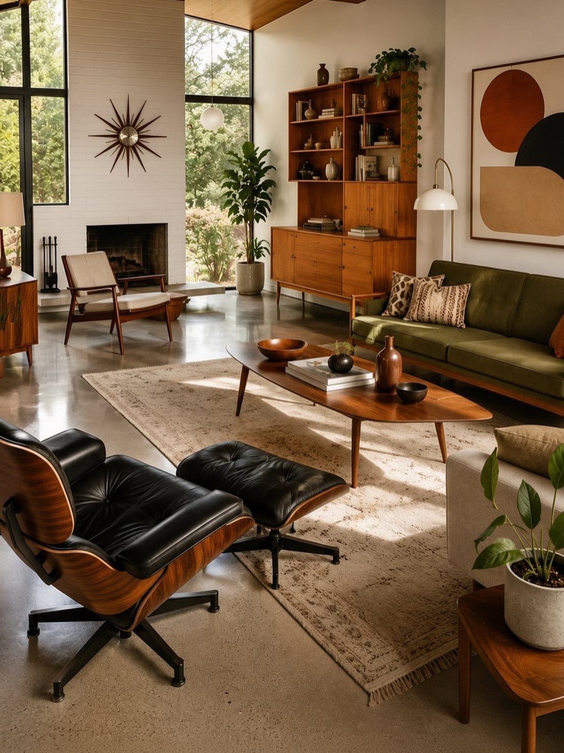
The sunburst mirror is the fastest mid-century signal you can hang on a wall. The radiating metal spokes catch light and add dimension on the wall alone.
Hang it above the fireplace or on the wall opposite your seating.
Size it so it reads from across the room; a small mirror disappears on a large wall. The metal finish should match other hardware in the room or stand alone as the only gold or brass piece.
This works in small rooms where a large framed mirror would feel heavy.
16. Geometric Rug Patterns
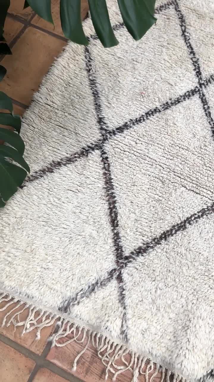
A geometric pattern on the rug brings graphic interest to the floor without competing with patterned walls or upholstery. Diamonds, hexagons, and chevrons all fit, and black on white gives you high contrast that reads clearly from across the room.
Choose a rug where the pattern covers most of the surface but leaves some breathing room at the edges. An all-over print can feel busy; a centered motif with a plain border stays calmer.
Match the rug’s scale to the room. Small repeating shapes suit a large space; one bold graphic works in a small one.
17. Floor-to-Ceiling Windows
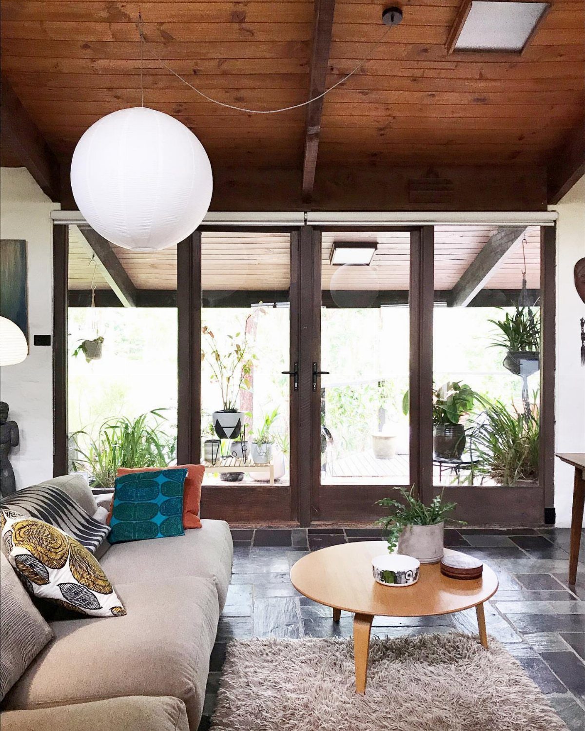
Floor-to-ceiling glass brings in more light than a standard window and blurs the line between inside and outside. The view becomes part of the room, and the space feels larger without adding square footage.
A patio with plants or a yard with mature trees extends the room visually. If the view is a fence or a parking lot, sheer curtains soften it without blocking all the light.
Keep window treatments minimal. Heavy drapes cancel the effect.
18. Use of Brass or Gold Accents
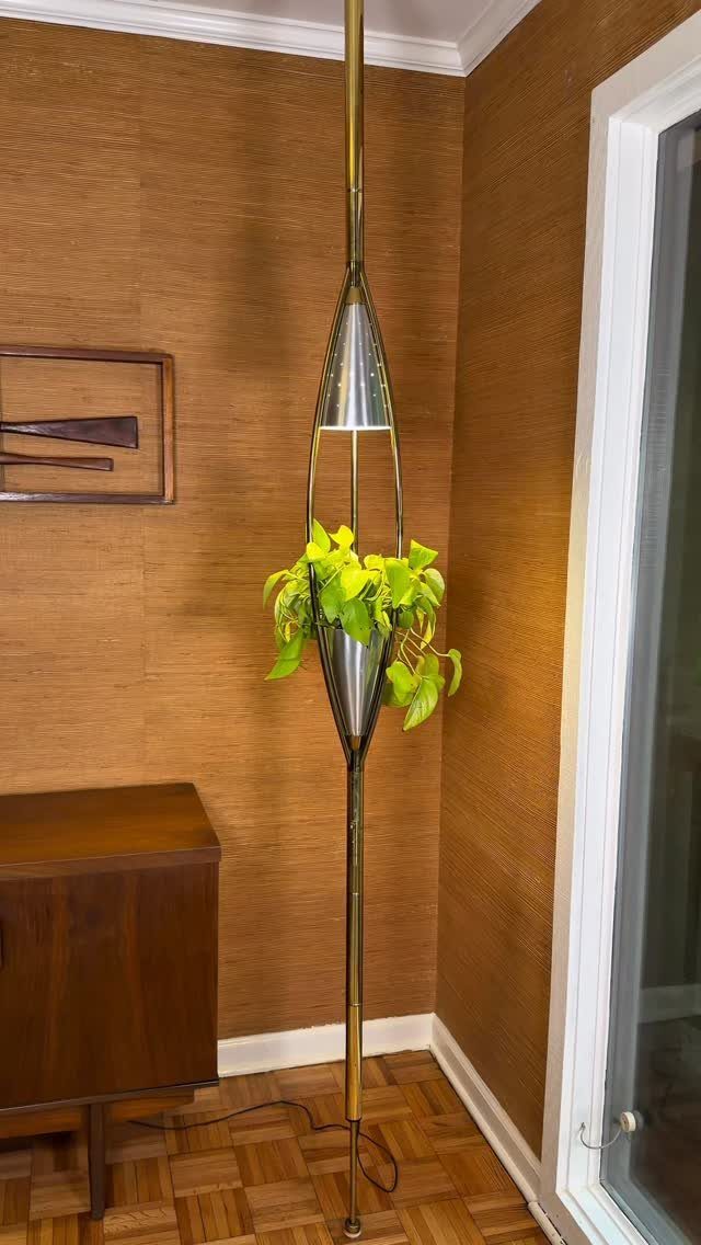
Brass and gold accents add warmth to a room full of wood and leather without introducing new colors.
A floor lamp in brass with a built-in planter does double duty, and the metal reflects light in a way that wood cannot.
Use metal in lighting, hardware, and small objects.
A brass lamp, gold picture frames, and metal legs on the coffee table repeat the finish without overdoing it. Too much and it reads as gaudy; a few pieces spread around the room is enough.
Polish the metal or leave it brushed. High shine stands out more; matte blends in.
19. Large Indoor Plants
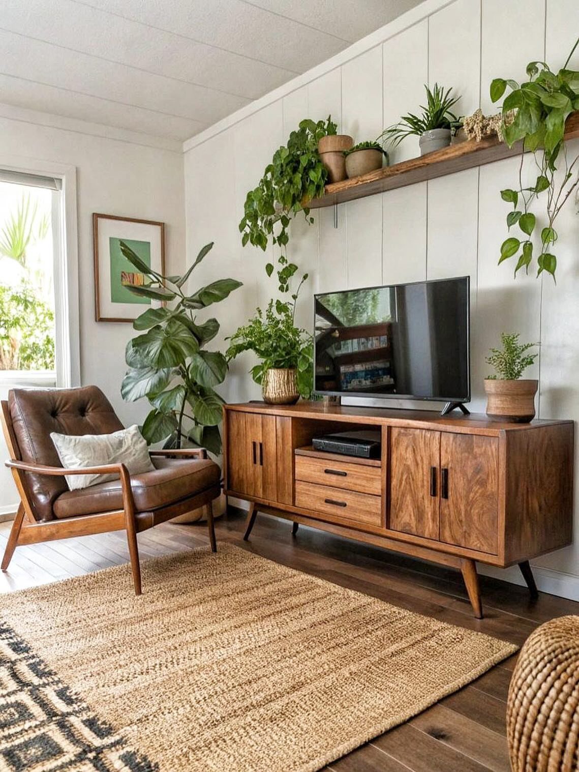
Large plants fill empty corners and add height where a piece of furniture would crowd the floor.
A fiddle-leaf fig or a monstera in a simple pot reaches up next to a chair or sideboard and softens the hard edges of wood and leather.
Group plants at different heights instead of lining them up at floor level.
One tall plant on the floor, a smaller one on a shelf, and a trailing pothos on the credenza give you layers without taking up more floor space.
Choose pots in neutral colors or natural materials. Terracotta and matte ceramic disappear into the room; bright glazed pots compete with the furniture.
20. Simple Coffee Table
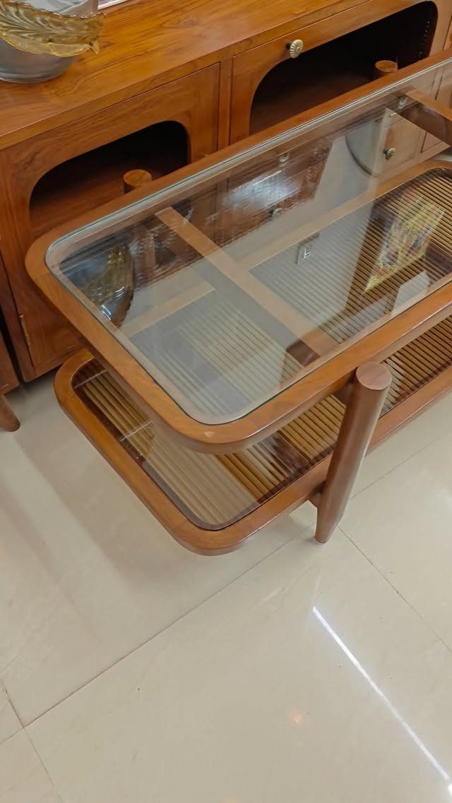
A coffee table with a glass top and an open lower shelf keeps the center of the room light and lets you see through to the floor.
The glass spans a wood frame, and the slatted shelf below holds books or a basket without closing off the space.
The glass should sit flush with the wood or slightly recessed, not raised on legs of its own. The lower shelf works best when it stays open rather than enclosed; solid sides add visual weight.
Wipe the glass daily. Fingerprints and water rings show up fast, and glass only looks clean when it actually is.
Mixing Styles
Pairing vintage finds with newer pieces keeps a mid-century room from feeling like a museum.
A teak credenza next to a contemporary sofa in a saturated color gives you the best of both: the craftsmanship and patina of older furniture, and the comfort and proportion of something built for how people sit now.
If the palette holds across pieces, the eras stop fighting each other.
A vintage chair reupholstered in a color that matches your modern rug ties the eras together. Leaving one piece in its original fabric adds authenticity, but cover the rest in solids that pull the room into a single palette.
High-contrast color on geometric furniture reads as both retro and current. The approach borrows energy from different decades without committing to one.
Importance of Natural Light
Architects working in this period designed around sunlight, and the rooms feel incomplete without it.
These small horizontal windows sit near the ceiling and flood the room with indirect light that highlights wood grain and the texture of upholstery.
They also maintain privacy without blocking daylight, which matters in urban spaces or rooms facing a neighbor’s wall.
Light in a mid-century room is structural, not decorative. It shows off the materials rather than competing with them, and a room starved of natural light loses half the point.
Functionality in Design
Furniture in this style was designed for postwar homes where space came at a premium and excess decoration felt outdated.
The result is pieces that do one job well: a chair that supports your back without extra cushions, a table with a surface large enough to use and legs thin enough to see past.
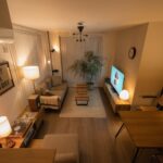
Low-profile seating keeps sightlines open and makes a small room feel larger. A sofa that sits close to the floor does not block the view to the window, and the horizontal line it creates stretches the room visually.
Metal legs and slim frames reduce visual weight, and features like hidden storage or fold-out surfaces add function without bulk.
The style emerged as a response to ornate traditional furniture, and that simplicity is still the reason it works in small spaces today.
The mid-20th century was a design renaissance for furniture, interiors and architecture.
Frequently Asked Questions
What is a mid-century modern style home?
A mid-century modern home uses clean lines, natural materials like wood and leather, and furniture built for function rather than decoration. The style came out of a reaction against ornate traditional furniture, favoring simplicity and livable spaces instead.
Is mid-century modern still in style in 2026?
Yes, mid-century modern remains popular because the principles behind it still work: small homes need furniture that does not waste space, and clean lines age better than heavily decorated pieces. The style adapts to current tastes without losing its identity.
Who was known for mid-century modern design?
Charles and Ray Eames, George Nelson, and Arne Jacobsen are among the most recognized designers from the period. Their furniture and lighting designs set the standard for the clean lines and functional forms that define the style.